


 |
|
Page 1 of 4 |
|---|
Monteis2002
Comment #3 Sunday, March 14, 2004 5:56 PM
Comment #3 Sunday, March 14, 2004 5:56 PM
This one's another winner!!! If you're still lookin for another color to add, well I'd like to see maybe an Orange.
Rutabaga64
Comment #4 Sunday, March 14, 2004 6:23 PM
Comment #4 Sunday, March 14, 2004 6:23 PM
Coolios!
And I love purple, so a purple variation would be nice.
And I love purple, so a purple variation would be nice.

Chickie
Comment #6 Sunday, March 14, 2004 6:34 PM
Comment #6 Sunday, March 14, 2004 6:34 PM
Oppsie! Sorry, I didn't see the red skin.
Could ya please add purple? Thanx.
Could ya please add purple? Thanx.
treetog
Comment #8 Sunday, March 14, 2004 7:26 PM
Comment #8 Sunday, March 14, 2004 7:26 PM
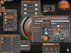
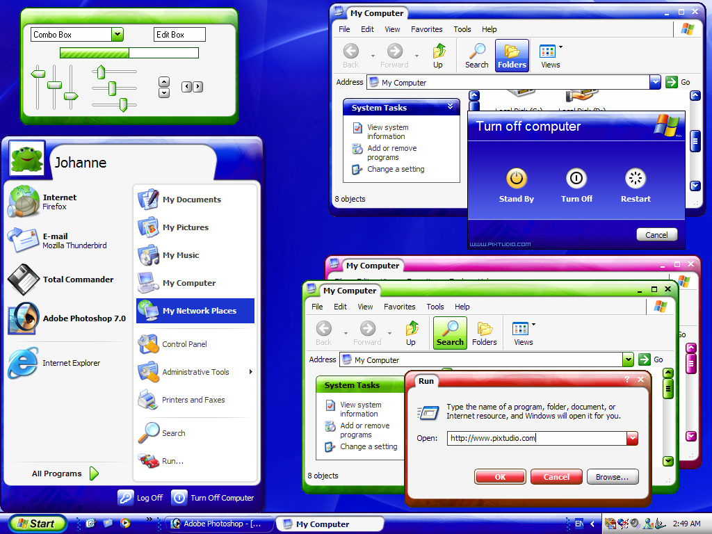
Johanne, the screenshot doesn't make justice to this skin. This is one of the most clean and usable skins I ever used. As for the colors, I like them all. Fantastic work, pixxy.
Alexandrie
Comment #10 Sunday, March 14, 2004 8:43 PM
Comment #10 Sunday, March 14, 2004 8:43 PM
thanks guys for your comments, always appreciate to see people that like your work
sig101
Comment #11 Sunday, March 14, 2004 8:57 PM
Comment #11 Sunday, March 14, 2004 8:57 PM
ooh, I like! Fun looking and usable. A vote for yellow as a possible additional color, but what the heck, they all look good. 
A vote for yellow as a possible additional color, but what the heck, they all look good. 
wulfn1
Comment #12 Monday, March 15, 2004 12:30 AM
Comment #12 Monday, March 15, 2004 12:30 AM
OOOH!! thanks Alexandrie! another one to add to my favorites!
treetog is right, the screenshot doesn't do it justice at all. such a fun skin!
treetog is right, the screenshot doesn't do it justice at all. such a fun skin!
retiredmaster
Comment #15 Monday, March 15, 2004 5:14 AM
Comment #15 Monday, March 15, 2004 5:14 AM
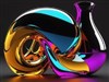
Nice touch of texture on the frame, which is very cool. I particularly like the title 'bubble' which breaks up the titlebar frame nicely. (..and reminds me of an old Dangeruss skin - Dream?)
Jan Oscar
Comment #16 Monday, March 15, 2004 5:37 AM
Comment #16 Monday, March 15, 2004 5:37 AM
Very useable and clean! Update the screenshot asap, and consider showing the other colour options as a smaller box or something. You will double the downloads by doing that. Can't wait to see the toolbar icons!
TheSkinsFactory
Comment #18 Monday, March 15, 2004 9:57 AM
Comment #18 Monday, March 15, 2004 9:57 AM
Essorant: no not Dangeruss. Fitting name for this skin considering it seems heavily inspired by our Bionic Dot WMP 9 Skin and the same skin we're porting for the competition. From the washed out colors on the top - to the reflection mapping on the bottom left corner. Amazing coincidence that it's exactly the same 4 colors as well.
Don't believe me? http://www.theskinsfactory.com/tsf-temp/bionic.jpg
Don't believe me? http://www.theskinsfactory.com/tsf-temp/bionic.jpg
Jan Oscar
Comment #19 Monday, March 15, 2004 10:55 AM
Comment #19 Monday, March 15, 2004 10:55 AM
Essorant: Yes, Russ Schwenkler aka Dangeruss did that one https://www.wincustomize.com/skins.asp?library=1&SkinID=1044
pjpowell
Comment #20 Monday, March 15, 2004 1:58 PM
Comment #20 Monday, March 15, 2004 1:58 PM
The skin instantly made me think of Dream for the same reason as essorant already commented. The similarities to bionic dot completely escaped me.
Let's look at them one by one.
1. Lighter colours at the top, darker toward the bottom.
Well. Let's see. Generally if one is trying to give the effect of a curved surface you would get the effect shown here. Light at the top gradiating to dark and curved at the edges. In fact the shading is very different to bionic dot. Bionic dot goes for the dark->light gradiated to dark->dark for the top whereas this uses light gradiated to dark for the top.
2. Reflection mapping in the bottom left.
It's supposed to be a reflective material. It's going to have reflections. Just about any glassy/reflective material 'should' have reflection mapping to add realism. You point out the bottom left but actually if you look there is reflections throughout.
3. Colours used. Blue, green, red and pink.
If I were asked what colour skins would most people ask for I would have to say the first three colours. Pink is an unusual one but the creator is a woman. Women like pink. No idea why but there you have it. I would personally have gone for a black or grey design but that's just me.
There the similarities end as far as I can tell and both of the first points are standard ways of conveying what both of the artists were trying to convey. Reflective, curved (maybe even bulbous) surfaces. The last is about a choice of colours. They're popular colours, why were they picked for bionic dot and this? Probably for that very reason.
Please login to comment and/or vote for this skin.
Welcome Guest! Please take the time to register with us.
There are many great features available to you once you register, including:
- Richer content, access to many features that are disabled for guests like commenting on the forums and downloading files.
- Access to a great community, with a massive database of many, many areas of interest.
- Access to contests & subscription offers like exclusive emails.
- It's simple, and FREE!
|
|
Page 1 of 4 |
|---|


Comment #1 Sunday, March 14, 2004 5:05 PM
Lots of good stuff here!