


 |
|
Page 1 of 2 |
|---|
Comment #5 Wednesday, January 16, 2013 9:14 PM
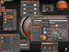
Love this skin, it's definitely my favourite of yours! I like the top of the taskbar and sides of the start menu.
Comment #9 Thursday, January 17, 2013 8:25 PM
omg i love this skin love the sleek look of it and i'm using it on vista works pretty good. Overall its a very usuable and sexy dark skin can't wait to purty up my desk with it  many thanks for ya hard work
Comment #10 Thursday, January 17, 2013 10:00 PM
I think you have potential my friend, but i feel this is a step back from you r last one.
Let your originality and imagination.. roam.

Comment #11 Friday, January 18, 2013 8:06 AM
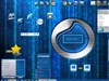
Thanks for your kind words. I felt that the last one could have improved in many directions. I felt that it was a little too dark to see the details. I just aimed for a more usable feel with this one. I probably shouldn't have called it Serica 2 but not to worry. My next one will be great, or at least I hope.
Thanks again to everyone for their continued support
Comment #12 Friday, January 18, 2013 8:14 AM
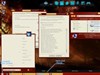
Love this minimalistic skin, however, it messes up my Thunderbird folder fonts so I get tiny fonts for folders w/o unread messages and big (14 bold?) font for folders w/ unread messages causing overlap. TB 17 must have changed something because a lot of WBs do that these days.
Possibly related to Win 7 Personalize|Display|Font Size. If I change from Smaller (default) to Medium everything looks much better. At Smaller, the Start Menu items (not All Programs) are also chopped off at the verical center so I only see the top half. Not so @ Medium.
Comment #13 Friday, January 18, 2013 10:53 AM
Would have to see it to know what you mean since I just use gmail. Could you post a screenshot?

Comment #15 Friday, January 18, 2013 4:09 PM
Thanks Tom I hope only to improve even further 
Comment #16 Friday, January 18, 2013 6:17 PM
Don´t worry. You will be hoping all the time as most of us do with every new skin  Wishing you a pile of inspirations and tuns of patience for future skins.
Comment #17 Friday, January 18, 2013 6:52 PM
I'm working on one as we speak. It's already proving to be a pain but perseverence and determination is the key to success. We will get there in the end! 
Comment #18 Friday, January 18, 2013 7:54 PM
One blind at a time, and I see lots of success in all your work. Wonderful!! 
Comment #19 Saturday, January 19, 2013 6:18 AM
Thank you ladyj55 your kind words motivate me to continue even more
Comment #20 Saturday, January 19, 2013 8:33 AM
If there is anything I could do for you, just let me know. I have busy days now but will help all I am worth if required. I do have this skin of yours on my laptop as we speak. I like it. I understand you wanned have it all without any "disturbing colour". But I feel that taskbarbutton might have been coloured, just slightly. And as the transparency on the startmenu is big, perhaps it might been better having that blury. I apologise if you take this personally. I hope you will not. Just trying to help. And I am not the best in this so who know, perhaps I can be wrong. Once again, a very good looking blind and I will be gladly using it for a time THANK YOU
Please login to comment and/or vote for this skin.
Welcome Guest! Please take the time to register with us.
There are many great features available to you once you register, including:
- Richer content, access to many features that are disabled for guests like commenting on the forums and downloading files.
- Access to a great community, with a massive database of many, many areas of interest.
- Access to contests & subscription offers like exclusive emails.
- It's simple, and FREE!
|
|
Page 1 of 2 |
|---|

Comment #1 Wednesday, January 16, 2013 6:24 PM
Very nice, thanks!
