Comment #2 Monday, January 22, 2007 8:43 PM
 �
�Comment #3 Wednesday, January 24, 2007 12:17 PM
�
 �
�Comment #4 Thursday, February 8, 2007 1:41 PM
Comment #5 Friday, February 9, 2007 11:12 AM
This one's awesome Rob!�
 �
�I don't know why I didn't see this one before.
Must have been while I was still away.
This one's definately a keeper!
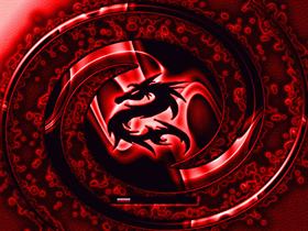
I personally am glad that the Dragon is opaque with the red glow around it.
I don't think it could look better any other way.
The only drawback I see, and this is only me, with my weird opinions, is the two tone Progress Bar.
The only reason why I say this is because you have this awesome, and I do mean awesome, looking BootSkin which bursts out of the screen practically 3 Dimensional, and there's the flat two tone bar.
I think myself personally that such a richly detailed image with such depth to it, should also have a Bar with depth as well.
Just something with some highlights and a little shading.
Here's an example. I took your Progress Bar Style, and gave it just a little depth to coincide and exist in harmony with your awesome image.
Here's the Image:

As you can see, it gives your image its continuing 3 Dimensional effect.
Now we'll show both Progress Bars side by side as to show the distinct differences between a 3D style and a flat 2D style.

Okay, enough of that, either way this one's a keeper for me!�
 �
�Comment #6 Friday, February 9, 2007 1:19 PM
but I would say as a matter of fact that your bootskins contain the most original progress bars I've ever seen. Even an old fart like myself (turned 35 this year, I ain't "springtime" no more, pretty soon I'll just be a memory �
 � ) can learn something new every now & then.
I'll use your progress bar style for my blue dragon bootskin when I release it (which is just a hue shift of the red one above - I'm getting lazy in my older years)
Thanks Johnny, I appreciate the tips - keep them coming! �
 �
�Comment #7 Friday, February 9, 2007 5:34 PM
 �
�I really appreciate it!�

They're okay on some. I usually go with a regular 3 Band Cylindrical Bar.
You really don't have to change out your Progress Bar if you don't want to.
I was just giving an opinion, that's all.
But thanks for being so cool about it!�
 �
�Comment #8 Monday, February 12, 2007 4:46 PM
Like John, I must have missed this one�
 ��
�� ��
�� ��
�� ��
�� ��
�� � . You two amaze me. I've got something to shoot for. Nice PB, John. Thanks much for the 3D stuff. �
 ��
�� �
�Be well,
Ed
Comment #9 Monday, February 12, 2007 4:54 PM
 �
�Please login to comment and/or vote for this skin.
Welcome Guest! Please take the time to register with us.
There are many great features available to you once you register, including:
- Richer content, access to many features that are disabled for guests like commenting on the forums and downloading files.
- Access to a great community, with a massive database of many, many areas of interest.
- Access to contests & subscription offers like exclusive emails.
- It's simple, and FREE!


Comment #1 Friday, January 19, 2007 8:01 PM