


Quick Lesson in Dreams
or: How to conquer the universe, win contests, invade the planet and still look good while doing it
Friday, November 30, 2007 by Zoomba | Discussion: Tutorials
To go along with the launch of the Create Your Alienware Dream Contest, I asked Seabass, our resident undiscovered 3d artist extraordinaire to put together a quick and dirty Dream and write up a little bit on what he did and why, as well as give a few other examples of what would or wouldn't make a good Dream.
This article should help out any Dream maker, whether for the contest or otherwise. It's a good lesson in what makes a Dream successful and usable, and what sorts of effects and techniques you'd be best to avoid.
Without further delay, here's Seabass's article
In the course of the next contest we thought it would be best to go over the Do's and Don'ts of Dream creation. Since this is an art medium however there really is nothing that you can't do. However the most popular Dreams all have certain things in common. We are just going to go over a few of those in the hopes of giving everyone that extra edge in this contest.
Yesterday I put quickly put this dream together of the planet Earth exploding in a fiery ball of death and... well fire. This Dream contains several bad things as well as a few good things.
You might notice that the Planet takes up the center of the screen. This part is good. Since currently the only Dreams that are used out there are on Vista Ultimate you can be certain of space being used on either side of the screen. With icons taking up one side and the sidebar taking the other side it is best that you allow the more visual aspects of the dream to be centered. You can also make the focus lean right as not all use the sidebar, and most leave it transparent. However filling in the spaces between the cursors on the desktop will make it look cluttered and will not be as usable. The center of your Dream is always the best.
Another good point is that the planet explodes in a really bright ball. No matter how pretty it might look this is bad. Having lots of motion on the desktop is harsh on the eyes and worse on whatever you might have had in your stomach. Now this isn't always true since many people like using full screen applications and will cover the whole of this destruction. So this is not all bad but it still will only be appealing to a select few. The best dreams are the subtle ones with small or smooth motion.
Size of the file is a big deal. If you make a file enormous (like using a stupid amount of particle and fluid effects for example) you will bog down the computer and the movie file will drag. This makes having the dream as pointless as it gets. Don't go overboard, but if you do look into the best compression software you can find. If it would be the same as just running a loop on the media player in the background then something has gone wrong.
You will also notice that there is no loop. Earth blows up, is in need of some major hydration only to suddenly be fine... and blow up again. Smooth loops are what set professional Dreams apart from the rest. If you are new to animation for this contest make sure that what ever you are animating have the exact keyframes at both the start and finish of the animation. The best way to do this is to key the subject of your dream, push the slider to the end, then key it again. This all happens before you do any other motions. Many programs like Maya, Flash, and others will fill in the gaps of the animation. So with out those last key frames it could look just a bit off.
No matter what you might think of your work have three people look at your work before sending it in. No matter what kind of art training you might have anyone anywhere can just see when something is wrong. Colors mesh in a strange way, animation looks just a bit off, a little clip in the file or missing frame.... etc. After looking at something for a really long time you miss the details easier than Zoomba trying to hit me from his desk with a foam cow all the way across the office. You kinda have to be there for that one. Suffice to say it's a hard thing to do. Either way let people look at it before you post it. If even more than one go... "uummm I don't know" then do some face scrunching then you should check your work again.
Lets look at a few more examples out there.
Mana Burn is an example of a small blue flame set that runs the bottom of the screen. I like this one because it does not require tiling for those that have dual screens. The animation is simple and isn't over bearing at all.
Blissful Dream is one I like because all the movement is subtle. The colors are bright but not over bearing and it has it's major focus in the middle of the picture so nothing on your desktop gets in the way.
The Lines 2 is another great one in that it's subtle but has a great presence on the screen. The use of color shifting keeps it from getting boring.
ATI Ruby is a fun to watch but far too much is going on. Having a full movie, even when it is good looking, is over bearing. Besides who wants to watch the same fight over and over? Once again this isn't to say that it is bad but the point of the dream is to appeal to as many people as possible.
I hope these tips help! Good Luck!
Cheers,
Seabass
-My Chi knows how to Splode.


Thanks again to Seabass for taking the time to put together both the dream and this article!
SkinStudio 6 (Beta) Overview
Monday, October 1, 2007 by Quentin94 | Discussion: Tutorials

We'll choose "I am experienced..." cause all options are displayed for this overview, but the great new feature with SKS6
is that we can choose as beginner the "I am new..." and left out some option like animations.

Here like i've Photoshop 7 i'm gonna choose it as custom editor.
We can notice some others options; like "Do not convert TGA to PNG" and "Show tree in edit windows"
interesting options cause SKS6 by default convert TGA with alpha channel to PNG with transparency so if you don't want that enable this option.
We will see the tree option later.


Then we have the choice (again) between "WindowBlinds Basic" and "WindowBlinds advanced" well we take advanced cause they are more flexible.
We enter a new name like "My first WB" and press enter.


A new window appear we select Arileen on the list and we'll press open.
We could press also copy to make a copy of the skin to work on it.


Then "Edit Controls" with severals menus where we'll see "buttons" "toolbars"....
Then "Start Menu and Taskbar"...
....
Well lets see all of them in the following Pictures.


The next Picture show how looks the "Tree view" can bee useful especially at the end of the WB building to check out all the settings and see if we haven't forget something.

Like we can see there are displayed at the top of the new window a preview of how looks the buttons.
Under the Preview there are "Force Image Reimport press F5" to refresh the preview, "Apply" button to apply the skin to see how it looks in real,
A rollbox to choose witch states we want in the preview (here normal state but we can choose to see Mouse over or press...)
An other to choose the background color of the preview.
The search icon is to open the Zoom useful to see your skin with a new regard
Beside "Color Preview margins" checkbox we have a symbol click on it to open a new window where we can set the margins
Yes we can set them without open it. But on this new window we can resize the picture larger than in the main window.
Useful for window's borders or high pictures
At the Left side we have the different sections for this controls. Be sure to see all of them.


,Animation (where to enter the animation settings like for a start button animated), Painting margins (where to set the margins), Text (where to set the text margins, fonts and colors of the text)
Tools, Coloring mask, and Help(important that's show us the different states for the pictures we have to set.)


Well we'll import the picture that we have made previously.
Press "Import" button a popup appear press the browse button and choose your picture.
Here like we import a TGA with transparency and translucend and then with a Alpha channel, we'll select the checkbox "This image has transparent parts" and "this image has alpha channel".
If it was a Bmp with only transparency (and then with Magic pink) we has only select the first one.


A 0 stretching will looks like really weird. So we'll try different settings at the end we'll keep the best ones.
here that'll be a 7 in top/bottom/right/and Left.
Instead of stretch the picture we could also set it to "Tile the middle section", "Center Middle section",...


Be sure to set them for all states trough the rollbox.
We'll create a new color, go to the "Change skin color" "create a new color" see the image it explain better than text
Back to the button in text tabs choose the new color from the rollbox. Good
Hum back the black anyway lol
Now the fonts go to "Change skin Fonts" "add new font" select the font name, the size, the decoration (bold, underline,...) press ok.
Back to the button and select the new font (like the color)


Look to the symbol for each XP and Vista specific section we have the XP or vista logos or both when the section is for both.
If a setting has no logos it's for XP and Vista.
On Vista the pictures for certain sections aren't build in the same way as XP
In the following case it's build with states not by buttons.
Like this one: We have to built the left and right arrow together and by states:Mouse over, Normal,...


In this case after import we have to select the checkbox "This image has frames stacked vertically


I hope this will help someone a little
Download the Article as PDF zipped Download the Article as PDF
Photoshop - Pen tool Pt.3: Paths
Thursday, December 28, 2006 by SKoriginals | Discussion: Tutorials
Part 1: How to use the Pen tool: Link
Part 2: Pen tool Pt2: The Selection Tool: Link
Ok so now that the pen tool has been explained I guess a further explanation of the paths is in order.
In the other pen tutorials I used #1 which creates a filled shape with paths. #2 creates a shape unfilled or just a path. The shapes of #3 are just like using the custom shape tool but with paths and depending on if #1 or #2 is selected they will be either filled or unfilled. For the rest of this tutorial I will be using #2 the unfilled paths.
Well, now I'm going to create a simple path.
With #2 selected you'll notice a few differences when creating path. One, this does NOT create a new layer. Second, it’s not filled. Now to show you something I didn't in the other tutorials and why I'm writing this one. The Paths Tab.
Now this tab will allow an array of this to be done. The path will also come up when #1 (the filled shape) path type is selected. So, whatever was your last path drawn (using #2 the unfilled shape path) will be your working path. Here is what it looks like with a filled shape path also drawn.
Now if you want to draw another unfilled path you will need to delete the current working path, if you do not it will continue drawing from your last anchor point.
If you right click on the path you'll get a pop up which will look like this.
The options are just as they say. You can delete it (or drag it to the trashcan on the bottom). Use it for making a selection just as if you were using the selection options. Or fill and stroke the path. These last two are the main reasons I decided to write this tutorial. If you use these two options you will need to pay close attention to what layer you are one. Remember when we used the pen tool to create just a path (unfilled) we did not automatically create a new layer. When using these options you will fill or stroke on whatever layer you are currently on. I'm going to create a new layer so I'm now filling and stroking on my background layer. Then go back to my paths tab.
If you select fill another pop up appears with all the same options as if you selected fill under Edit>Fill in the main menu. But, this one has the further option of allowing a feathered fill which is not under Edit>Fill.
This is what I have to say I use this whole set of options for more than any other. If you choose stroke this pop up appears.
These are the options under pull down menu. As you can see you can used pretty close to any tool to stroke your path. One of the main things to keep in mind when stroking a path is that (along with paying attention to what layer you may be on) whichever tool you use it will stroke the path at whatever the last settings were for that tool. And that is to say ALL settings that were in place for that tool. I highly suggest checking all the settings before stroking your path and making whatever changes you need too.
Now you might be asking why all this. The answer is very simple... control. Using this option you can create very controlled precision brush strokes.
As with the others I say play around with it and find out in what ways this can be useful for you and I hope this tutorial has been as helpful as the others.
Photoshop - How to use the Pen tool Pt1
Thursday, December 28, 2006 by SKoriginals | Discussion: Tutorials
So, where is it and what do all the elements do?
-- The Arrow -- is pointing to the pen tool itself. If you right click on it the pop-up menu comes up.
-- #1 -- is the main pen tool option which will use anchor points and bars to draw shapes.
-- #2 -- is the freeform pen tool which will allow you to completely draw freehand and will add anchor points and bars after you complete your shape. Personally this is very hard to control and I don't suggest using it but, thats me.
-- #3 -- this option lets you add a new anchor point to an existing path.
-- #4 -- is the opposite and lets you delete an anchor point to an existing path.
-- #5 -- the convert tool is a little harder to explain and we will get to that later on as I show you how to use the tools.
OK, so some definitions now seems to be in order.
-- #1 -- is an anchor point, this is the center and portion of every point.
-- #2 -- Photoshop calls these directional points but I like to call them handle bars so I'll be using that to explain them. These tell the path where to go to get to the next anchor point.
-- #3 -- this is a path which is vector based, if you don't know Photoshop is a bit based image program which means all images are created with alot of little squares. Vector is math based and the paths in Photoshop "act" as a vectored line. I say act because the final image is still bit based.
Only one more thing to show you.
-- #1 -- is the path type selection. This one will make a filled in shape inside the path.
-- #2 -- this one makes only a path.
-- #3 -- the first two are the regular pen tool and then the freeform tool, the others work just like the custom shape tool but creates them with paths, anchors and bars.
Drawing with the Pen
Drawing Part 1
Well lets get to it. Open up a new image fill it in and grab the normal pen tool. First thing I want to show you is the very basic way to draw. Be sure to have the regular pen tool and have the filled shape selected up top. Move around and just do a single click. An anchor point will appear with NO bars and creates a whole new layer like this.
Move to another spot and make a second point. This time you will notice the path will be drawn between the two points and it will fill from one point to the next. Go ahead and make a third point. Don't worry about the shape, we aren't caring about that. Now you should have something like this...
Now we are going to close off and finish our shape. Go ahead and add as many points as you want but to close off the shape we are going to go back to the original starting point and look for a little circle to appear under the pen tool. once you have that click and the shape will be closed off.
Now as I said this is the very basic. You will see this just does straight out lines with no curves. The handle bars create the curves and there are two parts to doing that.
Drawing Part 2
Ok, clear out the layer we just did and lets start a new shape. This time I want you to hold down the button and drag. A few things happen here. One, the very first place you start is going to be your anchor point. The next is the two bars will appear one going in the direction you are and another mirroring it going the other way. The direction you move in is going to be the direction the path is going to move. When you let go of the button your point will be created and look something like this...
Ok as before lets make another point the same way hold the button and drag somewhere else. Again, as you drag this time you will see the path moving and curving so get it where you would like and let go setting the point. As soon as the point is set it will also fill in. Now you should have something like this...
This time when you go to close off the shape (just as before, look for the little circle under the pen tool) you will notice you can now reposition the bars but the bar you made first will rotate in the same direction but does not move in and out like the new one.
Note: No matter what you end up creating with the pen tool you will always be able to go back and modify your points so getting the shape 100% right the first time is not a huge worry.
Drawing Part 3
Alright almost done. Now for the most advanced way to draw using the pen tool. Lets get rid of the old shape and start a new one. Make sure all your settings are the same. Hold the button and drag just like in part 2 but, do not let go of the button just yet. You will need to pay special attention to the other side of the handle bars and where it is at. Once you have it where you would like hold down the Alternative (Alt) key (Apple key for Mac users) and the bar on the side you dragged will now move independently from the other, let go of both the button and the key when you have it like you want. Make sure you let go of the mouse button first or the bars will go back to being connected. This action allows for a whole lot of flexibility and creates a point where ever the anchor point is where part 2 allowed for a flowing curve at the anchor point. Here's what this will look like...
Well just like the others lets create some more points in the same manner. Remember the opposite side where you drag is just as important now mostly because when you do hold down the Alt key you will not be able to move it. Go ahead and create as many as you want and close off the shape. this time when you do and hold the Alt key the bar will move 100% independently from the first.
Note: Once you hold the Alt key as long as you don't let go of the mouse button you can let go of the Alt key and move the opposite point around again then hold the Alt key again. This is a nice feature but is also why it is important to let go of the mouse button before you let go of the Alt key when you get your bars where you want them. Another thing when moving your bars around is you can cross them too which can create some interesting things but can also mess up your final shape but, remember you can always go back and modify the shape.
Finally some last words. You can mix and match these three different types of points on one shape. The shapes you create are only limited by your imagination now. You can rasterize the layer. You can add layer styles, use the paths tab next to the layers tab and much more which I will get into later on. To modify the paths, anchor points and bars you will need to use the selection tools which I'll be writing a separate tutorial on soon, so look for it!!
Here it is, I highly suggest reading this tutorial as well because it explains just how to modify the paths, points and shapes you just learned to generate using the pen tool.
Part 2: The Selection Tool: Link
Liquidox Icon Tutorial - Alien Head Icon
A tutorial by skilled skinner, PixelPirate
Tuesday, October 3, 2006 by Zoomba | Discussion: Tutorials
Today, we launched the latest in our line of premium suites; Liquidox by PixelPirate and Stardock Design. To go along with the suite, PixelPirate was kind enough to write up a very detailed tutorial on how he created the cool 3D glassy Alien head icon. It's a great read for anyone interested in the icon creation process.
Be sure to download the files for this icon, here. Includes ico, png, ai and psd files
Liquidox Icon Tutorial - Alien Head Icon
By PixelPirateFor the launch of the suite, here's a little tutorial on how I made the icons - in case you wondered or in case you want to give it a try yourself. I used Adobe Illustrator CS2 (AI) and Adobe Photoshop CS2 (PS).
Start by creating a new document in AI, make it 512 px wide and 512 px high, RGB color. Then create the shape you want to turn into an icon with the Pen Tool or Elipse Tool or Rectangle Tool etc., in this case a green alien head.
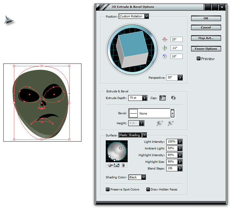
Now, we want to turn this into 3D by using the 3D Effect in AI. Make sure you select all objects on your artboard and group them by pushing ctrl+g. Then go to Effect - 3D and select Extrude & Bevel.
Click More options to expand the dialog shown below. Use the settings below, to further give the 3D look, make sure to use some perspective on your shape. Since the alien head has round curves, remember to increase the Blend steps, so the highlights gets smooth.
Now I have the base to continue to work with in PS. In AI, go to File - Export and save a .psd of the alien head. If you have multible layers, as I've had with some of the icons, remember to include layers in the .psd so you can work with those individually.
Now open the .psd up in PS so we can make it shine! The first thing you'll notice, is that the .psd isn't 512 px as it was in AI. Simply go to Image - Canvas Size and set both to 512 px. In your Layers palette, you now have a folder with the alien head. What I do, is create a white background layer, so I get a better idea of what the icon's gonna look like. I then use the Pen Tool to draw a shape under the head, that will be the shadow under the icon. Click the Path tab on the same palette, hold down control and click the path you just created to make a selection out of it.
Create a new layer on top of the white background layer and fill it with black. Go to Filter - Blur and select Gaussian Blur and use a proper value, in this case 4. Set the opacity of the layer to 75%, so the shadow isn't so dominating.
Now let's move on to the shadows and highlights of the alien. Use the Pen Tool again to draw on top of the alien to get a shape of the top surface. Create a selection of the path, create a new layer above the alien head in the folder in your Layers palette.
Select the Gradient Tool and select a black gradient that goes from 100% to 0% in opacity, and use the tool on your new layer from the top right of the head, to the bottom left. Then deselect by pushing ctrl+d. Mark your layer in the palette and push ctrl+alt+g to create a clipping mask to ensure that there aren't any pixels exceeding the shape of the alienhead.
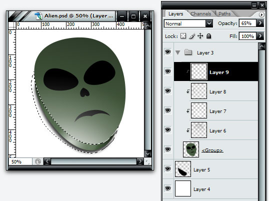
Then create a highligt from the path as before on a new layer, set the gradient color to white and make it from the bottom left to the top right. The side looks a little flat now. The 3D effect in AI is limited to being very simple, so if you really want depth, we can add that in PS, so pick up the Pen Tool again, and draw a path that covers the side, use the gradients as before to create shadows/highlights on the side on new layers and remember to create Clipping Masks again on those layers. You should then have something like below:
Now let's move on to the glossy part. Make a selection of the path you created for the top surface, then select the Elliptical Marquee Tool. You can hold alt to substract from your selection or hold shift+alt to make an intersection on your selection, depending on where you need to place the glossy highlights. If you want to make the selection a couple of pixels smaller, go to Select - Modify - Contract. That way the glossy highlight doesn't go all the way out to the edge of the head.
Now I've created a bunch of highlight layers all over the alien's head and eyes to make it look like below. The selections are something you're gonna have to try out for yourself to fully understand how they work. For the highlights, I've used the Gradient Tool, white from 100% to 0% in opacity. You may want to alter the opacity on some of the layers, if you find the highlights you made to be too bright.
Now let's move on to the final part in PS, the sharp edge highlights. Use the Pen Tool to create strokes where you want highlights placed. I selected the parts as shown below:
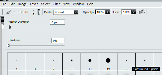
Before we continue, select the Brush Tool and set it to use the Soft Round 5 pixels brush and also make sure the color is set to white.
Now create a new layer, go to Paths, right-click the lines just drawn and select Stroke Path, then set it to Brush and check Simulate Pressure as below:
Now we have some pretty strokes all over the alien.
Then set the white background layer to be invisible by clicking the eye icon to the left of the layer in the palette and save a .png of the icon. Reopen the .png, go to Image - Image Size and set it to 256x256 px and save the .png.
All there's left to do now is convert the 256 px .png to .ico in your favorite icon creation software. I use Stardock's IconDeveloper for this and included 8 sizes; 16, 24, 32, 48, 64, 92, 128 and 256 px.
You can download the .ico, .png, .ai and .psd for this icon in the Misc Icons library here on WinCustomize to lurk some more on the creation phase.


ObjectDock Plus – Editing Non-Tabbed Docks 102
A mini tutorial for beginners
Sunday, January 22, 2006 by Corky_O | Discussion: Tutorials
ObjectDock Plus – Editing Non-Tabbed Docks 102
This mini tutorial is designed for beginners who want to understand the steps involved in adding entries to non-tabbed docks using ObjectDock Plus, as well as a few additional features available via the dock context menu.
An assumption has been made that users have already installed ObjectDock Plus, so please do so before using the procedures in this tutorial (note – make sure that any free version of ObjectDock has been uninstalled previous to installing ObjectDock Plus). If you have any content files that you have downloaded for use with the free version, it is recommended that you copy these files to a temporary folder on your computer before uninstalling the free version of ObjectDock.
For this mini tutorial I will be using a dock similar to the one created in "ObjectDock Plus – Create A Non-Tabbed Dock 101", which can be found here http://corkyo.wincustomize.com/Articles.aspx?AID=98639
This mini tutorial has been created using the default Windows XP installation and settings.
Before adding anything to the dock, let’s remove some of the default content to get us closer to a "blank canvas", by removing two of the entries as shown in the image below:

Note – leaving one default entry until you have added one of your own entries will prevent the dock background from stretching across the screen in strange ways. The final default entry can be removed after adding one of your own entries.
ADDING AN ENTRY TO A NON-TABBED DOCK
You can create a new dock entry (icon) using either the context (right-click) menu, or using the "drag-n-drop" method. Both of which are illustrated below.
Context Menu Method
1 - Right-click on the dock > mouse-over the "Add Entry" option > select a new entry type to add to the dock (in this case, a "New Shortcut") as shown in the image below:

Please notice that the context menu is divided into groups, with new links and system related entries in the top group, with Docklets in the lower section, and at the bottom you will see the "My Docks" option (which invokes the current dock listing dialog).

2 – Right-click the remaining "New Shortcut" that was just added, and then select the "Dock Entry Properties" option as shown in the image below:

This will result in the display of the Dock Entry Properties dialog shown below:

The "Title" text box at the top of the dialog contains the text that will display on mouse-over of the dock entry. You can change this text, or delete it. Deleting the text will result in no text being displayed on mouse-over. To change the text font and size, you can use the "ObjectDock Properties (AKA the "Dock Settings) > General category > Advanced Options" dialog, which is discussed in the "ObjectDock Plus – Create A Non-Tabbed Dock 101" mini tutorial.
2 – Assign a link for the new dock entry by using one of the following methods: (1) use the preset drop-down list, (2) use the Browse button to locate an "executable" file, or (3) type or paste the address to a folder or file in the "Link" text box. In this case, we will select "My Documents" from the preset drop-down list as shown in the image below:

Note - the "Arguments" text box is for command specific actions, and is beyond the scope of this mini tutorial.
3 – Select an image for your entry by clicking the "Change Image" button as shown in the image below:

This will invoke the Choose Image dialog, which is a basic explorer window allowing you to select a folder in the left pane, and then an image from the selected folder in the main pane as shown below:

Alternatively, you can use the "Browse" button to navigate to any ".ico" or ".png" file. Note – for editing and designing a theme which you intend to distribute, it is recommended that you keep all files in the ObjectDock sub-directory. This will make your theme more likely to be compatible with another users’ computer.
DRAG-N-DROP METHOD
On your keyboard, hold down the "Windows" key (key with flying window symbol), and immediately press the "E" key – to invoke "Explorer". Alternatively, you can open "My Computer" and click the "Folders" button in the toolbar. You can then drag-n-drop any icon from either the left pane, or main pane onto the dock – as illustrated by dragging the "My Computer" icon onto the dock - in the image below:

The result of dragging My Computer onto the dock is shown in the image below:

Note – change the text and image the same way indicated for the context menu method.
I have added a few other entries using the methods above to add some functional content to the dock, including the "Recycle Bin" – which I used the context menu method to illustrate it’s location in the menu as shown in the image below:

Make sure to change both the "Empty" and "Full" images for the recycle bin as shown in the image below:

DOCK BACKGROUND
Let’s polish the theme off with some increase in icon size, and a matching background for the dock, by right-clicking the dock and selecting "Dock Properties" as shown in the image below:

Click the "Appearance" category and use the "Icon Size" slider to increase icons to 72 pixels, and then use the "Background" drop-down list to select a background – as shown in the image below:

LOCKING FEATURE
You can lock the icons in place on the dock to prevent deleting one by accidentally dragging if off the dock and watching it disappear in a "POOF" – which I have managed to do a few times previous to the addition of this feature. To lock the icons in place, right-click the dock > select "Lock Dragging" as shown in the image below:

Well, that is all for this lesson.
I hope you found this mini tutorial useful. Until next time, have fun and "Keep On Customizing".
ObjectDock Plus – Create Tabbed Dock 101
A mini tutorial for beginners
Sunday, January 22, 2006 by Corky_O | Discussion: Tutorials
ObjectDock Plus – Create Tabbed Dock 101
This mini tutorial is designed for beginners who want to understand the basic steps involved in creating tabbed docks using ObjectDock Plus.
An assumption has been made that users have already installed ObjectDock Plus, so please do so before using the procedures in this tutorial (note – make sure that any free version of ObjectDock has been uninstalled previous to installing ObjectDock Plus). If you have any content files that you have downloaded for use with the free version, it is recommended that you copy these files to a temporary folder on your computer before uninstalling the free version of ObjectDock.
This mini tutorial has been created using the default Windows XP installation and settings, and illustrates procedures using the main ObjectDock Plus dialog boxes.
STARTING OBJECTDOCK PLUS
Start ObjectDock Plus by clicking Start > All Programs > click either the Stardock, or Object Desktop folder > click ObjectDock Plus icon.
If this is the first time you have started any ObjectDock program (Free or Plus version) on your computer, you may see a message from your firewall program informing you that ObjectDock.exe is attempting to access the internet. This message may be similar to the one shown in the image below:

Note – in this case, ObjectDock is attempting to access the weather information from the internet for use by the Weather docklet on both the tabbed and non-tabbed docks that load by default. Allowing this access is safe, and no personal information is given out by the ObjectDock program.
CREATING OR EDITING A TABBED DOCK
1 – Right-click the ObjectDock icon in the notification area (A.K.A. the ‘system tray’) of the taskbar, and then select and click "My Docks" as shown in the image below:

Note – this tutorial will use a blank "My Docks" dialog (starting with no docks). If you want to start with a "blank canvas" when designing a new theme, simply select any current docks in the list, and then click the "Remove this dock" button to delete the dock – as shown in the image below:

2 – Once you have removed all docks, click "Create new tabbed dock" as shown in the image below:

This will place a default tabbed dock on your desktop, and invoke the ObjectDock Properties dialog (A.K.A. the "Dock Settings" dialog) to allow dock editing. Note – if you wish to edit an existing dock listed in "My Docks" dialog, simply select the dock in the list, and click the "Edit this dock" button to invoke the same dialog.
To complete the creation of a "blank canvas" tabbed dock, we can remove entries by dragging them off of the dock where they will disappear in a "POOF" when you release the mouse button, as shown in the image below:

EDITING A TABBED DOCK
1 – Click the "Positioning" category in the left-hand list of the dock settings dialog to display the options as shown in the image below:

This will allow you to edit the dock’s screen position, z-order alignment, and mouse-over activation speeds (when mouse-over activation is selected). You can also enable or disable taskbar buttons using the radio buttons (note – the system tray option will add additional ObjectDock icons to the system tray, in addition to the one that is displayed when ObjectDock Plus is loaded. Currently, you cannot remove the one system tray icon displayed when ObjectDock Plus is loaded – this may or may not change in future builds).
Note – in the image above, I have selected the "Show dock as drawer" at top of screen.
To make the dock easier to work with, you can right-click the dock and select "Detach from edge", which I have done to complete this mini tutorial as shown in the image below:

2 – Click the "Size & Appearance" category on the left-hand list of the dock settings dialog to display the options as shown in the image below:

This category allows you to enable and set icon zooming options, work with tab positioning, tab size, tab alignment, and entry (icon) name options. Note – the "Tab Position" options will be grayed out when the dock is set as a drawer in the "Positioning" category.
3 – Click the "Tabs & Styles" category in the left-hand list of the dock settings dialog to display the options as shown in the image below:

This category allows you to add a tab to the dock, and to edit the current tab styles. To edit a tab style, select the tab name in the tab names list. This will display the style options in the lower half of the dialog as shown in the image below:

To change the name (text) on the tab, simply highlight the text in the "Name" field, and type the new name. To change the tab and background style, use the drop-down "Style" list to select and apply a background from the list (the background style is applied in real-time when selected). You can colorize the tab and background by using the "Color" drop-down list – which offers (1) preset colors, (2) "None" (the tab style default), and (3) "Other" option to invoke the color picker to set a custom color.
4 – You can reattach the dock to the edge by right-clicking a tab, and then selecting the "Attach to edge" option as shown in the image below:

5 – You can use the "Hotspots" option, which is found in the top section of the left-hand list in the dock settings, to set a hotspot on the screen; that when bumped with the mouse, will display the tabbed dock on top of all windows, or hide the dock. The image below shows this dialog, in which you simply click one of the areas indicated by the black arrows to assign the hotspot and use the drop-down list to select an action.

Note – selecting "Do nothing to this tabbed dock", and then clicking the dock will clear any assigned hotspot.
6 – Finally, you can set ObjectDock to load at startup by selecting the option under the General category as shown in the image below:

This concludes the basics on creating a tabbed dock. More to come in "ObjectDock Plus - Editing Tabbed Docks 102".
I hope you found this mini tutorial useful. Until next time, have fun and "Keep On Customizing".
ObjectDock Plus - Creating Non-Tabbed Docks101
A mini tutorial for beginners
Sunday, January 22, 2006 by Corky_O | Discussion: Tutorials
ObjectDock Plus - Creating Non-Tabbed Docks101
An assumption has been made that users have already installed ObjectDock Plus, so please do so before using the procedures in this tutorial (note – make sure that any free version of ObjectDock has been uninstalled previous to installing ObjectDock Plus). If you have any content files that you have downloaded for use with the free version, it is recommended that you copy these files to a temporary folder on your computer before uninstalling the free version of ObjectDock.
This mini tutorial has been created using the default Windows XP installation and settings, and illustrates procedures using the main ObjectDock Plus dialog boxes.
STARTING OBJECTDOCK PLUS
Start ObjectDock Plus by clicking Start > All Programs > click either the Stardock, or Object Desktop folder > click ObjectDock Plus icon.
If this is the first time you have started any ObjectDock program (Free or Plus version) on your computer, you may see a message from your firewall program informing you that ObjectDock.exe is attempting to access the internet. This message may be similar to the one shown in the image below:

Note – in this case, ObjectDock is attempting to access the weather information from the internet for use by the Weather docklet on both the tabbed and non-tabbed docks that load by default. Allowing this access is safe, and no personal information is given out by the ObjectDock program.
CREATING OR EDITING A NON-TABBED DOCK
1 – Right-click the ObjectDock icon in the notification area (A.K.A. the ‘system tray’) of the taskbar, and then select and click "My Docks" as shown in the image below:

Note – this tutorial will use a blank "My Docks" dialog (starting with no docks). If you want to start with a "blank canvas" when designing a new theme, simply select any current docks in the list, and then click the "Remove this dock" button to delete the dock – as shown in the image below:

2 – Once you have removed all docks, click "Create new dock" as shown in the image below:

This will place a default dock on your desktop, and invoke the ObjectDock Properties dialog (A.K.A. the "Dock Settings" dialog) to allow dock editing. Note – if you wish to edit an existing dock listed in "My Docks" dialog, simply select the dock in the list, and click the "Edit this dock" button to invoke the same dialog.
EDITING A NON-TABBED DOCK
1 – The "ObjectDock Properties" dialog will display with the "Appearance" category selected as shown in the image below:

This category allows you to enable and set icon size (both static and magnified sizes), enable/disable magnification, and work with the dock background. Note – the difference between the static icon size and the magnified icon size gives you control of the amount of zoom.
2 – Click the "Positioning" category in the left-hand list of the dock settings dialog to display the options as shown in the image below:

This will allow you to edit the dock’s screen position, edge alignment, and z-ordering. In this case, I have set the dock to the "Top" screen position, and I have left the "Center" alignment and "Always on top" Z-Ordering alignment default settings. Note – Z-Ordering refers to the "depth alignment" on screen (where X-axis is horizontal alignment, Y-axis is vertical alignment, and the Z-axis is the depth – or front to back alignment).
3 – Click "Dock Contents" category to display the dialog shown in the image below:

Note – I have deselected the "Show running tasks on the dock" option, to display only the static entries, which will be used in the next tutorial "ObjectDock Plus - Editing Non-Tabbed Docks 102".
4 – Click the "Appearance Tweaks" category in the left-hand list of the dock settings dialog to display the options as shown in the image below:

This category allows you to adjust (tweak) the zoom appearance, as well as some running task oriented tweaks in the lower portion of the dialog. The image also illustrates the "zoom" process while set to "Wide Mode" (note – the Wide and Normal modes refer to the expansion of the dock during "zooming", where the dock will expand at the ends more in "Wide Mode" than in "Normal Mode").
5 – Click on the "General" category, and then click the "Advanced Options" button as shown in the image below:

The resulting pop-up dialog:

This dialog allows you to select a few interesting settings. In addition to the top 4 check boxes, which are fairly self-explanatory (and can be experimented with), there are a few that may benefit from a bit of explanation as follows:
- The "Entry Label" font and size are changeable, though these changes only apply to "mouse-over" text displays.
- The "Attention" effect drop-down allows you to designate the effect displayed (or animated) when an entry is selected. This can be helpful if you are running a system tray dock and using an Instant Messaging program that animates the icon to show a new message, etc.
- The "Temporarily disable docklets" option is provided for troubleshooting purposes (which I have selected for emphasis in the image above), and would be used by anyone who is experiencing issues with a dock theme. Disabling the docklets will help narrow the search for the cause by removing them as a possible cause. If disabling the docklets fixes the issue, then the cause is likely in one of the docklets.
6 – To save a theme, notice the "Save Theme as" and "Load Theme" buttons in the General category. Click the "Save Theme as" button as shown in the image below:

Just type the name of your theme in the "Save dock theme" box (shown in the image above), and then click "Save" button.
7 – To load a theme, click the "Load Theme" button, select a saved theme from the list, and click the "Open" button as shown in the image below:

Note – it is highly recommended that you save your themes. This will allow you to reload a theme later, or recover from a crash of some sort. If you do not save your theme, and there is a problem which removes the theme from the screen, you may need to rebuild your theme.
This concludes the basics on creating a non-tabbed dock. More to come in "ObjectDock Plus - Editing Non-Tabbed Docks 102".
I hope you found this mini tutorial useful. Until next time, have fun and "Keep On Customizing".
Loading a desktop with DesktopX (Newbies #15)
Cordelia's Corner for the Complete No0b #15
Thursday, July 7, 2005 by Cordelia | Discussion: Tutorials
Today's topic is loading a DesktopX 3.0 desktop. A DesktopX desktop is basically a snapshot of your desktop. It can be a desktop you've arranged with all of the widgets and objects you like displayed in a pleasing manner (or a displeasing manner, if you have a taste for suffering. Who am I to judge?).
It might also be something that has been set up for "fun" - I'll have to look up this "fun" word when I'm done here. Perhaps someone could provide me with a tutorial on "fun"?
And finally, a desktop might be a secure environment that restricts the user to a limited number of functions. Why would anyone want to do this, you ask? Well, what if you have small children and want to restrict their access to certain programs/folders on the computer. Admittedly, many 5 year olds know more about computers than I do, but it is still possible to restrict them.
|
|
Let's see some examples of this. Here is a screenshot of my current desktop.
|
|
|
Now I open DesktopX and click on Load Desktop...
|
|
|
There are 2 desktops that currently come with DesktopX 3.0. The first one is a game called "Keepie Ups" and it looks like this (click on thumbnail for a larger view). If I click on that soccer ball, the game tallies how long I can keep it in the air. You can see my pathetic score in the upper right and left corner of the screen. I don't feel bad, though - I've always sucked at any sport other than self-loathing or running away. |
|
|
The next desktop is the "Guest" desktop. Have family coming over for a visit? Will they all be clamoring to use your computer? Load this desktop and restrict their access to your files. One button takes them to the Internet, and the other can be set up to take them to a program they can use - perhaps "Word". Simply right-click on the "My Program" icon and set the link to go to the program you want. |


Notice that any widgets or programs you have running when you set the desktop will remain active and visible after you set the desktop.
This desktop is not secure. This desktop would be perfect for my mother (whom I love very much, but who is a technophobe), however most small children will have this desktop unloaded in a matter of seconds. Truly secure desktops can be created with DesktopX Enterprise Edition, but that is well beyond the scope of this article.
 |
If you want to unload the desktop, just right-click on the background and select "load desktop". You get this dialog box and you can choose from any of the 3 desktops. Notice the picture on the "classic" desktop. My guess is that it does not look like your desktop. That's ok, select that one and you will go back to how your desktop was before you changed it. |
And that, my friends, is all there is to loading an already made desktop. Making your own is a whole other article. Probably the next one  .
.
If you don't have DesktopX 3.0 you can get it here.
https://www.stardock.com/products/desktopx/dx-faq.asp
This link will take you to the FAQ page for DesktopX. It's quite possible that I am leaving a lot of questions unanswered in this tutorial, and it's not because I don't like you. (I do, believe me.). It's a very complicated program, and it seems to me that if you can imagine it, you can create it with DesktopX. My little tutorials are just for beginners, no0bies, greenhorns...etc.
Check out the other Newbie Tutorials here: #1: Intro., #2: WindowBlinds, Part 1, #3: WindowBlinds, Part 2, #4: Screenshots, #5: IconPackager, #6: Wallpaper Basics; #7: Logon Studio; #8: CursorXP; #9: BootSkin; #10: RightClick; #12: WindowBlinds Advanced; #13: DesktopX 3.0: Loading Widgets; #14: Loading Objects with DesktopX
My Desktop:
Skin: Encoded by PixelPirate (It's new, and it's awesome)
Cursors: Encoded by PixelPirate (Keeping with the theme)
Wall: Simplicity by Nerio (Ok, I've used it before, but I can't help it: it's good and it just goes with a lot of stuff!)
Icons: Icon-A-Day by mormegil (was there any question what I'd be running?)
CorelDRAW For Skinners, Part 2.
Drop Shadows & Reflections
Saturday, January 22, 2005 by mormegil | Discussion: Tutorials
| CorelDRAW for Skinners. Part 2: Drop Shadows & Reflections. | |
| I have gotten a lot of positive feedback from last weeks CorelDRAW for Skinners and a lot of requests for more videos, so this week we have 2 more. I will try and cover all requests as time allows. This week I am covering the two most asked for techniques that I am using in the Icon-A-Day icons, Reflections & Drop shadows. Both these videos ran a bit longer than I wanted, but they cover all the basics, and should allow for a better understanding of some of what is being done it the written tutorials. This weeks videos: Dropshadows 101 Reflections 101 Stay tuned for more; I will try and get 2 more in next weekend. Requests encouraged, and appreciated. |
|
Video
# 3: Drop Shadows 101 |
Video #4:
Reflections |
|
|
|