Comment #2 Saturday, September 13, 2003 3:54 PM
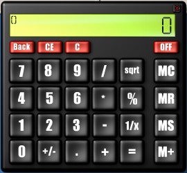
Would it be possible to have a text-only version, with just the text box, so that it's easy to include it in a theme ?
Comment #3 Saturday, September 13, 2003 5:01 PM
Comment #5 Sunday, September 14, 2003 5:26 AM
Minor niggle
Comment #6 Sunday, September 14, 2003 12:30 PM
Comment #7 Monday, December 8, 2003 2:38 PM
Comment #8 Tuesday, December 9, 2003 1:02 PM
Would like to try and work out what is causing it. It only uses dxscript and standard controls, no strange plugins so I'm puzzled.
Just checking but you are using a registered DesktopX 2 version aren't you? also what OS is this on?
Comment #9 Wednesday, December 10, 2003 12:44 PM
Comment #10 Thursday, December 11, 2003 4:04 AM
Comment #11 Friday, March 12, 2004 10:50 AM
Comment #12 Sunday, April 11, 2004 10:10 AM
Comment #13 Tuesday, August 24, 2004 8:46 PM
Comment #14 Friday, September 10, 2004 10:45 PM
Comment #15 Saturday, September 11, 2004 7:53 PM
Fortunately now objects can trap keypresses themselves so
it's not needed. The latest widget version should not suffer from ugly white boxes and uses a custom font created by me specially for this object.
Comment #16 Sunday, September 12, 2004 8:51 AM
Comment #17 Sunday, September 12, 2004 10:01 PM
Also, this widget should be in the widget section, but it would be nice if you could also make a regular object, for those who would like to ultimately customize it with our own grapics.
Comment #18 Monday, September 13, 2004 3:32 PM
Comment #19 Monday, September 13, 2004 3:55 PM
Comment #20 Monday, September 13, 2004 8:53 PM
Please login to comment and/or vote for this skin.
Welcome Guest! Please take the time to register with us.
There are many great features available to you once you register, including:
- Richer content, access to many features that are disabled for guests like commenting on the forums and downloading files.
- Access to a great community, with a massive database of many, many areas of interest.
- Access to contests & subscription offers like exclusive emails.
- It's simple, and FREE!


Comment #1 Saturday, September 13, 2003 8:25 AM
Personally I moved all the memory buttons to the other side as I found that more natural, but it's great.
I would like it if you could make a version which has a small image that pops up the calculator rather than 'destroying' it but that's a minor thing.
Good job