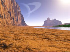
The View
Average Rating: 6
Yours: -1
File Size: .78MB
Downloads Today: 0 Downloads Total: 4324

The View

Updated May 19, 2003 by Apocalypse_67


First Previous Page 1 of 2 Next Last
Dredd_67
Comment #1 Monday, May 19, 2003 10:39 AM
Nice as always but I think the colors are too bright. Perhaps adding some haze would be a good idea? (Oh God who am I to give some advices to Apo.... )
EventHorizon
Comment #2 Monday, May 19, 2003 11:16 AM
Not too bad, (I like your last one better) but the 'plants' on the right dont quite fit into the scene.
Xerraire
Comment #3 Monday, May 19, 2003 12:03 PM
Gee, I thought the plants somehow looked good.
I'd love to know how you did it.

Apocalypse_67
Comment #4 Monday, May 19, 2003 3:22 PM
Thank you Dredd. All advices and tips are welcomed. Some times I'm so tired that I overlook some details, and its nice to have someone point them out.
Apocalypse_67
Comment #5 Monday, May 19, 2003 3:23 PM
Thank you Event.
Actually I thought the plants give the design a little 'life', after all, there is a lake there
Apocalypse_67
Comment #6 Monday, May 19, 2003 3:27 PM
Thank you for your comment Xerraire. Im glad you like it.
It was done in Terragen with lots of PS post-editing
DarkMist
Comment #7 Monday, May 19, 2003 4:54 PM
Great stuff
pickleman12
Comment #8 Monday, May 19, 2003 5:23 PM
WOW!!!!!!!!!!!!!!!!!!!!!!!!!!!!!!!!!!!!!!!!!!!!!!! LOL LOL LOL LOL LOL LOL LOL
Apocalypse_67
Comment #9 Monday, May 19, 2003 5:32 PM
Thankx Dark
Apocalypse_67
Comment #10 Monday, May 19, 2003 5:32 PM
Thank you Pickelman
Malakai2u
Comment #11 Monday, May 19, 2003 10:45 PM
Real nice work.I think maybe No greenery or more greenery would have been best.There's just not enough to show the life water would have brought in reality.still real nice.I wonder what the 2 white dots/lines are to the right of the planet.UFo's/Mistake or is it the glare that a real picture from a camara would have taken?
Lady_Akasha
Comment #12 Monday, May 19, 2003 11:13 PM
Nice job as always hon
Apocalypse_67
Comment #13 Monday, May 19, 2003 11:15 PM
Thankx Malakai The 2 'lines' are actually small traces of thin clouds. I didnt want to 'poblate'the edge of the lake with much vegetation. I just wanted to give an 'accent' of life to the design. The idea of the design its a view from a planet (not Earth)
boude
Comment #14 Tuesday, May 20, 2003 1:33 AM
cool
Malakai2u
Comment #15 Tuesday, May 20, 2003 1:37 AM
Thanks for the answer..should have realized the not earth thing with saturn right in my face LOL
Apocalypse_67
Comment #16 Tuesday, May 20, 2003 1:38 AM
Thankx Boude

No prob Malakai
bistro
Comment #17 Tuesday, May 20, 2003 5:05 PM
Very nice...reminds me of....Hey! Wait a minute! I've BEEN there! It was that party I was at back in the 70's and we were experimenting with some stuff and...*...oh... uh.....never mind.
Apocalypse_67
Comment #18 Tuesday, May 20, 2003 5:29 PM
Ahhh, You was at that party too Bistro?..
remember when the mother ship came and.... errr....never mind

LOL
Angel_Wings
Comment #19 Wednesday, May 21, 2003 1:04 AM
This is beautiful...The only thing I'd change would bring the top/middle half in closer and not so much red-'earth' showing but it's quite breathtakingly surreal just the same!

Apocalypse_67
Comment #20 Wednesday, May 21, 2003 3:50 AM
Thankx Shmoopy. That is a great tip, I'll keep that in mind for my next scenery

Please login to comment and/or vote for this skin.

Welcome Guest! Please take the time to register with us.
There are many great features available to you once you register, including:

  • Richer content, access to many features that are disabled for guests like commenting on the forums and downloading files.
  • Access to a great community, with a massive database of many, many areas of interest.
  • Access to contests & subscription offers like exclusive emails.
  • It's simple, and FREE!
Downloads remaining: 5
User Level: Visitor

Featured Wallpapers

Popular Wallpapers

Top Wallpapers Skinners

Yesterday  |   Last 30 Days  |   All Time
1. AzDude 12229
2. Sed 7355
3. teddybearcholla 2028
4. Ghzamfir54 1459
5. Frankief 1310
6. DEVJIT 989
7. 3java3 954
8. WC_Bot 787
9. BoXXi 673
10. vlad 658
11. ahabkaba 655
12. Ton-K300 650
13. kenwas 631
14. Richard Mohler 604
15. ernie leo 346


web-wc01