Icon-A-Day 2.0, Day 4. Open Folder, Live Folder, what's the difference?

Thursday, August 7, 2008 by mormegil | Discussion: OS Customization

Back in the dark times of 2005, we did not have such things as Live Folder, and the Open Folder was a rarely seen anomaly on the Windows desktop. Now things have changed; though you rarely see the actual Open Folder icon, you see the Live Folders everywhere. We will take advantage of this to finally give the Open Folder some love, and I will try and explain just what goes into the Vista Live Folder icons along the way.


Day, 4
(Thursday, August 7th, 2008) Line

In the original Icon-A-Day series, we only had two types of Windows folders. Closed, and Open. In Vista we have four types, consisting of five different icon files. Closed Folder, Open Folder, Live Folder (Front), Live Folder (Back), and Data Folder.

This does not even include the User Folders, which in Vista are given a different style in order to set them apart from the normal system folders. Today we are going to be keeping it simple and take care of the Open Folder icon. The problem is that these will more or less be the same, visually, as the Live Folders, so today's and tomorrow's tutorials may seem a bit redundant.

Open Folders:
We should be able to save a lot of time today, because we will be creating the new Open Folder icon by modifying the Closed Folder icon we created yesterday.

I will be using a new guide that I created to make sure that our folder works with the Live Folders; I will go into how and why I created this in tomorrows post when we create the Live Folder icons.

Step 1:
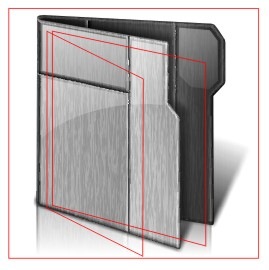
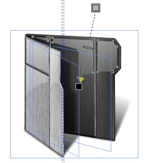
Here you can see my Live Folder guide. In step one I will simply copy our Closed Folder and place it behind my guide. 

  IaD_4_S1

Step 2:
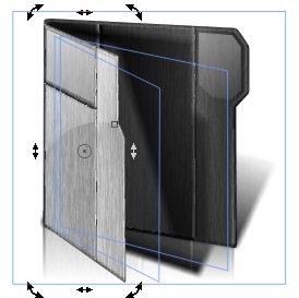
Now I will simply grab the front of the folder and size it and skew it, using the Pick Tool. I just want to make it look more or less like it is opened up. We will touch it up a bit in Step 3.
IaD_4_S2 

Step 3:

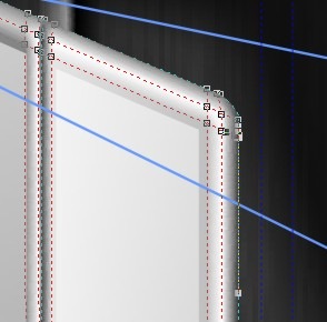
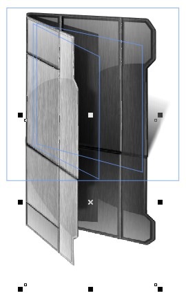
If we were in a hurry the simple skewing and sizing of the folder front would probably be good enough, however, since we are trying to do things right, I want to tweak the mesh nodes to make sure our folder front does not look squished.

In order to do this, I nudge the brush fill out of the way so I can get to my folder front.

 IaD_4_S3

Step 4:

Once I am done touching up my mesh tool, I nudge my texture fill back over. Since I have not changed the folder shape much, I don't need to edit it.

Now that we have changed our folder front, our inner shadow is messed up. In order to fix this we will use the same shadow technique as yesterday.


   IaD_4_S4   

 Step 5:
Now that we have the correct shadows, we can see that our gloss no longer looks quite right. Once again I just draw in some new white shapes, or edit the existing ones, and then I fade them out with the Interactive Transparency tool.

   IaD_4_S5

Step 6a:

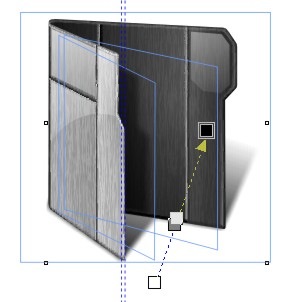
Our last step, will be more or less the same as our last step yesterday; we have to re-do our reflection.

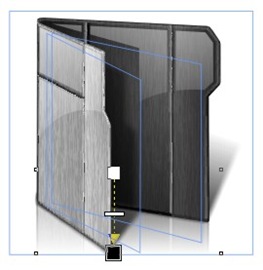
In short I copy both our folder front and back, create bitmaps with them, then size them and flip them, placing them in a mirrored position under our icon. Then I squish them down until they look right.

IaD_4_S6a 

Step 6b:

Once I am done with that, I convert them to one bitmap and fade them out with the Interactive Transparency tool.

Once again I will point out that both the techniques in Step 4 and Step 6 are in the Save video over at Corel For Skinners.

IaD_4_S6b 

Finished Icon:
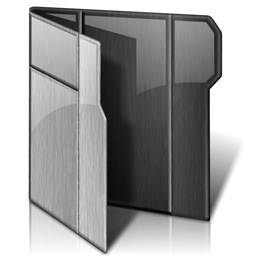
Once we export our file, to a PNG, we have our finished image, our Open Folder icon is ready to go.


IaD_4_7

Wrap Up:
Today we were able to take yesterdays work, and quickly create our Open Folder. Tomorrow we will use our work from today to quickly create our Live Folder icons.  While we are at it, I will try and explain how Vista Live folders are created, and the special challenges they inflict on icon designers.

Download Open Folder Icon: 
Get today's Icon form the Miscellaneous Icons Library.
IAD_Download

All Icon-A-Day artwork, copy, and Icons, are copyrighted by Paul Boyer © 2008, and may not be used with out express permission.
ZubaZ
Reply #1 Friday, August 8, 2008 12:42 AM
You make it seem so easy.  I can't tell you how many times I've tried to rip adn adjust your icons.  True art/artist.


I hate you. 

Please login to comment and/or vote for this skin.

Welcome Guest! Please take the time to register with us.
There are many great features available to you once you register, including:

  • Richer content, access to many features that are disabled for guests like commenting on the forums and downloading skins.
  • Access to a great community, with a massive database of many, many areas of interest.
  • Access to contests & subscription offers like exclusive emails.
  • It's simple, and FREE!


web-wc01