|  The Users Folder: The Users Folder:
In Windows 95 through XP, user folders (My Music, My Pictures, My Video, etc.) were placed into the My Documents folder. This was fine for most people but was a bit annoying to people who did not want to poke around the Documents & Settings folder to find their files. In Vista we now have the Users Directory, and in the Users Directory there is a folder for each user, and in that folder almost all user files live, by default. This is not a terribly new concept, as OS-X, Linux, and even more hardcore Windows users have been doing this for years.
How This Affects Our Icon Package:
In order to differentiate these special User folders, Microsoft came up with a new convention; they placed them all in a special folder. In Vista it is a glass binder-like thing. The truth is that this is completely superfluous; the folders themselves are still special folders, like they were in XP. However, I am of a mind to keep this convention going for a few reasons. First, because it gives us something new to do, and second, because it gives the user an obvious way to tell what all these folders are - special - and have special properties that they all, more or less, share.
Today we will create a brand-new icons, although sadly it will not be used in our final pack, but will be used in creating all our User folders. For lack of a better name, I am going to call it the "Wrapper." In Vista the Wrapper is the teal colored glass folder. Because the Icon-A-Day icons have already established several glass elements in the icons, we will do it again in our Wrapper, but we will try and keep it from looking too much like the standard Vista style. |
| Step 1:
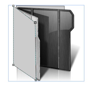
Because the Wrapper will need to contain several different types of sub-icons - folders, documents, music, etc. - I am going to begin by making a copy of my Open folder icon from last week and use it as a guide for my shapes.
Like in Day 3, we will start with two rectangular mesh fills.
 | Step 2:
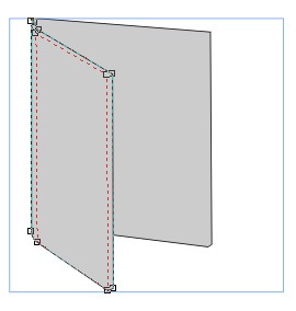
Once I have my shapes in position, I can delete the Open folder assets and begin to sculpt my meshes into the shape I want our Wrapper to be.
 | | Step 3:
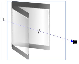
Now unlike our folder we want the bulk of our Wrapper to be glass, so I primarily use white and black in my fills. I then use the Interactive Transparency tool to make them translucent. This will make everything wash out a bit, but we will get our definition back in a few steps, with gloss and shadows.
 | Step 4:
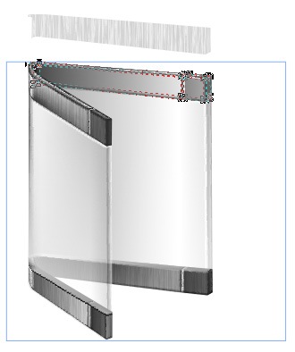
Now we dont just want to copy the teal Wrappers from Vista, we want to make our own. In order to change things up a bit, we will create a brushed metal edge on the top and bottom of our wrapper. This is done more or less the same as we made the main portion of the Wrapper, except this time we give our shapes the more "tooled" look of our folders.
 | | Step 5:
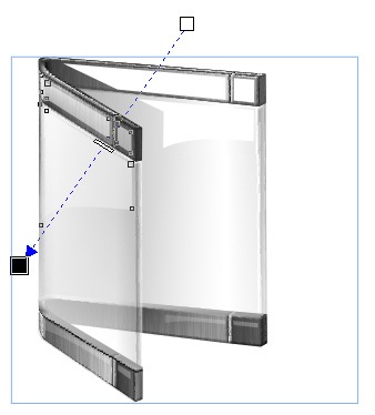
Once we have our metal bands, we need to bring in some gloss to sell the glass look, and to bring some definition to our shapes. We have to be careful not to make the gloss too bright, however, since these Wrappers will be going around other icons in the future.
 | Step 6:
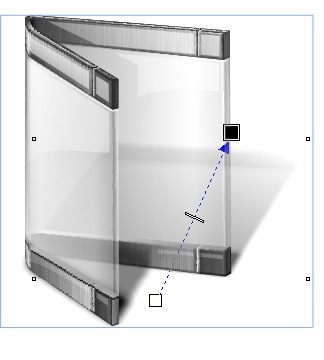
Now we need to re-establish our shadows. These are a bit more touchy than in the last few icons, because the bulk of our Wrapper icon is transparent.
As we bring the shadows in you will notice that it goes a long way in selling the glass feeling.
 | | Step 7:
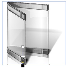
Our last step, as is often the case, is to do our reflection. I do this more or less the same way as in our previous icons, but like the shadows it is a bit more touchy do to the transparency.
 | Finished Icon:
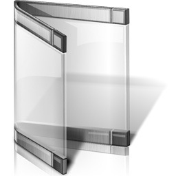
Here we have our finished Wrapper icon.
I will be including it, and 2 Pings, a front and a back in today's zip, so that people will be able to create their own matching User folder icon if they choose.
 | |
Wrap Up:
Tomorrow night, we will take this Wrapper and begin creating our USER folders. We should, in theory, be able to reuse many of our 1.0 folder assets as we go along. I have not quite decided which to do first, so you will have to check back tomorrow to find out. It probably depends on how late I get home from work 
PS. Those of you who use Twitter, can follow me; username Mormegil. I will be tweeting after each Icon-A-Day post is posted, as well as throughout the day, with various things from tech to running. |


