Comment #2 Monday, June 20, 2005 4:42 PM


Comment #3 Monday, June 20, 2005 6:46 PM
I agree with the others that it could use a little fine-tuning, but it still gets 5 stars from me!
Well done!

Comment #5 Monday, June 20, 2005 11:28 PM
Comment #6 Tuesday, June 21, 2005 2:22 PM
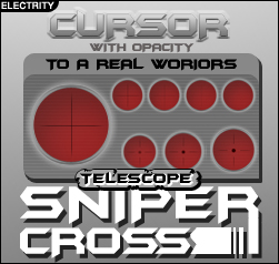
I cropped the brightest cursor from the animation (where it flashes light and dark), and am using that for my regular cursor, as well as the other cursors that were the same crosshair-type cursor.
I also swapped the animation field, so that it starts out light instead of dark, so it's a smoother transition.
The result is a much easier to use cursor.
It's not perfect, though. The crosshairs could be a little darker. And all the other cursors are still the original dark red (I lack the expertise on how to change them). But overall, I think it's an improvement. Hopefully, electrity will see fit to release a lighter version (maybe even with different color schemes).

Comment #7 Tuesday, June 21, 2005 10:17 PM

Comment #8 Wednesday, June 22, 2005 8:39 AM

Comment #9 Wednesday, June 22, 2005 9:54 AM
A second set, roughtly half the size of the current one, would be great.
Otherwise, this is one of the best cursors I've used.
Comment #10 Wednesday, June 22, 2005 12:07 PM
If you have CXP Pro you can adjust the size.
Comment #11 Friday, November 25, 2011 3:37 PM
Way to dark and way to big. Try a holographic reticle like the on in an Eotech holographic sight. Keep it about 3/8" to 1/2".
Comment #12 Sunday, August 2, 2015 4:17 PM
Just change the hue and you will find it quite workable. ![]()
Please login to comment and/or vote for this skin.
Welcome Guest! Please take the time to register with us.
There are many great features available to you once you register, including:
- Richer content, access to many features that are disabled for guests like commenting on the forums and downloading files.
- Access to a great community, with a massive database of many, many areas of interest.
- Access to contests & subscription offers like exclusive emails.
- It's simple, and FREE!


Comment #1 Monday, June 20, 2005 4:18 PM
Maybe you could make a light blue one? coz the red is too dark..