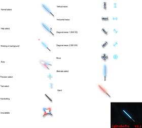
LightsaberPro v2.1
Average Rating: 6
Yours: -1
File Size: 2.14MB
Downloads Today: 0 Downloads Total: 20007

LightsaberPro v2.1

Updated May 26, 2009 by LukeSkillz


First Previous Page 1 of 2 Next Last
LEMMORSebrof
Comment #1 Monday, May 18, 2009 11:01 AM
Ahhh Much welcome update. Richer blade movements and looks. A bit shorter than original. I liked the length in version 1 and the tip of blade in version 1 I liked too. Hope you not removed it. Could the diaganal resize cursors be animated and also not so huge? I love the improvements.
LukeSkillz
Comment #2 Tuesday, May 19, 2009 1:07 PM
Actually, the length is even greater than in the original, not less. The hilt is bigger and the blade thicker, though, so it just feels a little bit shorter, and I suppose to a scale would be. As far as pixels are concerned, however, they are about the same. I kind of feel the same way as you about the resize cursors, but really I've had no trouble using them whatsoever...just give 'em a chance.
vAIp33r
Comment #3 Tuesday, May 19, 2009 1:32 PM
This is a great improvement indeed. I couldn't bring myself to use the last version because of various visual imperfections but this version appears to be really polished. Good job (there's one little problem though - in working in bg state the saber's handle appears to be higher than it should be, also it is a bit hard to use the cursor when in this state due to constant size varying. It would help to have some sort of a visible indicator on the hot spot during the animation.)
LukeSkillz
Comment #4 Wednesday, May 20, 2009 11:11 PM
hmm, a visible indicator...I didn't think of that. I considered putting the hotspot on the hilt, but I was afraid that might confuse people. As for it being a little bit higher, I have no clue why it does that. The positions and dimensions of the WiB cursor are the exact same as the rest, but for some reason it gets raised up a bit whenever I import it to CursorFX. The indicator idea really is good though; I may update this file one more time yet.
LEMMORSebrof
Comment #5 Friday, May 22, 2009 2:14 PM
Sweet... I look forward to update. I tell you this, I am pleased you took on this project. Soon as you update please post. And if you think you can do other things, I will be greatful.
vAIp33r
Comment #6 Friday, May 22, 2009 6:46 PM
Eager to see the new version, if you decide to make it of course. Seeing how much of an improvement v2 was over v1, v3 should be about perfect. (also I would advise not to put the hotspot onto the hilt since it would really ruin cursor's appearance continuity)
LukeSkillz
Comment #7 Saturday, May 23, 2009 11:06 AM
Uploading the new version as we speak. I didn't change nearly as much with this one as I did between v1 and v2, but I think it tops things off nicely. Hopefully it will be available for download shortly! Thanks for everyone's interest in my work! Without you guys, there probably never would have been a v2 or v2.1! �
MouseGoddess
Comment #8 Sunday, May 24, 2009 9:58 AM
Much, much better!
Lumic
Comment #9 Tuesday, May 26, 2009 11:09 AM
I have to give you all the praise...you have delivered
LukeSkillz
Comment #11 Tuesday, May 26, 2009 2:30 PM
I don't deserve any praise...any talent I have is a gift from God �
vAIp33r
Comment #12 Thursday, May 28, 2009 11:10 AM
Congrats, you really delivered just like SinTactics said, and you do deserve praise for taking constructive criticism and spending your free time improving this set. (also I'm using it as I'm writing this and am pretty sure I'll keep using it for a long time)
LEMMORSebrof
Comment #13 Friday, May 29, 2009 1:38 PM
Well for me, I just want to know Luke; will you be revising as the months go? Like an idea would hit you while in bathroom or wherever, will you continue work on this project? I wouldn't mind seeing what you come up with next!!
LukeSkillz
Comment #14 Saturday, May 30, 2009 10:24 AM
@ommel: I sure would! Already I'm working on something that I plan to be pretty amazing, but as it is VERY complex, I'm still just looking at my options and deciding how best to go about doing it. I'm still thinking lightsaber cursors, but I really want to beef up the effects; a lot more dynamic glow, clicked cursor states that look like the saber is cutting into the screen (sending sparks flying everywhere and such), blade-trailing when the mouse is moved, and just a lot more animation overall. It could be a while before I figure this one out though, so just stay tuned!
LEMMORSebrof
Comment #15 Monday, June 1, 2009 10:53 AM
@Lukeskillz: Wonderful... I be waiting. The Force is strong with you...!!
LEMMORSebrof
Comment #16 Monday, August 3, 2009 1:15 PM
huhh... no update yet? ( ( ( ( (
Cameochi
Comment #17 Sunday, August 16, 2009 8:50 AM
[quote][/quote] Stunning! I have a friend who is a major Star Wars fan. He will be very jealous of my new cursor. Thanks so much for the great work!
huchihasasuke
Comment #18 Sunday, August 23, 2009 3:05 PM
I loved this cursor set, excelent job, I'm actually using it right now and it's wonderfull!!! I also read all the posts and hope a new update comes soon, if you still are working on this great project. As a suggestion, maybe you could make some variation colors, for example a green lightsaber for the "button" pressing state, or some thing like that (or maybe a version with a green one like basic arrow, anyways it's up to you) Thanks for the great work, and hope to know more about you soon!!!
LukeSkillz
Comment #19 Thursday, October 1, 2009 10:59 PM
Thanks again! Sorry there hasn't been an update...I really haven't done any work on a new lightsaber cursor set just because my schedule got crazy and when I needed my computer it was to do stuff other than make cursors. Sry! Hopefully I'll have time to come up with something soon, but my CursorFX program acted up and I'm not sure if I fixed it yet or not...
wtpm
Comment #20 Wednesday, November 10, 2010 9:30 PM

Thank you for not putting the hot spot on the hilt. I don't like Star Wars, but I really like this set. I do have one question, I like the set because of the "light" effects, and animation, so is there any way that I can swap the "busy" and "working in background" animations. I almost never see the w-i-b ani, but the busy is quite frequent, and the w-i-b is one of the main reasons I downloaded it.

This is great work, I am just looking for the flashiest busiest cursor I can find, and it would be perfect swapped imo. Thanks, and looking forward to trying more of your work.

Please login to comment and/or vote for this skin.

Welcome Guest! Please take the time to register with us.
There are many great features available to you once you register, including:

  • Richer content, access to many features that are disabled for guests like commenting on the forums and downloading files.
  • Access to a great community, with a massive database of many, many areas of interest.
  • Access to contests & subscription offers like exclusive emails.
  • It's simple, and FREE!
Downloads remaining: 5
User Level: Visitor

More From This Author

Featured CursorFX

Popular CursorFX

Top CursorFX Skinners

Yesterday  |   Last 30 Days  |   All Time
1. Vampothika 867
2. BoXXi 814
3. B2R 676
4. JJ Ying 562
5. 3java3 481
6. J. Aroche 478
7. theAVMAN 472
8. neone6 451
9. rexorian 262
10. lMG0D5552666 225
11. Gemmee 225
12. Apocalypse_67 188
13. Erebus7 188
14. jalentorn 182
15. Libardo 166


web-wc01