|
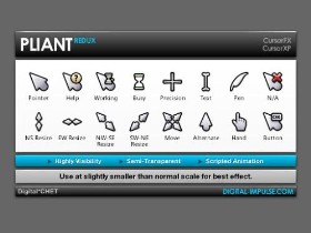
Pliant ReduxUpdated Apr 22, 2010 by DigitalCHET |
||||||
Comment #7 Friday, April 23, 2010 5:04 AM
I like them very much and I would use them, unfortunately CursorFX doesn't play nice with Multiplicity... ![]()
Comment #8 Saturday, April 24, 2010 9:56 PM
That's a real shame. I wonder if Stardock devs are aware of those issues. Hopefully they'll fix it soon.
Comment #9 Monday, April 26, 2010 6:54 AM
Really tired of the fancy schmancy cursors where you can't even tell what you're on or if it's on a hot link etc.
Thanks for this one. It's what I've been waiting for.  Also, just the right size on my 15.5 laptop.
Comment #11 Wednesday, October 27, 2010 1:30 AM
Would you disclose what makes a great cursor great and what distinguished Pliant, or is it a trade secret?
I don't know anything about making cursors, and I'm sure there are many finer points I don't notice. The whole of my knowledge derives from obsessively looking at cursors for the past few days. One thing I did notice in my wanderings is that users often consider the simple cursors that cursor skinners make on first or second try from the improvements that you can see in their work a year or two out. The cursors demonstrate higher and higher levels of creativity and expertise, but this is something users often don't appreciate because the early productions often get the most downloads, even the highest ratings.
Plaint may be an example, although I can barely detect any difference. The clocks are hour glasses now, but what would incline me to use the first version over the second is that the color has been drained from the second: much of it resided in the clocks.
My only reservation about the first is also present in the second: the i-beam is too thick, but I'm sure sure mileage varies on this. But from my point of view, the one thing a cursor maker can do that significantly affects the ergonomics of computer use is to resign the i-beam. Yet this is wear cursor makers are most conservative. (Skinners who have been innovative in that are Bonehead with his underline and AlexStallard (who has just posted a new Trisol version--no I'm not plugging him, don't even know the guy) with, in my opinion, the most original and effective approach.
I don't mean to reroute this discussion from a focus on your work, but Pliant Redux is just too good an example to ignore. It's a very nice cursor, but I don't see why Pliant wasn't even nicer. And I think if skinners want to improve an established cursor, one place to go is to rework the I-beam.
Comment #12 Monday, April 4, 2011 1:01 AM
Thanks for your frank critique, srdiamond.
It's true. The I-beam has always been an annoyingly difficult cursor for me to deal with, but as with pretty much all my designs, I like to marry form and function as best as possible without sacrificing the design or usability too much. Although it may not ultimately be the best way to draw the beam, it's my compromise to keeping it within the theme.
You could likewise make the same case for the Precision cursor but I guess its limited use means it doesn't hold the same importance.
I guess the only secret to great cursor design is that it performs its function with minimal fuss or distraction. A simple static cursor will ultimately always win out over an elaborate and intricately drawn animated pointer. We can always appreciate the time and skill the artist took to create the elaborate one, and perhaps even find it suitable for use within an overall customization theme for a time, but where function is ultimately concerned, simple is always better; less is always more; K.I.S.S. (Keep It Simple, Stupid), etc.
Although I had a clear vision in mind for the design of this cursor, I kept that philosophy clear in my mind and tried to make it even more usable than the original.
I also agree with you that there are far more innovative, talented and more prolific designers than I. I simply designed what I thought best at the time. There will always be room for improvement. ![]()
And who's to say that I might not one day get the urge to further optimise this set for usability? ![]()
Once again, thanks for your critique. ![]()
Please login to comment and/or vote for this skin.
Welcome Guest! Please take the time to register with us.
There are many great features available to you once you register, including:
- Richer content, access to many features that are disabled for guests like commenting on the forums and downloading files.
- Access to a great community, with a massive database of many, many areas of interest.
- Access to contests & subscription offers like exclusive emails.
- It's simple, and FREE!


Comment #1 Thursday, April 22, 2010 7:53 AM
As cool as pie.