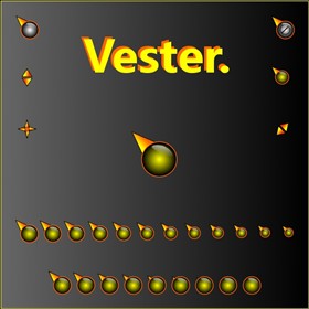
|
VesterUpdated Nov 22, 2010 by CountryYokel |
||||||
Comment #2 Monday, November 22, 2010 8:59 AM
Excellent, CY! This is gonna look great with "V"! ![]()
Comment #3 Monday, November 22, 2010 9:47 AM
I think it's cool for a first attempt!! Well done!
(the only advice I would give is this..... if you still have the .psd file, with the "glassy" area that is at the top right of the circle, then I would move it down about 3 pixels, left about 3 pixels, blur it by about "3" and then reduce it's total opacity to about 50-60% of what it is now. I hope you don't mind me offering this small critique, it's something I very rarely do.) 
Comment #4 Monday, November 22, 2010 10:01 AM
Pretty cool first cursor! ![]()
Great advice from a skinning legend!! ![]()
Comment #5 Monday, November 22, 2010 11:14 AM
Very well CountryYokel for first cursor... I look forward as follows ![]()
Comment #6 Monday, November 22, 2010 11:18 AM
I have to agree with BoXXi, the bubble should be within the outer circle, blur sounds good also. It's a very nice cursor for your first attempt and I raise my hat to you. Bravo. ![]()
![]()
![]()
Comment #7 Monday, November 22, 2010 3:31 PM
Comment #8 Monday, November 22, 2010 11:04 PM
Bonito degradado, el diseño se puede mejorar, pero quedo bién, en general funciona como cursor, es usable.
Comment #9 Tuesday, November 23, 2010 5:57 PM
Hey CY, That looks a whole lot better! much more realistic as a reflection. ( I didn't mean for you to change the whole thing, I was just offering advice of a general nature ![]() But it DOES look better.....
But it DOES look better.....
Have Fun!! 
Comment #10 Tuesday, November 23, 2010 6:54 PM
Thanks for the comment, gaboalien.
Thanks BoXXi, I have been doing WindowBlinds for a while now & just thought I would have a go at something different, so I was pleased to get some advice on something I have not done before, that is why I like Wincustomize, there are always top skinners to help you when you need it.
Please login to comment and/or vote for this skin.
Welcome Guest! Please take the time to register with us.
There are many great features available to you once you register, including:
- Richer content, access to many features that are disabled for guests like commenting on the forums and downloading files.
- Access to a great community, with a massive database of many, many areas of interest.
- Access to contests & subscription offers like exclusive emails.
- It's simple, and FREE!


Comment #1 Monday, November 22, 2010 8:17 AM
First step to greatness "I have a lot to learn!" and with 'Vester' your well on your way.