Comment #2 Monday, March 10, 2003 9:55 PM
Comment #4 Monday, March 10, 2003 11:57 PM
 I'm real sorry about that... well not really LOL Thankyou Darkee, I'm glad your having fun with'em too . And Radial
 Comment #5 Tuesday, March 11, 2003 8:34 AM
Anyway, apart from being creative and all that, I have to say this is one successful cursor set. All your graphics?
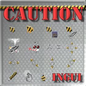
Ah, I have to admit though that the fire is not my favorite. It doesn't look too firey. Otherwise, love the busy, bg busy, and not avail cursors especially. I guess I have a thing for 3D looking stuff...
Keep it up as always. Oh and good news, 3DS lets you output PNG animation directly. Haven't tried to see how the transparency ends up but maybe I just might some time after I finish remodeling my bathroom.
Ow, yet another long comment...
Comment #6 Tuesday, March 11, 2003 10:09 AM
Just so you know, I have a formula for gauging how well I did on a particular set...
(Downloads x Comments)
Comment #7 Tuesday, March 11, 2003 10:14 AM
(Downloads x Comments)� TombalaFactor =
 or
or  LOL Cya next time Tom
Comment #8 Tuesday, March 11, 2003 10:21 AM
Comment #9 Tuesday, March 11, 2003 10:30 AM
I would already have given this set an 11 out of 10 even without the flames. I just love the busy and not avail cursors!
Comment #10 Tuesday, March 11, 2003 10:33 AM
Comment #11 Tuesday, March 11, 2003 11:15 AM
Comment #12 Tuesday, March 11, 2003 1:55 PM
Way to go!!
Comment #13 Wednesday, March 12, 2003 3:54 PM
Comment #15 Wednesday, March 12, 2003 7:15 PM
Comment #16 Wednesday, March 12, 2003 8:23 PM

Angel_Wings has been busy and not payin' attention! Bad, bad Shmoopy! LOL
This rocks! Your animations make me *sigh* with envy!
Comment #17 Thursday, March 13, 2003 8:18 AM
You are exceptional at making cursors.
Comment #18 Thursday, March 13, 2003 7:25 PM
 errr... hehe, well i guess that wouldnt work after all
 Comment #20 Thursday, September 4, 2003 7:41 PM
A very entertaining cursor set. (the graphics are fantastic)
That "busy" machine is sweet !
Now, here are a couple of things that may stand improvement (to an otherwise outstandinf set):
a) The "unavailable" appears away from the hot spot (which is a bit awkward)
c) The "hand" seems a bit swollen ?
Please login to comment and/or vote for this skin.
Welcome Guest! Please take the time to register with us.
There are many great features available to you once you register, including:
- Richer content, access to many features that are disabled for guests like commenting on the forums and downloading files.
- Access to a great community, with a massive database of many, many areas of interest.
- Access to contests & subscription offers like exclusive emails.
- It's simple, and FREE!


Comment #1 Monday, March 10, 2003 9:52 PM
I now just sit and watch the animations at work instead.
Well done