Please login to comment and/or vote for this skin.
Welcome Guest! Please take the time to register with us.
There are many great features available to you once you register, including:
- Richer content, access to many features that are disabled for guests like commenting on the forums and downloading files.
- Access to a great community, with a massive database of many, many areas of interest.
- Access to contests & subscription offers like exclusive emails.
- It's simple, and FREE!


Comment #1 Monday, April 7, 2003 10:29 AM
I guess I will comment.
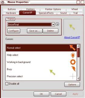
The shapes that you used for the cursors are very nice. I especially like the bulb and he lightning. But the gear animation is not complete, the gear does not look like it is making the full rotation, you need to add frames so that it doesn't look like it's jumping.
Also, I think this set would be better without the animations (color cycling). The cycling is a little distracting for me.
Other than that, I think you are off to a good start for a new cursorer.
Keep it up!