Comment #2 Wednesday, January 30, 2002 10:52 AM
Comment #3 Wednesday, January 30, 2002 6:09 PM
well to be serious.
It is not made for your busy schedule. We both know that this "Look and feel" can not be accomplished without loosing information space.
But for users having a handfull schedules, tasks and E-Mails, the space is shure enough. The rest of the PDA is full with games etc..
So the XP skin for PDA has the same effect then a WindowsBlind skin. Nobody has any advantage out of it, but the "Look and Feel" is all about it.
Agree?
Comment #4 Thursday, January 31, 2002 8:12 AM
Comment #5 Friday, February 1, 2002 8:42 AM
<my face flashing red>
Well, no.
Ver.2.1 has more optical improvements.
Landscape is possible, I only don't know how many interest is in this.
Please login to comment and/or vote for this skin.
Welcome Guest! Please take the time to register with us.
There are many great features available to you once you register, including:
- Richer content, access to many features that are disabled for guests like commenting on the forums and downloading files.
- Access to a great community, with a massive database of many, many areas of interest.
- Access to contests & subscription offers like exclusive emails.
- It's simple, and FREE!


Comment #1 Monday, January 28, 2002 3:22 PM
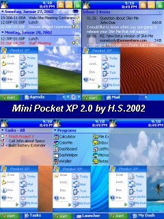
On the permanent Start-Menu you see this on the left side:
-Zoom = Zooms your icons or text
-Load...= Is loading your information new
-Date = set a new appointment
-Help = starts IE and shows you Dashbaords help
-All Programs = starts the Mini Launcher
On the right side you see the standard functions from dashboard.
Clicking on the Start-Menu itself brings up the option Menu from
Dashboard.
In the middle of the Taskbar you see the activated function (in words and with icon)
Where normaly the clock is, you can scroll pages.
Every of the 5 standard functions has its own Wallpaper.
(well knowns from Win XP)
While the Start-Menu is fixed the wallpapers change.
The top of the screen is of course for the information.
This space is made look like a transparent window.
The price for the "Look and Feel" is, that the information aera is little small.
But who cares. For the few private matters it will be enough.
hardcore PDA users don't have time for playing with skins anyway
The whole story is rounded up with Wisbar support.
As soon I get into mood I look for something Gigabar styled.
Hmmm...