Comment #2 Thursday, September 20, 2001 10:19 PM
Comment #3 Friday, September 21, 2001 5:59 AM
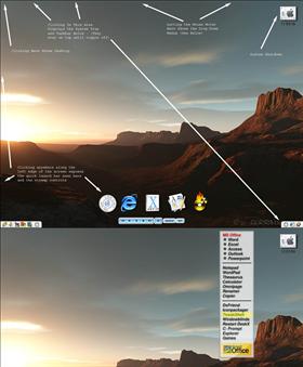
I like themes like this. PJ has done a nice one (Minimalism 98/2000) which I use from time to time and in the past I used several LiteStep themes in the same category. LiteStep is hard to configure, but once you learn it you can do anything you like (except ironing your shirts). What I always disliked about LS and what is found in many (not all) LS themes is that one needs to have graphic skills to make changes. Your theme has the same disadvantage. I know that DX is partially the blame because making menus in DX is not very easy to do (for the average user) and I also noticed that you tried to make it as general as possible.
Don't consider this a harsh comment, but if DesktopX and Ultra Minimalism are about productivity then this needs to be said. There is a work around. You can add a object to each menu item. Such an object can handle the label of the item and optionally (probably not is the style of Minimalism) its icon.
Maybe we should ask Alberto (lead programmer of DX) to add labels to objects which can use font properties and font locations preset by the theme builder as a default for a given shortcut. This allows the end user to make simple changes. It could also prompt for an icon and extract these from the executable and an icon library. In fact it looks more like this is a job for OB, but OB cannot do what you are trying to do either. Another solution would be that OB allowed DX to use its skinnable menus. We can dream, can't we?
The predefined shortcuts are too much orientated to your own configuration. Example: The Explorer menu item has a path set to E:\WinNT. On my system it won't run, because the Explorer is in my C:\WinNT folder. You could simply improve upon that by omitting the path. Note that tt is not a theme for your personal use anymore if you have put it on the net with the intention that everyone can enjoy it.
Also DX allows objects to have names. Older versions of DX allowed just numbers (and my themes are released in that period). Your theme uses hard to use names like "Object237", which puts us right back to the beginning. A name like "GamesItem" would make it easier to make changes and references to objects.
I also agree to what Phil said about resolution indepence. It is very easy for you to adapt the theme to be resolution independent. I don't understand why a lot of skinners won't take the trouble.
BTW: Somehow I couldn't find a menu item option to start my browser, but I could have overlooked it.
Thanks for this theme and I hope that I didn't sound too negative
Comment #4 Friday, September 21, 2001 3:48 PM
You're right, Litestep is incredibly versatile. I used to use it - my favorite was the notes theme - but the line coding of the steprc file got to be too much. I like DeskX because of the way you can manipulate the location of items on-screen, and it's incredible transparency support. As for making the shorcuts work on all systems, this is just not possible. All of the ones that can be made to work on all system have been made (these are the executables that drop down from the file shortcut menu). But all others will have to be changed by the end user (some people don't even use a WINNT folder - they name it something else - etc.) This could all be solved if everyone were running objectbar, but most people who run deskx don't run objectbar. Convergence is the obvious solution to this whole mess. I really don't understand the resolution independent settings, which is why this theme is set for what the majority of people use. I have flat panel monitors, so it is impossible for me to test the theme at higher resolutions, sorry. Also, I tend to use the object browser to identify objects by the name of the graphics file - I have made these pretty descriptive. Hope this answers some of your questions. As I learn more about skinning deskx, I'm sure my themes will become more adaptable. Thanks for the comments!
Please login to comment and/or vote for this skin.
Welcome Guest! Please take the time to register with us.
There are many great features available to you once you register, including:
- Richer content, access to many features that are disabled for guests like commenting on the forums and downloading files.
- Access to a great community, with a massive database of many, many areas of interest.
- Access to contests & subscription offers like exclusive emails.
- It's simple, and FREE!


Comment #1 Thursday, September 20, 2001 5:03 PM
1. The image needs to be changed to stretched.
2. Some sort of mouseover image on the menu items and the winamp/quicklaunch images. Even if it's a normal image = 50% alpha and mouse over = None type of mouseover. Just helps it seem like it's not just a load of static images I'm clicking on.