|
In The Dark
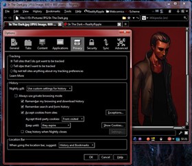
In The Dark is a theme created with simple shades of gray, designed to be simple and dark.
The theme is designed to be compact, dark, and easily visible. Most of the icons use only Black, white, and four shades of gray, in a standardized style to easily recognize what action is being taken. The theme's icons were created by RealityRipple specifically for In The Dark, and may freely be reused. Title inspired by the album by Beatdrop.
The GUI craze of today is round, glassy, and bubbly. They take up resources, distract the eye, and in many cases, inhibit productivity and understanding. In The Dark is a step in a different direction for user interfaces. It's designed to be minimalistic, using a total of six colors: black, white, and four shades of gray, which it employs in a standard and logical manner in order to easily see icons and objects, determine the state of those objects, and understand what they do.
In The Dark uses high-clarity icons to make even the smallest buttons easy to understand, keeping the interface from hindering your work. Items you can click are easily identified by a noticeable alteration of color. Menus stay flat against the background until you need them, and the selected item makes itself clearly known without being displeasing to the eyes. The entire interface uses a very dark-oriented tone to keep your eyes from being strained by light, and white text sticks out plainly without being overpowering or hard to read. In The Dark is free for use in Firefox.
|

![]()
![]()


Comment #1 Sunday, March 22, 2009 2:24 PM