|
DeveloperUpdated Jan 21, 2003 by Scott MacDonald |
||||||
Comment #22 Tuesday, December 10, 2002 9:38 PM
It's looking mean and lean. I dig it. Oh did I mention I love blue?
Comment #23 Tuesday, December 10, 2002 10:31 PM
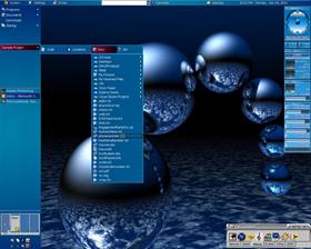
To change/add stuff to the sample project you actually have to open up the object bar properties and edit the bars. I've thought about making a utility that would find all code projects and set up the bars for you, but this is in the future.
I'm kinda confused about your 2nd question since the running apps appear on the side, not the top, and there's tons of room to see them all. The reason I don't like just icons for running apps is because I usually have 2 or 3 instances of DevStudio running and I need to know which is which.
I think we're stuck with the default length of the address bar for now, I've tried to make it bigger and failed. Maybe a future version of the plugin.
I am thinking about doing full color changes for the bars (now that i've gotten the mouseovers fixed), any suggestions are welcome.
If you need any help setting up your bars, feel free to email me at samus@faier.net. If anything we can arrange to get on a chat client at the same time.
Comment #24 Friday, December 13, 2002 2:53 PM
Upp'ed my rating
Comment #25 Sunday, December 15, 2002 10:04 AM
 Especially the system tools.
Do wish the address bar was a little longer though... LOL
Comment #27 Sunday, January 19, 2003 11:45 AM
Comment #28 Thursday, January 23, 2003 9:15 AM
Comment #29 Saturday, January 25, 2003 12:26 AM
RonPou
Comment #30 Saturday, January 25, 2003 2:48 AM
Comment #31 Thursday, January 30, 2003 5:45 AM
Comment #32 Thursday, January 30, 2003 10:18 AM
Comment #33 Monday, February 3, 2003 1:14 PM
Comment #34 Monday, February 3, 2003 6:50 PM
Comment #35 Tuesday, February 4, 2003 6:51 PM
Comment #36 Wednesday, February 5, 2003 10:49 AM
Comment #37 Tuesday, February 11, 2003 7:58 PM
Comment #38 Wednesday, February 12, 2003 11:45 AM
Still a great theme when I delete those 3 things!!!
Comment #39 Wednesday, February 12, 2003 4:17 PM
OK, the thing on the bottom left is Stardock's Tab Launch Pad, not part of object bar.
The thing on the right is Sysmetrix, not desktopX, or object bar.
As for the 3 blueish dots, you're the first to report that...hmmm...its possible that something got left behind in there that shouldn't have. Try switching to one of the alternate themes and see if they're there. It could also be a sizing issue, you might be running at a low enough resolution to cause some of the bars to shrink to dot size. (I've experienced that before). I'll take a look tonight, if I can recreate, I'll post here. Otherwise, I'll stay silent
Comment #40 Wednesday, February 12, 2003 4:39 PM
Third time I've said it... but still it's a great theme!!
Please login to comment and/or vote for this skin.
Welcome Guest! Please take the time to register with us.
There are many great features available to you once you register, including:
- Richer content, access to many features that are disabled for guests like commenting on the forums and downloading files.
- Access to a great community, with a massive database of many, many areas of interest.
- Access to contests & subscription offers like exclusive emails.
- It's simple, and FREE!


Comment #21 Tuesday, December 10, 2002 6:46 PM
Nice work, but I would suggest trying a minimised version with just icons, as a developer myself, I know exactly what I'm running and what the icons look like, therefore (alongside the fact that I usually have 20 or so apps running at the same time) it would be nice to have the ability to shrink the fields in the topbar and set them all to icon only (not tht I can't do that, it just doesn't resize well) Or am I missing something?
Also, can anyone tell me how to get the address field longer? The plug-in is un-adjustable in length, as is the setting in the theme settings.
But
PS. any chance on color change for the whole bar and not just the button outline?