Comment #2 Friday, September 12, 2003 9:51 PM
Outstanding!
Comment #3 Friday, September 12, 2003 9:55 PM
Comment #5 Friday, September 12, 2003 11:26 PM
Comment #6 Saturday, September 13, 2003 12:11 AM
Comment #7 Saturday, September 13, 2003 3:24 AM
Comment #8 Saturday, September 13, 2003 1:28 PM
-Daniel
Comment #9 Saturday, September 13, 2003 5:10 PM
Comment #10 Saturday, September 13, 2003 6:01 PM
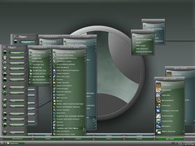
I will almost certainly do matching Sysmetrix and Rainlendar skins, it's about 90% certain that a WB skin is in the pipeline, and I'm currently three quarters thru doing a matching cursorXP set.
Can't find the skin you're referring to Balls...give me a link?
Comment #11 Saturday, September 13, 2003 7:02 PM
Comment #12 Monday, September 15, 2003 12:40 PM
If you ever do an update for this pls consider that.
Comment #13 Monday, September 15, 2003 2:09 PM
I assume you're referring to the start menu? Actually they are 32x32 icons, albeit customized so as to fit into the orb shapes - it would make the menu too spread out to try and fit standard 32x32 icons into circles. However I'm sure I can include an alternative skin section with square or lozenge-shaped icon windows in an update. Thx for the idea.
Maybe the update where I include a third colour, which currently is planned to be...amber!
Comment #14 Monday, September 15, 2003 2:14 PM
I dont need text for running apps, i know which icons are which app. I just need text for explorer/IE
Check out the pic to see how i use it.
http://www.geekstorm.com/bar.jpg
Comment #15 Monday, September 15, 2003 4:50 PM
container style #4 is suitable for what you suggest I just need to modify the mouseover and selected item images..
I'd have to modify some other skin settings to enable a dbl height taskbar too, but I shall investigate because I think your setup is a great idea
Comment #16 Wednesday, September 17, 2003 9:21 PM
Comment #17 Thursday, September 18, 2003 4:24 AM
I'm currently working on an amber skin for this (as well as some DX2 fill-in-the-gaps type objects), but if you post me a link to something containing the kind of blue you like you never know...
wait...you mean the blue I included isn't blue enough for ya?
Comment #18 Saturday, September 20, 2003 9:17 AM
Comment #19 Saturday, September 20, 2003 8:36 PM
you could probably extract a wall from the GT2 logon come to think of it...it's not exactly the same but it's close
GT2 CXP cursors - https://www.wincustomize.com/skins.asp?library=25&SkinID=672
GT2 CXP bronze - https://www.wincustomize.com/skins.asp?library=25&SkinID=674
GT2 logon - https://www.wincustomize.com/skins.asp?library=26&SkinID=1721
ok enough of this shameless self promotion
o, did I mention the GT2 desktopX media player? Awaiting approval at the time of writing...*koff*
Comment #20 Monday, September 22, 2003 9:02 PM
Please login to comment and/or vote for this skin.
Welcome Guest! Please take the time to register with us.
There are many great features available to you once you register, including:
- Richer content, access to many features that are disabled for guests like commenting on the forums and downloading files.
- Access to a great community, with a massive database of many, many areas of interest.
- Access to contests & subscription offers like exclusive emails.
- It's simple, and FREE!


Comment #1 Friday, September 12, 2003 9:06 PM