


|
ObjectDock Icon (New)Updated May 10, 2004 by UpsidedownGC |
||||||
UpsideDownGC
Comment #2 Monday, May 10, 2004 9:26 PM
Comment #2 Monday, May 10, 2004 9:26 PM
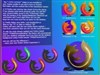
It just looks that way cuz of the shadow. I used teal beause I am trying to stay as much with the actual OD icon as I can.
d8abyte
Comment #3 Monday, May 17, 2004 5:51 PM
 I have alot of stuff to upload and also in the works but on this damn dial-up all I can do is watch and see what people are making. Keep improving it gets easier the more you design.
Comment #3 Monday, May 17, 2004 5:51 PM
 I have alot of stuff to upload and also in the works but on this damn dial-up all I can do is watch and see what people are making. Keep improving it gets easier the more you design.
Please login to comment and/or vote for this skin.
Welcome Guest! Please take the time to register with us.
There are many great features available to you once you register, including:
- Richer content, access to many features that are disabled for guests like commenting on the forums and downloading files.
- Access to a great community, with a massive database of many, many areas of interest.
- Access to contests & subscription offers like exclusive emails.
- It's simple, and FREE!


Comment #1 Monday, May 10, 2004 3:08 PM
better. the 'o' looks like it has some depth - just don't use that teal for its color! much better though.