Comment #2 Wednesday, June 1, 2011 7:53 AM
In my presentation I already said that my second upcoming idea will be more functional, that's meaning that this one is eyekindy but not fully functional as you wanted to point out ...
...following your attitude the new ObjectDock_Backgrounds Library should be only an addon to the best WindowsBlind graphics and don't forget that at the moment this is already a kind of B gallery respect the original ObjectDock until on the Stardock O.D. page (more themes) the new users will find only the direct link to the OD gallery and not to this one ! ... Always thanks for your feedback !
Comment #3 Wednesday, June 1, 2011 8:23 AM
Nice work frankell. Some people may like the look of the seperators between each icon. You are always willing to try different things with a program that is somewhat limited in letting you try things. If I had to suggest anything it would be to leave what you have and just add another sub style that would place the seperator between groups. Now people would have 3 choices. I don't see how it won't be functional as it is but like I said a 3rd sub would give another choice.
Comment #4 Wednesday, June 1, 2011 8:56 AM
Many thanks for the feedback Dave !
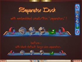
as a skinner it's easy to explain: "Separator Dock" by the name ... as Terminator or Dragonator, and by design it's featuring the separators ! ,
if you want you can even add the usual blank\large separators !
as for the TransparentText my input was the forums https://forums.wincustomize.com/407967
probably you'll prefer my second solution just have to wait for a while !
All the best Dave ! ![]()
Comment #5 Wednesday, June 1, 2011 11:05 AM
I'm not really sure what you mean by this. Anyway, I look forward to your second solution.
Comment #6 Wednesday, June 1, 2011 12:13 PM
no problem natas2 !
...well your mention to the groups gave me even another idea, so please can you tell me which are the names of the Groups you'd like to have on the dock ?
I'm asking the same to Dave and everyone else will be so kind to collaborate. Thanks a lot !
Comment #7 Wednesday, June 1, 2011 12:54 PM
All for a dock? I think this is a greta idea and frankly, I commend your willingness to always try something new. Myabe it's not made for everyone's taste. I agree with DaveBax on a substyle. Bravo Frankell. I've tried mostly all of your docks and heve never been let down. ![]()
![]()
Comment #8 Wednesday, June 1, 2011 1:35 PM
well well my dear skyzyk as in the best traditions there will be "Separator II " !
with a different approach (no more tiles) and naturally with the substyle without any fixed separator as you and Dave requested ![]()
Please login to comment and/or vote for this skin.
Welcome Guest! Please take the time to register with us.
There are many great features available to you once you register, including:
- Richer content, access to many features that are disabled for guests like commenting on the forums and downloading files.
- Access to a great community, with a massive database of many, many areas of interest.
- Access to contests & subscription offers like exclusive emails.
- It's simple, and FREE!


Comment #1 Wednesday, June 1, 2011 7:15 AM
The problem here is, when most people use separators, they use them to SEPARATE different groups of icons. (which is what they are designed for) You're using a tile with "separators" at each side of it which puts a "separator" between each icon.
I like to see that you're trying to come up with new things, but sometimes things sound like a good idea, but they really don't work out that way. That said, I'm sure everyone will come in here and say OMG! This is AMAZING!
Keep working at it though, I'd like to see your actual dock graphics get better instead of the gimmicks you keep trying to deploy.