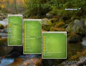
Harmony for RightClick
Average Rating: 8
Yours: -1
File Size: .3MB
Downloads Today: 0 Downloads Total: 1940

Harmony for RightClick

Updated Oct 21, 2007 by messiah1


Fairyy~
Comment #1 Sunday, October 21, 2007 12:01 PM
Very nice - I hadn't had time to make myself one - on my smaller sub-menus that don't stretch out far Im getting a line down the center when bmp compresses. If I check off to add icons it seems to fix it.
messiah1
Comment #2 Sunday, October 21, 2007 5:40 PM
Thanks Fairyy, I'll see if I can dupe it and fix.
Fairyy~
Comment #3 Monday, October 22, 2007 1:03 AM
All I did was take your original and made a copy and recolored the inset one color green - no gradient. That works fine for me for my smaller menus - took 2 minutes to do it.
messiah1
Comment #4 Monday, October 22, 2007 6:17 AM
Is the line down the center the line that is on the right of my preview? That's part of the design. Like the Start menu of the skin. I can see how it would look wonky on small menu's though.
vStyler
Comment #5 Monday, October 22, 2007 12:29 PM
Awesome, matches perfectly �
Fairyy~
Comment #6 Monday, October 22, 2007 7:27 PM
Is the line down the center the line that is on the right of my preview? That's part of the design. Like the Start menu of the skin. I can see how it would look wonky on small menu's though.


no..I realise that is part of the start menus design ..this was when the menus were small and the gradient compressed. I uploaded a pic of mine ( Link Below ) - you see its the gradient on small menus compressing . In the SS I didn't have clear type on but it didn't make any difference in the menu stretching out further. After I recolored it solid color it works fine.
WWW Link
messiah1
Comment #7 Monday, October 22, 2007 9:05 PM
Gotcha, I see cleary now...steenkin gradients...��� Hows it look with the solid Fairyy?
Fairyy~
Comment #8 Tuesday, October 23, 2007 5:27 AM
Gotcha, I see cleary now...steenkin gradients... Hows it look with the solid Fairyy?


Looks good solid. You could just add a solid sub-style - the gradient RC is fine if you have lots of text.

Here is SS of RC without gradient ( I didn't get fancy here just a quick repaint )
WWW Link
messiah1
Comment #9 Tuesday, October 23, 2007 6:57 AM
Looks good solid. You could just add a solid sub-style - the gradient RC is fine if you have lots of text.


I shall do that. Thanks Fairyy~ You're the Queen of RC.
Yo_Adrian
Comment #10 Thursday, October 25, 2007 12:03 PM
Very cool

Where can I find the wallpaper?

Thank you.
messiah1
Comment #11 Thursday, October 25, 2007 2:10 PM
The wall is at Interfacelift.com...it's called fallintennessee.

Please login to comment and/or vote for this skin.

Welcome Guest! Please take the time to register with us.
There are many great features available to you once you register, including:

  • Richer content, access to many features that are disabled for guests like commenting on the forums and downloading files.
  • Access to a great community, with a massive database of many, many areas of interest.
  • Access to contests & subscription offers like exclusive emails.
  • It's simple, and FREE!
Downloads remaining: 5
User Level: Visitor

Featured RightClick

Popular RightClick

Top RightClick Skinners

Yesterday  |   Last 30 Days  |   All Time
1. Nimbin 406
2. codysan 319
3. bk13GarbageMan 233
4. buzzh58 148
5. Fairyy~ 128
6. Snowman 113
7. Cavan1 88
8. hallv5 77
9. Mirsguy 69
10. WebGizmos 64
11. Lantec 56
12. gef 42
13. Xiandi 38
14. Quentin94 37
15. chris161 36


web-wc01