|
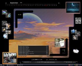
Black on TweadUpdated Sep 24, 2005 by Shortcake83 |
||||||
Comment #4 Sunday, September 25, 2005 2:22 PM
 I was just playing around in photoshop using styles and textures and this just happen to come up and I thought it looked pretty neat. I like the tweed look ( I misspelled the word in the title ), at least it is a little different. Thanks again....
  I get most of my ideas from all of the screenshots here also, so you guys keep up the good work so I can continue to learn from you.....Thanks
Comment #5 Sunday, September 25, 2005 3:45 PM
 What we do is "simple" SS compared to what you do - in my opinion
I think it's you who is the artist of what you are doing and it's a great work you put together and I can not see the inspiration in the SS in here, but maybe I need
 and dog
Anyway - Great work

Comment #6 Sunday, September 25, 2005 4:25 PM

Comment #7 Sunday, September 25, 2005 8:46 PM


Comment #9 Thursday, October 13, 2005 2:26 PM
Please login to comment and/or vote for this skin.
Welcome Guest! Please take the time to register with us.
There are many great features available to you once you register, including:
- Richer content, access to many features that are disabled for guests like commenting on the forums and downloading files.
- Access to a great community, with a massive database of many, many areas of interest.
- Access to contests & subscription offers like exclusive emails.
- It's simple, and FREE!


![Aero11 (Vista Edition) [Theme Preview]](http://skins17.wincustomize.com/40/19/4019518/13/28337/preview-13-28337-100x75.jpg?d=1677593646.38)


Comment #1 Sunday, September 25, 2005 5:08 AM