


|
Slider previewUpdated Aug 30, 2007 by I.R. Brainiac |
||||||
 |
|
Page 1 of 2 |
|---|
 Totaly agree with bilbo.
WebGizmos
Comment #3 Thursday, August 30, 2007 7:36 AM
Comment #3 Thursday, August 30, 2007 7:36 AM
Darker...Taste great! Lighter...less filling! 

JMSpeakman
Comment #6 Thursday, August 30, 2007 11:36 AM
Comment #6 Thursday, August 30, 2007 11:36 AM
Your doing your THING and your good at it!� �
�
 �
�
messiah1
Comment #7 Thursday, August 30, 2007 12:01 PM
Comment #7 Thursday, August 30, 2007 12:01 PM
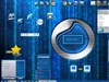
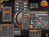
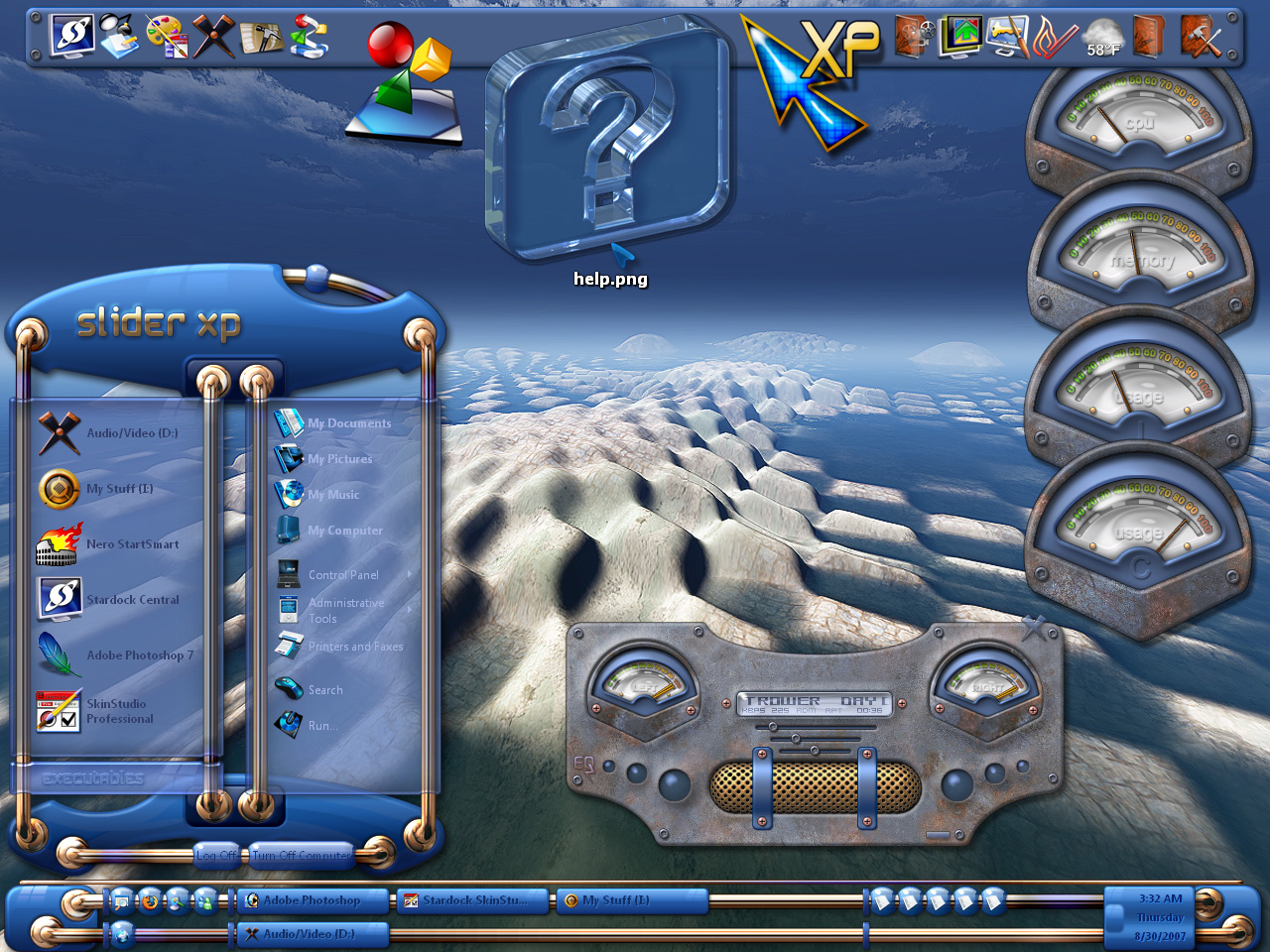
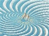
Coming right along. While looking at the taskbar, I see two different perspectives. The top slider has an "under it" perspective and the bottom one has an "over it" perspective. Slightly confusing to me. Do you see what I mean? Does anyone or do I need my brain checked?
lgspence
Comment #8 Thursday, August 30, 2007 12:39 PM
Comment #8 Thursday, August 30, 2007 12:39 PM
This is really looking good.Hope it gets released soon.
I.R. Brainiac
Comment #9 Thursday, August 30, 2007 5:48 PM
Comment #9 Thursday, August 30, 2007 5:48 PM
Thanks friends...dark text it is then...� �
�
Messiah...do I need to smack you?Thats the whole point you doofus...they are on a curving surface...what point would there be in 2 different taskbars in 1 image if they were identical?
The start menu does it too...its an ILLUSION,forced perspective...2D attemt at a third dimension.� ���
���
 �
�Messiah...do I need to smack you?Thats the whole point you doofus...they are on a curving surface...what point would there be in 2 different taskbars in 1 image if they were identical?
The start menu does it too...its an ILLUSION,forced perspective...2D attemt at a third dimension.�
 ���
���
messiah1
Comment #10 Thursday, August 30, 2007 7:33 PM
Oh. Thanks for explaining it so nicely.�("You don't need your brain checked...that's what I was going for" would have worked.) �
�
Comment #10 Thursday, August 30, 2007 7:33 PM
Messiah...do I need to smack you?Thats the whole point you doofus...they are on a curving surface...what point would there be in 2 different taskbars in 1 image if they were identical?
The start menu does it too...its an ILLUSION,forced perspective...2D attemt at a third dimension
The start menu does it too...its an ILLUSION,forced perspective...2D attemt at a third dimension
Oh. Thanks for explaining it so nicely.�("You don't need your brain checked...that's what I was going for" would have worked.)
 �
�
WebGizmos
Comment #11 Thursday, August 30, 2007 10:14 PM
Comment #11 Thursday, August 30, 2007 10:14 PM
I think he was just kidding Messiah. But now that you mention it the top bar does seem to have a bit more curve effect to it than the bottom one...but it all still looks great!
But now that you mention it the top bar does seem to have a bit more curve effect to it than the bottom one...but it all still looks great!
messiah1
Comment #12 Thursday, August 30, 2007 10:47 PM
Maybe, maybe not. It doesn't change the my initial reaction to the perspective on the taskbar being somehow wrong-ish. (to me) It may be that the two are too close to each other to actually get that effect. I understand ILLUSION and forced perspective and it works well on the start panel because they are spread out more (talking about the outer ones). I'm not bashing though, or calling anyone a doofus...just stating an opinion. But that's the great thing about America, I have the right to be stupid and wrong.
Comment #12 Thursday, August 30, 2007 10:47 PM
I think he was just kidding Messiah.
Maybe, maybe not. It doesn't change the my initial reaction to the perspective on the taskbar being somehow wrong-ish. (to me) It may be that the two are too close to each other to actually get that effect. I understand ILLUSION and forced perspective and it works well on the start panel because they are spread out more (talking about the outer ones). I'm not bashing though, or calling anyone a doofus...just stating an opinion. But that's the great thing about America, I have the right to be stupid and wrong.
I.R. Brainiac
Comment #13 Friday, August 31, 2007 4:04 AM
Comment #13 Friday, August 31, 2007 4:04 AM
Messiah...doofus is a term of endearment amongst friends and comrades...ya doofus!�����
And to really mess with youse guys...all 7 bars are the same bar...with a bit of ps trickery to alter perspective and shine...AND...the 2 on the taskbar are the same manipulation,flipped,the top one having the mount ring squashed slightly because it wouldnt fit on the dang taskbar.(but identical amounts of curve on the bar)
Hows that fer delusion?� �
�
����And to really mess with youse guys...all 7 bars are the same bar...with a bit of ps trickery to alter perspective and shine...AND...the 2 on the taskbar are the same manipulation,flipped,the top one having the mount ring squashed slightly because it wouldnt fit on the dang taskbar.(but identical amounts of curve on the bar)
Hows that fer delusion?�
 �
�
messiah1
Comment #14 Friday, August 31, 2007 11:47 AM
This may be what's causing my small brain to tell me eyes something aint right. Compounded with the issue that they are too close together to get such perspective. And yer a doofus...hey that feels good...doofuss, doofuss...��
Comment #14 Friday, August 31, 2007 11:47 AM
the top one having the mount ring squashed slightly because it wouldnt fit on the dang taskbar.
This may be what's causing my small brain to tell me eyes something aint right. Compounded with the issue that they are too close together to get such perspective. And yer a doofus...hey that feels good...doofuss, doofuss...�
�
hookem
Comment #15 Friday, August 31, 2007 6:30 PM
Comment #15 Friday, August 31, 2007 6:30 PM
Awesome!!!
Something completely different. I'm not a programmer, all I see is a great new skin. Where can I get this?
Something completely different. I'm not a programmer, all I see is a great new skin. Where can I get this?
WebGizmos
Comment #16 Friday, August 31, 2007 11:21 PM
@Messiah...let it all out bud! No really...don't hold back...he can take it!
The bottom bar could use just a tad bit more angle downwards though...the top one looks fine. Or maybe a bit less on the top one...either way...doofus. 
Comment #16 Friday, August 31, 2007 11:21 PM
@Messiah...let it all out bud! No really...don't hold back...he can take it! The bottom bar could use just a tad bit more angle downwards though...the top one looks fine. Or maybe a bit less on the top one...either way...doofus.

I.R. Brainiac
Comment #17 Friday, August 31, 2007 11:42 PM
WIP...isnt done yet...a free previw wb will show up at Maxstyles.com soonish.Then a 3 color version will be for sale there and then here.(go longhorns)��
I see maturity is at a new level here...name calling leads to shoulder punching.����
Comment #17 Friday, August 31, 2007 11:42 PM
Where can I get this?
WIP...isnt done yet...a free previw wb will show up at Maxstyles.com soonish.Then a 3 color version will be for sale there and then here.(go longhorns)�
�I see maturity is at a new level here...name calling leads to shoulder punching.�
���
WebGizmos
Comment #18 Saturday, September 1, 2007 5:04 AM
Na na na na na!
Comment #18 Saturday, September 1, 2007 5:04 AM
name calling leads to shoulder punching.
Na na na na na!


Please login to comment and/or vote for this skin.
Welcome Guest! Please take the time to register with us.
There are many great features available to you once you register, including:
- Richer content, access to many features that are disabled for guests like commenting on the forums and downloading files.
- Access to a great community, with a massive database of many, many areas of interest.
- Access to contests & subscription offers like exclusive emails.
- It's simple, and FREE!
|
|
Page 1 of 2 |
|---|

![Aero11 (Vista Edition) [Theme Preview]](http://skins17.wincustomize.com/40/19/4019518/13/28337/preview-13-28337-100x75.jpg?d=1677593646.38)
Comment #1 Thursday, August 30, 2007 6:03 AM
my vote : darker text