Comment #2 Saturday, June 2, 2007 3:46 AM
My monitor runs at 1920 x 1200, but I agree it would be nice to include and preview at smaller resolutions which are still very common. Also your logo at the bottom right is positioned so it's almost completely obscured by the taskbar.
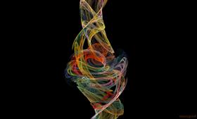
As always art is in the eye of the beholder. I think this colorful, "living" energy stream is amazing and would look amputated/unnatural if it DIDN'T continue flowing beyond the artificial confines of the computer screen--unless you made it a self-contained vortex infinitely folding back on itself. That would be a completely different design and a different energy.
IMO, MaxFlame could be mounted in a picture frame. I hope you develop more art using this effect/color scheme. I'd give it 4 stars (5 if the two issues above were resolved). Unfortunatley, as a non-subscriber running an older version of ObjectDock I'm not eligible to rate it...
Please login to comment and/or vote for this skin.
Welcome Guest! Please take the time to register with us.
There are many great features available to you once you register, including:
- Richer content, access to many features that are disabled for guests like commenting on the forums and downloading files.
- Access to a great community, with a massive database of many, many areas of interest.
- Access to contests & subscription offers like exclusive emails.
- It's simple, and FREE!


Comment #1 Tuesday, May 22, 2007 10:48 AM
A couple of things for your next wall..try not to chop off the top and bottom of design..and the preview was way too big..not everyone has football field size monitors..
a 1024 or 1280 preview would be better, this preview took a long time to load.