Comment #2 Monday, June 28, 2010 7:08 PM
Thanks for the heads up, skyzyk. I will read through the guidlines.
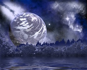
The blue was kind of an after though. I tweaked it a bit by adding a tree line and a little fog ..and decided to change the color scheme.
Should I edit/delete both and re-up them together in one package?
Comment #4 Monday, June 28, 2010 9:51 PM
NO they are very nice works. Maybe the next time. They're there so ...
BTW I like the blue one better ![]()
Please login to comment and/or vote for this skin.
Welcome Guest! Please take the time to register with us.
There are many great features available to you once you register, including:
- Richer content, access to many features that are disabled for guests like commenting on the forums and downloading files.
- Access to a great community, with a massive database of many, many areas of interest.
- Access to contests & subscription offers like exclusive emails.
- It's simple, and FREE!


Comment #1 Monday, June 28, 2010 12:59 PM
It's a very nice wallpaper but I think you should have packaged it together with the red planet. I believe there's some sort of rule about that, you might want to check that out in the guidelines. I really enjoy your work and your imagination. Thank you
