


DarkMist
Comment #3 Saturday, May 24, 2003 10:12 AM
Comment #3 Saturday, May 24, 2003 10:12 AM
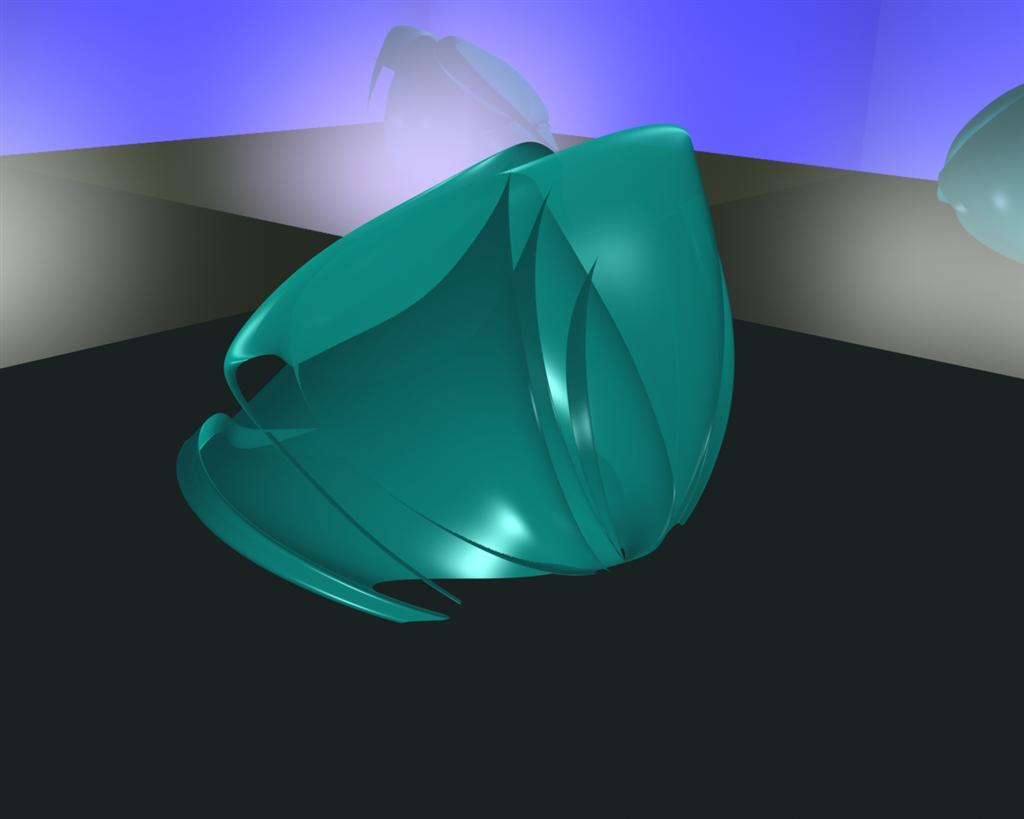
Good first wall, just need to work on the background 

Styl-X Design
Comment #4 Saturday, May 24, 2003 2:31 PM
Comment #4 Saturday, May 24, 2003 2:31 PM
Its ok, only too bad about the background and underground.
You might want to give them another texture, more like a miror or something.
No offence, just a hint
You might want to give them another texture, more like a miror or something.
No offence, just a hint
Malakai2u
Comment #5 Saturday, May 24, 2003 3:51 PM
Comment #5 Saturday, May 24, 2003 3:51 PM
I agree with Lady Akasha.It's soo simple and pretty that I could almost see this in an art exibit 


 (
(
jimmy_sea
Comment #8 Sunday, May 25, 2003 7:48 PM
Comment #8 Sunday, May 25, 2003 7:48 PM
Congrats GT5ooo on your first W.P.  Hope too see more of your work here.
 Hope too see more of your work here.
jimmy_sea
Comment #9 Sunday, May 25, 2003 7:52 PM
Comment #9 Sunday, May 25, 2003 7:52 PM
Also i agree with Styl Skinner mabe a dark blue underlay with the objects reflection
X_Dror
Comment #10 Monday, May 26, 2003 2:26 PM
Comment #10 Monday, May 26, 2003 2:26 PM
Nice Shape!!! but like styl skinner sad, you should add some more detail to the backround and the floor, like adding some raytrace and maybe some video post effects... Good Job anyway.
but like styl skinner sad, you should add some more detail to the backround and the floor, like adding some raytrace and maybe some video post effects... Good Job anyway.
GT5000
Comment #11 Wednesday, May 28, 2003 10:24 PM
Comment #11 Wednesday, May 28, 2003 10:24 PM
Thank you for the comments. I'm still very new at this and is having trouble on making a mirror like surface. If anyone knows where I can find help on this problem please post it here or email it to me at WGT50000@msn.com.
GT5000
Comment #12 Thursday, May 29, 2003 10:03 PM
Comment #12 Thursday, May 29, 2003 10:03 PM
I hope you peolpe like the update for this wall. Since everybody said the mirrors would make the wallpaper better looking I also would thought it was a good idea when I heard it.
X_Dror
Comment #13 Friday, May 30, 2003 8:08 AM
Comment #13 Friday, May 30, 2003 8:08 AM
This is Much Better i think it will be better to make the glossines a bit lower (some thing about 20) and the speculare a bit higher (only a suggestion)
i think it will be better to make the glossines a bit lower (some thing about 20) and the speculare a bit higher (only a suggestion)
spaceboy444
Comment #14 Saturday, June 28, 2003 5:08 PM
Comment #14 Saturday, June 28, 2003 5:08 PM
very nice shape but it might be more appealing to do a series like this in red or orange. the shaoe just remindsme of fire but great job on the new wp
Please login to comment and/or vote for this skin.
Welcome Guest! Please take the time to register with us.
There are many great features available to you once you register, including:
- Richer content, access to many features that are disabled for guests like commenting on the forums and downloading files.
- Access to a great community, with a massive database of many, many areas of interest.
- Access to contests & subscription offers like exclusive emails.
- It's simple, and FREE!


Comment #1 Saturday, May 24, 2003 1:09 AM
Simple it is...but there is an elegance about it.
Keep up the good work.