Comment #2 Saturday, May 1, 2004 8:15 AM
Good job!
Comment #3 Sunday, May 2, 2004 12:26 AM
Comment #4 Monday, May 17, 2004 9:20 PM
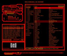
It's Very Similar To My First Idea For A Skin....FIREAMP
I Like The Detail That Even When The MAin Window Is Windoshaded And The Eq Isnt...or the eq is windowshaded and not the main...
the skin is still conected perfecly..
The Only Think I Disliked Was The Balance Bar In The EQ WINDOWSHADED....Its A bit Dificult To See....Just Because Its Cut...And When You Put The MAIN with The EQ togeter it looks like the ending of the main window....
well....nothing else...
Please escuse my speaching...I'm From Argentina And I'm trying To Learn LOL
El*ArGeNtO
Comment #5 Tuesday, May 18, 2004 5:39 AM
thanks for the nice words! the connection-thing between the main and EQ was one of my focus points, cool someone noticed!
about balance in EQ-shaded mode, well, i sorta forgot about that, because it wasnt of that interest to me.. but i figure if you want to balance between R and L that badly, you can do it anways - or switch to non-shaded (normal) mode
btw: no probs with your english, i'm no native-speaker myself
-
@ all the others:
also thank you for the comments!
Comment #6 Sunday, August 8, 2004 2:52 PM
Please login to comment and/or vote for this skin.
Welcome Guest! Please take the time to register with us.
There are many great features available to you once you register, including:
- Richer content, access to many features that are disabled for guests like commenting on the forums and downloading files.
- Access to a great community, with a massive database of many, many areas of interest.
- Access to contests & subscription offers like exclusive emails.
- It's simple, and FREE!


Comment #1 Saturday, May 1, 2004 5:48 AM
stupendous, for your first