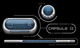
capsule II
Average Rating: 10
Yours: -1
File Size: .66MB
Downloads Today: 0 Downloads Total: 37080

capsule II

Updated Jul 01, 2004 by booster29


First Previous Page 1 of 2 Next Last
Rontz
Comment #1 Thursday, May 6, 2004 8:17 AM
sweet!
better than version 1
CarlosP
Comment #2 Thursday, May 6, 2004 9:30 AM
hey guys good skin but where is the alpha slider for the reflection?
Alpha Drone
Comment #3 Thursday, May 6, 2004 11:47 AM
We have a winner! Third best skin for me, right after D-R and Impulse.
FrezoreR
Comment #4 Thursday, May 6, 2004 12:06 PM
Clean and nice, I like this one.
-xino
Comment #5 Thursday, May 6, 2004 4:33 PM
awesome stuff. very clean looking.
TheSkinsFactory
Comment #6 Thursday, May 6, 2004 8:36 PM
really nice work. very clean. has this "i've seen this before" look about it but still a good job.
a-t-o-m-i-c
Comment #7 Thursday, May 6, 2004 11:50 PM
Looks and feels great. I like this one a lot better than your other entry. The normal mode is really nifty in the way you integrated all the elements into the interface. One small addition which I feel would make the skin more intuitive would be that if you're in the visualization mode and click on EQ you still have the visualisations open without it turning back to the main controls (hope thats not too confusing). Overall it has that very sleek and clean design, very usable. In fact I would almost suggest this one for the "most usable" category - but thats your choice of course
Alpha Drone
Comment #8 Friday, May 7, 2004 7:13 AM
I agree with a-t-o-m-i-c, retaining the VIS while using the EQ qould rock. Also, in the mini mode, can you add the other 2 VIS modes too?
booster29
Comment #9 Friday, May 7, 2004 7:33 AM
Thanks for all the comments and input on the skin, if you have any more suggestions i'm open to it.

CarlosP: will be adding that feature as soon as i learn how to, hehe.

a-t-0-m-i-c: thanks man, i get what you mean will be integrating that in my update.

Alpha Drone: will be adding those other 2 VIS modes soon, and will prolly add some more VIS in the main normal mode.

If you also have any suggestions for color themes and see any bugs tell me, but unfortunately it might take me a long while to update the skin. work sucks!!!
Well, it was great having been able to participate in this contest, with so many great skinners. Good luck to you all. Thanks!
punk182
Comment #10 Saturday, May 8, 2004 10:55 AM
This is by far the best skin I have seen for winamp to date! It looks so nice am drewling!!
punk182
Comment #11 Saturday, May 8, 2004 10:56 AM
Can you do purple with a the current silver boarder, an yellow, but not too birght. What about man utd red? Not arsenal tho!!
Maisch
Comment #12 Saturday, May 8, 2004 11:40 AM
This is a sweet skin! Nice and clean looking, great design!
etypell
Comment #13 Saturday, May 8, 2004 12:38 PM
Even better then the first.
Elegant design with functions integrated into player a very nice approach.Colors to match any wallpaper.
I still think the fonts should be easier to read
Alpha Drone
Comment #14 Monday, May 10, 2004 10:30 AM
Dude, did you add some sort of invisible easter eggs in the main mode? The area below the TH EQ etc buttons section acts as the C-button section, with Previous ,Eject, Play, Pause, Next buttons.
Plague_
Comment #15 Saturday, May 15, 2004 8:09 AM
pretty sweet. nicely done man!
Alpha Drone
Comment #16 Sunday, May 16, 2004 10:21 AM
booster29, are you accepting more themes?
booster29
Comment #17 Monday, May 17, 2004 7:38 AM
punk 182: thanks man....i'll be sure to add those colors on the update.

Alpha Drone: the hidden cbuttons are coding mistakes. sorry bout that. ...yep im still accepting themes, try and email it here > lawrence.villanueva@digitel.ph ...i'll be sure to include it on the update.
Slippah
Comment #18 Saturday, June 26, 2004 4:11 PM
I love this skin, it's terrific work. The only gripe i have is with the playlist buttons down at the bottom, they just dont seem to fit in as well and don't appear as polished as the rest of the skin, which isn't saying much because of how incredibly polished this skin is! Very nicely done, it's my first default winamp3 skin!
Slippah
Comment #19 Friday, July 9, 2004 1:03 PM
Just wanted to let people know (because I'm such a stalker ) that booster29 updated this and posted Capsule 2.05 on DA. You can check it out here: http://www.deviantart.com/deviation/8602395/
horizon
Comment #20 Friday, August 6, 2004 3:13 AM
pretty!!

Please login to comment and/or vote for this skin.

Welcome Guest! Please take the time to register with us.
There are many great features available to you once you register, including:

  • Richer content, access to many features that are disabled for guests like commenting on the forums and downloading files.
  • Access to a great community, with a massive database of many, many areas of interest.
  • Access to contests & subscription offers like exclusive emails.
  • It's simple, and FREE!
Downloads remaining: 5
User Level: Visitor

More From This Author

Featured WinAmp

Popular WinAmp

Top WinAmp Skinners

Yesterday  |   Last 30 Days  |   All Time
1. ariszlo 209
2. teffumi 104
3. tatosh 72
4. SisTeck 52
5. Pimousse38 50
6. Graypony 48
7. mdwm 48
8. nelleht 45
9. kriptoner 43
10. eric menk 43
11. SMAR 43
12. zrco 43
13. sxnc 39
14. Dangeruss 34
15. TheD2JBug 30


web-wc01