Comment #2 Wednesday, April 6, 2005 12:25 PM
Comment #3 Thursday, April 7, 2005 2:06 PM
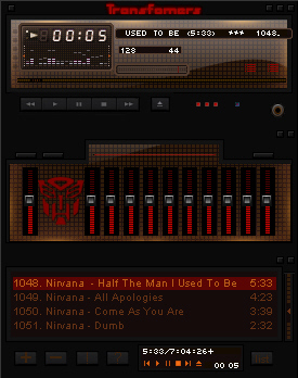
A nice design that went bad. Much too dark. I can't read or make out anything!
Comment #4 Friday, April 8, 2005 12:43 AM
Comment #5 Friday, April 8, 2005 2:43 AM

The Autobot skin here is fine, as far as design goes. Everything has a minimalist approach, much like how a robot (A Transformer?) would design it. Brilliant! Your choice of colors is also excellent: Charcoal gray, and metallic bronze with the Autobot RED. Just keep in mind that the color that people look for once they see that Autobot symbol is that beautiful eye-popping RED. So it would be a wise idea to make all the important buttons show that RED as well. This includes the Winamp buttons (Play, FF, Rewind, etc.) and the Playlist Editor buttons ( +, -, !, etc.).
I'd kill to see a Decepticons skin with a metallic steel color and a vivid PURPLE...!
Comment #6 Friday, April 8, 2005 6:32 AM
Comment #7 Friday, April 8, 2005 11:31 PM
Comment #8 Sunday, April 10, 2005 4:22 AM
Comment #9 Wednesday, June 8, 2005 8:57 AM
Comment #10 Friday, September 9, 2005 2:46 AM
Please login to comment and/or vote for this skin.
Welcome Guest! Please take the time to register with us.
There are many great features available to you once you register, including:
- Richer content, access to many features that are disabled for guests like commenting on the forums and downloading files.
- Access to a great community, with a massive database of many, many areas of interest.
- Access to contests & subscription offers like exclusive emails.
- It's simple, and FREE!


Comment #1 Wednesday, April 6, 2005 8:56 AM