|
SimpleUpdated Jul 31, 2005 by rpeterclark |
||||||
Comment #2 Monday, August 1, 2005 6:05 AM

Comment #4 Monday, August 1, 2005 7:25 AM

Comment #6 Monday, August 1, 2005 9:27 AM
 Your skins are always top shelf when it comes to looks... and since this one is not really... there must be something else special about it that I'm to ignorant to see.
Comment #7 Monday, August 1, 2005 9:55 AM
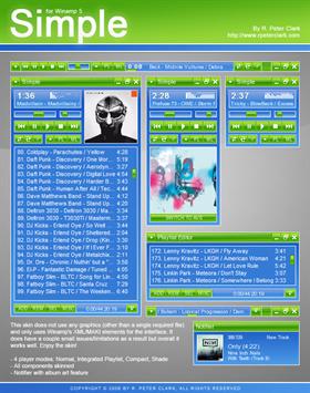
 Yeah, it's not my usual style, but it seemed like a fun thing to try. When you have to rely on skimpy rectangle and gradient tools for the entire interface, even simple things like sliders and buttons become much more challenging. So it lacks the visual appeal I usually go for, but it's a good example of how to push the Winamp modern skinning engine.
Comment #8 Monday, August 1, 2005 10:57 AM
Comment #9 Monday, August 1, 2005 8:24 PM
i like it ! but i have a question. i can't have covert... i must have a plugin ?
thanks Gg
Comment #10 Tuesday, August 2, 2005 7:36 AM
Comment #11 Thursday, August 4, 2005 5:47 AM
I'd love to get some color variants ( I understand they need to be separate skins )

Comment #12 Thursday, August 4, 2005 7:59 AM

Comment #13 Thursday, August 4, 2005 2:23 PM
Sorry .. I obviously had some trouble with the font size.
I swear never to hit any buttons before I know exactly what they do.
Comment #14 Wednesday, November 30, 2005 10:45 PM
Thank You
Sembetu
Please login to comment and/or vote for this skin.
Welcome Guest! Please take the time to register with us.
There are many great features available to you once you register, including:
- Richer content, access to many features that are disabled for guests like commenting on the forums and downloading files.
- Access to a great community, with a massive database of many, many areas of interest.
- Access to contests & subscription offers like exclusive emails.
- It's simple, and FREE!


Comment #1 Sunday, July 31, 2005 11:57 PM
It seems you must be running your computer in 1024x768, and of course, submitting art like this only creates a schme of trial and error as I have found 1 problem. I run my desktop at 1280x960 and have found that the MEDIA LIBRARY window cannot be stretched to its fullest without creating magic pink in the ML Titlebar. Shame, because I really love this skin so far. Once this is corrected, a definate 10/10