Comment #3 Monday, June 9, 2003 10:18 AM
I love the look, but I've tried 3.0, hated it, and returned to the 2.x series. (apparently I'm in the majority as Nullsoft is ditching v3, going back to v2, and is developing v5)
Comment #4 Tuesday, June 17, 2003 11:02 PM
Comment #5 Thursday, July 10, 2003 10:54 AM
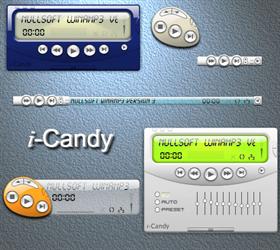
is it just me? so now, its stuck in the mode in the lower left corner (orange view).
sorry. but it seems like most of the skins you do are buggy.
they look good; just don't work 100%.
Comment #6 Thursday, July 10, 2003 11:46 PM
Comment #7 Friday, July 11, 2003 12:45 AM
the problem with the double click method is that you give the user the option to click a button, then suddenly change functionality. its called usability.
and yes, iSkin was buggy. iCandy has usability issues. that being said, it is and will remain my current winamp skin thanks to one of the theme colors matching my desktop.
i apologize for coming so harsh initially.
it is a good skin.
Comment #8 Friday, July 11, 2003 12:48 AM
Comment #9 Saturday, July 12, 2003 12:50 AM
Comment #10 Sunday, July 13, 2003 9:11 AM
Comment #11 Thursday, October 2, 2003 9:48 PM
Please login to comment and/or vote for this skin.
Welcome Guest! Please take the time to register with us.
There are many great features available to you once you register, including:
- Richer content, access to many features that are disabled for guests like commenting on the forums and downloading files.
- Access to a great community, with a massive database of many, many areas of interest.
- Access to contests & subscription offers like exclusive emails.
- It's simple, and FREE!


Comment #1 Monday, June 9, 2003 4:23 AM
Also; the "M" looks weird in both small modes. Can you do something about that?