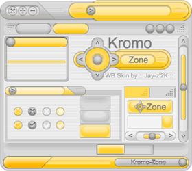
Kromo Zone
Average Rating: 9
Yours: -1
File Size: .06MB
Downloads Today: 0 Downloads Total: 10813

Kromo Zone

Updated May 22, 2001 by Jay-z2k


Sylva
Comment #1 Sunday, May 13, 2001 8:21 PM
I haven't downloaded it yet, but the screen shot looks great! I'll have to grab it later when I have time to actually use it for a while.
desumu
Comment #2 Monday, May 14, 2001 12:26 AM
I love this skin. Is it color customizable? The yellow makes the white text in the toolbar hard to read. Keep up the good work.
desumu
Comment #3 Monday, May 14, 2001 12:30 AM
Oh yea is it possible to have a version with the buttons on the right. I'm so used to the generic windows placement of buttons.
Mackintosh
Comment #4 Monday, May 14, 2001 12:42 AM
Beautiful skin, you have a winner here, but for God's sake, please either add custom colour support or have a few alternate versions, as the yellow is driving me insane
Aleksyandr
Comment #5 Monday, May 14, 2001 12:47 AM
Looks fantastic from the shot!
Jay-z2k
Comment #6 Monday, May 14, 2001 12:58 AM
Thanks for your comments. Ok, I will make a "right buttons" version ... and try to make a color customizable version update but I haven't many experience in color masks, so not sure of the result !
juni
Comment #7 Monday, May 14, 2001 1:37 AM
Innovative. Make a whole skin suite
misterME
Comment #8 Monday, May 14, 2001 2:03 AM
This is a nice start, though it has some rough edges, literally.

The skin is very soft, which is good. But it makes the rough edges in the titlebar stand out even moreso.

I like the way everything seems to flow together, Nice use of shapes and gradients.

I have to agree the yellow can be a bit much, though that's a taste thing.

Again, the only real flaws I can find is that the titlebar edges are very rough, which detracts from its look. And to make it stand out more, maybe you could colorize the titlebar buttons when moused-over. As it is, since your mouse is over the top of them when the symbols appear, it's a little hard to tell which one does what (especially considering their non-standard placement .
Jay-z2k
Comment #9 Monday, May 14, 2001 12:52 PM
lol, thank for your comment misterME, it was a little bit hard to translate your text but I agree with you, I will consider it to try to improve the design, but to blend the rounded border to match every background colors is not easy, for the windows control buttons, mouseover coloring is in progress (I wanted to finish it too fast I thonk ...)

I'm thinking more and more to make a skin suite ... so maybe !
Sylva
Comment #10 Monday, May 14, 2001 1:18 PM
your work really is pretty good. I haven't really spoken to anyone from the community skin projects lately, but it seems to me we should all be ready(hopefully) to work on another one soon. If you come up with anything you'd like a bunch of people to work on with you as a community project, why not just let us all know? Something similar to this would be great for it...*s*
DavidK
Comment #11 Monday, May 14, 2001 2:20 PM
Very nice skin! It would be nice if you made a GIF screenshot with transparency for the corners. The JPG is why the preview is so small.
Jay-z2k
Comment #12 Monday, May 14, 2001 3:25 PM
This should be great Sylva ! I would be honored to join your skin community, please e-mail me to speak about this ... And really many thanks for the proposition.
Sylva
Comment #13 Monday, May 14, 2001 8:09 PM
woah! slow down a minute. maybe I phrased it wrong. I am not the person in charge of the community skin projects. I was merely suggesting that you might be interested in it for future projects. I know that during the last project several people mentioned it would be nice to do something with a different style that the first two projects.
Sylva
Comment #14 Monday, May 14, 2001 8:11 PM
Oh, and as far as being a member f the skin community, you've been one since you made your first skin...*s* that's how we all get here...*s*
CygnusXII
Comment #15 Monday, May 14, 2001 10:30 PM
Nice Layout and I really like the left hand / right hand feature. I agree with others about the color selection, and would hope a color variation, might be in the works.
Jay-z2k
Comment #16 Tuesday, May 15, 2001 1:01 AM
That's what understood sylva ... maybe it's me who phrased it wrong
Jay-z2k
Comment #17 Thursday, May 17, 2001 12:58 AM
You can now customize colors for the two included skins ... enjoy
Jay-z2k
Comment #18 Saturday, May 19, 2001 7:55 AM
Someone contact me to start a theme ... so maybe OB, wallpaper, wmp7, beatnik, quicknotes, icq and more soon ... ! If other people vant to join us, you're welcome, a little help should be great
asyinni
Comment #19 Wednesday, August 22, 2001 1:46 PM
I download what i like. You in my list.

Please login to comment and/or vote for this skin.

Welcome Guest! Please take the time to register with us.
There are many great features available to you once you register, including:

  • Richer content, access to many features that are disabled for guests like commenting on the forums and downloading files.
  • Access to a great community, with a massive database of many, many areas of interest.
  • Access to contests & subscription offers like exclusive emails.
  • It's simple, and FREE!
Downloads remaining: 5
User Level: Visitor

Featured WindowBlinds

Popular WindowBlinds

Top WindowBlinds Skinners

Yesterday  |   Last 30 Days  |   All Time
1. LightStar 7353
2. don5318 4450
3. SimplexDesigns 3221
4. Vampothika 3188
5. adni18 2928
6. 2of3 1267
7. retiredmaster 1208
8. AeroPurple 761
9. SemoB 606
10. IceBabee 576
11. gmc2 570
12. BoXXi 542
13. DaveBax 513
14. jazzymjr 429
15. Dcrew57 422


web-wc01