Comment #42 Friday, November 26, 2004 6:36 AM
Comment #44 Friday, November 26, 2004 12:54 PM
Comment #45 Friday, November 26, 2004 12:58 PM
Comment #46 Friday, November 26, 2004 2:27 PM
Comment #47 Friday, November 26, 2004 8:44 PM
Comment #48 Friday, November 26, 2004 10:29 PM
Comment #51 Saturday, November 27, 2004 11:02 AM
Comment #52 Saturday, November 27, 2004 11:26 AM
Comment #53 Saturday, November 27, 2004 11:51 AM

Tecimo: I can´t see the link.
bordfryr: Using WindowBlinds Advance Configuration, choose the option "Change Skin Color".
Comment #54 Sunday, November 28, 2004 9:00 AM
Comment #55 Sunday, November 28, 2004 9:18 AM
I really like this theme but when I downloaded and installed it I could only see the blue one. How do I get the other colours? I tried looking at "change skin colour" but don't know what to do. Please help. Thanks
Comment #56 Monday, November 29, 2004 7:27 AM
Sent you you a new set of links that are good via email. Let me know what goes and will do whatever you need to be! Do notice the tray!!
Love your wb - it's the best!! LOL
The Car ~
Comment #57 Monday, November 29, 2004 7:35 AM
https://www.wincustomize.com/window.asp?
Comment #58 Monday, November 29, 2004 7:41 AM
https://www.wincustomize.com/window.asp?Cmd=AUTHORINFO&accountid=870827
Comment #59 Wednesday, December 1, 2004 6:53 AM
mojo jojo66: Using WindowBlinds Advance Configuration, choose the option "Change Skin Color". Then check "Enable custom colour support" and "Force the skin to have the colour even if it does not explicitly". Finally, just change the Hue.
Tecimo: I saw the last link. Nice!
 Soon I'll change my email, the one displayed here at WC is not working.
Comment #60 Wednesday, December 1, 2004 9:37 AM
Welcome back Patricia
Please login to comment and/or vote for this skin.
Welcome Guest! Please take the time to register with us.
There are many great features available to you once you register, including:
- Richer content, access to many features that are disabled for guests like commenting on the forums and downloading files.
- Access to a great community, with a massive database of many, many areas of interest.
- Access to contests & subscription offers like exclusive emails.
- It's simple, and FREE!


Comment #41 Friday, November 26, 2004 6:35 AM
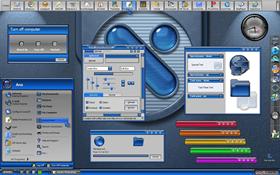
I'm not so sure about the mix of square buttond & round ones, I would have liked it more if they were all round..And then perhaps, make the buttons in the log off box blue...because the backround round the buttons is gray...and I thik they should be round too...and MAYBE, try making the close, min, max...etc, gray and the glyph blue??
I really like the gradient in the start panel and log off..would have liked to see it carried over into windows backgrounds, because the gray there is so much lighter...
Finally..disclaimer...As always not meant to be ugly...just suggestions and or MY preferences...it is a BEAUTIFUL skin..and I will use it!!
VERY nice job..thanks for sharing!!