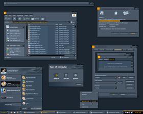
Envision
Average Rating: 8
Yours: -1
File Size: .26MB
Downloads Today: 0 Downloads Total: 40054

Envision

Updated Jun 21, 2005 by Dangeruss


First Previous Page 3 of 4 Next Last
Contour tracer
Comment #41 Friday, July 19, 2002 12:10 PM
This is very distinct so your not looking into a Flashlight yet it's not too Darque lines are very readable.

Thanks!!
docster
Comment #42 Saturday, July 20, 2002 6:51 AM
Excellent skin, Russ. Beautiful!

By the bye: Merryvale? cm = Component Manager.
c0d3r
Comment #43 Sunday, August 11, 2002 4:17 PM
is there any chances I can find a matching winamp and/or icq skin for this amazing one ?
Qkr
Comment #44 Monday, August 26, 2002 2:41 PM
WHERE DO I GET THE WALLPAPER FOR THIS??? DANGERUSS???
Snowman
Comment #45 Tuesday, June 21, 2005 1:37 PM

Brilliant!
Old skins rocks.

Thanks Mike.

Tsubasa10
Comment #46 Tuesday, June 21, 2005 1:42 PM
Wow, it may be old but it still rocks
Good job!
Thanx for ressurecting it, mike
titan
Comment #47 Tuesday, June 21, 2005 1:47 PM
Thanks Mike
BoddhiC
Comment #48 Tuesday, June 21, 2005 3:44 PM
I hope this starts a trend of updating some of Russ's fabulous skins to the new version of WB. For ages he was my favorite skinner. Alas, I don't really use his skins anymore as they lack so many of the newer WB features. I'd love to see more of them resurected, especially by a master of such caliber as Mike. Thanks for doing this one
fervc
Comment #49 Tuesday, June 21, 2005 4:41 PM
I agree this is a great update. I too would really like to see some of Dangeruss' stuff updated. Thanks MikeB314 for this update!
d0p3y2k4
Comment #50 Tuesday, June 21, 2005 4:43 PM
i like this alot anybody got a matching wallpaper ?
blazeaway
Comment #51 Tuesday, June 21, 2005 8:52 PM
No Problem with the dl on mine-XP Home,Intel Accel,latest WB,1.50G,6 yr.old GW. Problem ???,and yous guys forget,Dark colors and black fonts dun mix.Can't even see the 'submit'button very well.
Hus
Comment #52 Tuesday, June 21, 2005 11:12 PM
Classic! Nice update Mike...good to see one of Dangeruss' skins get new features.
--Gabriel
Comment #53 Tuesday, June 21, 2005 11:23 PM
The flat black areas look out of place, almost like the images are missing (such as the systray) its more of a personal preference thing I guess. I love the orange blue color scheme, very nice contrast. Its nice to see some older skins coming back.
Surj
Comment #54 Tuesday, June 21, 2005 11:44 PM
looks great
jalentorn
Comment #55 Wednesday, June 22, 2005 12:55 AM
Excellent Update.
LittleBearJason
Comment #56 Wednesday, June 22, 2005 1:20 AM
orange blue color scheme


I never knew those 2 colors mixed well
Jan Oscar
Comment #57 Wednesday, June 22, 2005 4:11 AM
Nothing more than WOW! to say, I guess. Excellent skin from the old master updated by one of the "new".
c242
Comment #58 Wednesday, June 22, 2005 5:04 AM
Thanks Mike Wonderful Update.

Ar3a51 : Fitting Wall by the Master himself : http://www.deviantart.com/deviation/686105/


Hmm, maybe the right time for some DX-Theme updating.
SPK23
Comment #59 Wednesday, June 22, 2005 6:41 AM
Welcome back!!!!!!!!

d0p3y2k4
Comment #60 Wednesday, June 22, 2005 10:18 AM
thx c242

Please login to comment and/or vote for this skin.

Welcome Guest! Please take the time to register with us.
There are many great features available to you once you register, including:

  • Richer content, access to many features that are disabled for guests like commenting on the forums and downloading files.
  • Access to a great community, with a massive database of many, many areas of interest.
  • Access to contests & subscription offers like exclusive emails.
  • It's simple, and FREE!
Downloads remaining: 5
User Level: Visitor

Featured WindowBlinds

Popular WindowBlinds

Top WindowBlinds Skinners

Yesterday  |   Last 30 Days  |   All Time
1. LightStar 7478
2. don5318 4712
3. SimplexDesigns 3184
4. Vampothika 3170
5. adni18 2777
6. 2of3 1382
7. retiredmaster 1304
8. AeroPurple 765
9. gmc2 682
10. IceBabee 622
11. SemoB 600
12. DaveBax 542
13. BoXXi 533
14. jazzymjr 453
15. Dcrew57 429


web-wc01