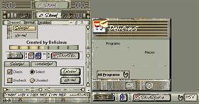
O Shoot
Average Rating: 5
Yours: -1
File Size: .33MB
Downloads Today: 0 Downloads Total: 6146

O Shoot

Updated Feb 11, 2003 by Delicious


PixieChick
Comment #1 Tuesday, February 11, 2003 12:09 PM
I love it! Great work...thanks!
George Rogers Jr
Comment #2 Tuesday, February 11, 2003 12:45 PM
Delicious, Just love the "marbled"" effect you've obtained with this. The colour selection & overall design is completely original & first rate...with BoXXi back designing & now Delicious... ...happy days are back! Thanks so much!
Delicious
Comment #3 Wednesday, February 12, 2003 6:18 AM
FWIW the screenshot is not a good preview. I chose to use the quick SkinStudio method because of a planned update when 4.o is released.
retiredmaster
Comment #4 Wednesday, February 12, 2003 8:42 AM
LOL - I like the "2 stupid buttons" comment
George Rogers Jr
Comment #5 Wednesday, February 12, 2003 6:10 PM
Sally, I can't get over the intricate design you've created...there are buttons/flip panels, minimize "border frame" buttons (integrated into the marble textures themselves), WBWinMenu 2.1 - again, under a "flip panel", sound effects...love the "ouch!" too! Must of taken sometime to complete. I just haven't had the time to discover all this! Lots of work here! Thanks again!
Delicious
Comment #6 Thursday, February 13, 2003 5:00 AM
Thank all of you for the nice words.
I have been working on this skin for awhile and made many changes. It is still not where I want it to be and plan to get it there by the time 4.0 is released.
I can't guarantee how this version will look under 4.0 because the new wb won't work on my machine.
Since I uploaded there has been changes made to the taskbar buttons, start button. Those two items still are not where I picture them to be.
Hopefully the next version I upload will get a better rating than what this version is getting.
Mighty Hog
Comment #7 Wednesday, February 19, 2003 6:06 PM
We love this one here at the Church of Hog. That wonderful impression of a very long, very pretentious project suddenly turned to shit for no apparent reason...and yet it's easy to use and perfectly legible. KEEP UP THE GOOD WORK
Delicious
Comment #8 Thursday, February 20, 2003 5:32 AM
Note:
I started to add the new WB 4.0 features but was unable to use the alpha version. There might be a 4.0 attribute in the code that I have overlooked deleting. One in particular is the glyph on the logoff button. Sorry! If you are running the alpha it will show a gap.
Delicious
Comment #9 Thursday, February 20, 2003 9:26 AM
Very eloquent comment, Mighty Hog. I am unfamiliar with the church of the hog but use to ride one. Maybe you would be able to interpret your comment for me
Ruthven
Comment #10 Thursday, February 27, 2003 8:57 AM
I have to say, while I like the concept of this, and it's more than obvious a lot of hard work went into it, I've found it very difficult to use. The "holes" in the titlebar are a really cool idea, but between that and the handwriting font, I really have to concentrate to read the title. I've also never been a fan of having to put your mouse on a button to see what it does, but that's just my personal preference.

Overall, though, this does give a great "organic feel" to your desktop, and there are features out the wazoo once you know where to find them!
Delicious
Comment #11 Thursday, February 27, 2003 1:58 PM
Thanks for your input Ruthven. I took a chance on the font because I was tired of the same ole font on every skin.

There is a new update soon to be released that is mucho better. I reworked everything and fixed a big problem there was with IE. The clock kept locking up the program so I had to remove it.

Please check back because the new version will be cowpond skin. One version for 3.5 and another for the new 4.o with many exciting changes.

Sorry I have to keep the notepad font. Just crazy. I did remove the hole in the new version.
jello B
Comment #12 Thursday, February 27, 2003 4:19 PM
zombies want your brain...oh and the prog is great too....ahem....aheh...
grrrr.....scary
adni18
Comment #13 Friday, February 28, 2003 9:06 PM
Not "cowpond" skin Delicious,
it is "Compound Skin".
It's my turn
adni18
Comment #14 Friday, February 28, 2003 9:08 PM
Great colors!
Delicious
Comment #15 Saturday, March 1, 2003 6:46 AM
If I use cowpond enough it just might catch on

Please login to comment and/or vote for this skin.

Welcome Guest! Please take the time to register with us.
There are many great features available to you once you register, including:

  • Richer content, access to many features that are disabled for guests like commenting on the forums and downloading files.
  • Access to a great community, with a massive database of many, many areas of interest.
  • Access to contests & subscription offers like exclusive emails.
  • It's simple, and FREE!
Downloads remaining: 5
User Level: Visitor

Featured WindowBlinds

Popular WindowBlinds

Top WindowBlinds Skinners

Yesterday  |   Last 30 Days  |   All Time
1. LightStar 6832
2. don5318 4383
3. Vampothika 3498
4. SimplexDesigns 3109
5. adni18 2472
6. 2of3 1365
7. retiredmaster 1184
8. AeroPurple 863
9. SemoB 644
10. BoXXi 575
11. DaveBax 571
12. IceBabee 565
13. gmc2 528
14. Dcrew57 443
15. jazzymjr 362


web-wc01