Comment #3 Monday, April 14, 2003 8:27 AM
Comment #5 Monday, April 14, 2003 9:27 AM
The items in the all programs menu seems to be a little of center vertically (ie "accessories" is on a line instead of centered within the box).
I hope that makes sense. I'm looking forward to the final release
Comment #6 Monday, April 14, 2003 10:05 AM
Comment #7 Monday, April 14, 2003 10:05 AM
beta release are a common VS themer practics, and im glad to see a Wb skinner doing the same.
why do my fonts look off! LOL
Comment #8 Monday, April 14, 2003 10:23 AM
Comment #10 Monday, April 14, 2003 11:42 AM
(https://www.wincustomize.com/skins.asp?Library=8&SkinID=4870)
@ GibMonkey - they look like the icons from here http://www.mmicons.com/ (MM Mercury X)
Comment #12 Monday, April 14, 2003 12:02 PM
Comment #13 Monday, April 14, 2003 12:16 PM
Comment #14 Monday, April 14, 2003 12:19 PM
can't wait for the final release
Comment #15 Monday, April 14, 2003 12:35 PM
you should add some more special function buttons (pin on top, roll up, etc.) on the top left corner of the title bar.
also, maybe make the turn off and log off buttons with some glass part in the middle, instead of just a plain grey button? hope this helps!
Comment #17 Monday, April 14, 2003 3:03 PM
Comment #18 Monday, April 14, 2003 7:13 PM
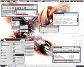
The main comment, suggestion is all to do with the menus. I had some real problems trying to get them to tile correctly, or even half-correctly. Normally I would have re-designed them and came up with something which wouldn't cause as many bugs, but as you can see from the LS preview it's one of the main features of the style/skin.
For the wallpaper used in the ss: It was the featured wallpaper today and was perfect to match the skin, I was so happy when I visited today and saw it there.
For the icons: They are actually from the BBX set of skins. These ones weren't made by Mikkel but were made by BB (Billy?) They look great at 16x16 and 32x32, but that's as high as they go I'm afraid. You should check bbxstudio.com for them in mac format. (I have a mac and so converted them for my own personal use)
Someone mentioned, more buttons in the titlebar...good point, but I set my WB up so that every skin rolls up on right click and goes on top with a double click on the titlebar, so that's two buttons I don't need to skin. No point adding clutter IMHO.
Comment #19 Monday, April 14, 2003 8:03 PM
Comment #20 Monday, April 14, 2003 8:07 PM
but how do u change the icons in explorer like the cut, copy, paste, back, so on??
apart the skin is looking really kool:)
would be nice to customize the turn off buttons:)
and add substile with normal menus perhaps so if u like the pic menus u can use them but for me it's a bit frustrating
it slows down the whole skin
Please login to comment and/or vote for this skin.
Welcome Guest! Please take the time to register with us.
There are many great features available to you once you register, including:
- Richer content, access to many features that are disabled for guests like commenting on the forums and downloading files.
- Access to a great community, with a massive database of many, many areas of interest.
- Access to contests & subscription offers like exclusive emails.
- It's simple, and FREE!


Comment #1 Monday, April 14, 2003 8:25 AM