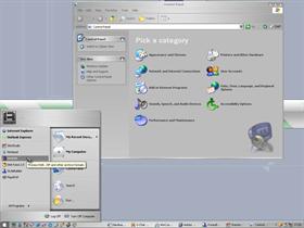
Itunes Graphite
Average Rating: 8
Yours: -1
File Size: .46MB
Downloads Today: 0 Downloads Total: 13073

Itunes Graphite

Updated Jun 20, 2003 by Vachon


First Previous Page 1 of 2 Next Last
c242
Comment #1 Friday, June 20, 2003 12:31 PM
This is nice. But what really bothers me about all those skins is the apple in it. I drive XP, no OS X and I have a PC, no Mac and I like it so I want a windows flag, damnit...
CodF4ther
Comment #2 Friday, June 20, 2003 12:57 PM
Fix the fonts (Title Bar and Start Menu), there's also something happening with the buttons. This could be great but you need to do more than run a VS through SkinStudio. There's still lots of tweaking to do...
Dacemtl
Comment #3 Friday, June 20, 2003 1:17 PM
Strong words c242, if you dislike Apple don't use skins that are rip-offs of Apple's interface and stick to your Windows-y, Fisher~Price-y Luna interface.

Nice skin, but it could be tweaked some more.
MikeB314
Comment #4 Friday, June 20, 2003 1:48 PM
Dacemtl, if any of us were content with our so-called "Windows-y, Fisher~Price-y Luna interface", we wouldn't be here downloading WindowBlinds skins, now would we. Of course your argument could be turned around and one could suggest that you go buy a Mac.

Nice looking skin, Vachon. Your best port yet.
c242
Comment #5 Friday, June 20, 2003 2:22 PM
Dacemtl : Maybe the smiley didn't show in Your browser ?
Urban1
Comment #6 Friday, June 20, 2003 3:23 PM
thanks all, you know, i first made one version of this port, but kol did not like the taskbar, so i had to make a new version until i saw that he liked it
treetog
Comment #7 Friday, June 20, 2003 6:34 PM
I usualy don't like Mac kind skins, but this one was really well done. The start Panel looks amazin. Thans for sharing GO! GO!
Surj
Comment #8 Friday, June 20, 2003 10:55 PM
love the skin, but I will have to replace the mac logo
mmekota
Comment #9 Saturday, June 21, 2003 7:37 AM
Ditto on losing the Mac logo. I once had to suffer with a powerbook at one job, and I hated it: I liked the look -- hated the rest.

I like computers and dont like having to pretend I have a metaphor instead. (Steve Jobs: if you're out there, why not call the next Mac the Mac "Metaphor"?)
Urban1
Comment #10 Saturday, June 21, 2003 7:57 AM
thanks all, thanks treetog, it means a lot coming from you
marercar
Comment #11 Saturday, June 21, 2003 1:49 PM
very nice.
whiteorchids
Comment #12 Sunday, June 22, 2003 10:06 AM
First of all, I would like to thanks Vachon for such a great skin . Secondly, I would like to ask any1 who know how to make the icons on the RHS of the start menu look big while the 1 on the LHS look as normal (Refer to the preview shot). Because the icons on my start menu didn't show like the preview pic. Any help would be very much apreciated!!!
Fred Hall
Comment #13 Sunday, June 22, 2003 10:13 AM
I think this is a really good iTunes skin. The only things I would add if you do an update are:
1) A choice for a metallic "flag" start button (along the same look as the apple you have now)
2) Increase the size of the titlebar/taskbar item fonts
Kitetrip
Comment #14 Sunday, June 22, 2003 12:25 PM
Woooaaahhh ! Very good job, with Object Bar, it's very beautiful !
lilaug
Comment #15 Sunday, June 22, 2003 10:06 PM
I lovvvve the skin- and also, the wallpaper looks pretty nice with it. Where did you get the wallpaper , by the way?

Dacemtl
Comment #16 Sunday, June 22, 2003 11:46 PM
I already have a Macintosh Mike, since I'd rather have the real thing than a cheap imitation (or as mmekota calls it: a "metaphor"). treetog, this isn't a "Mac kind skin", it's a rip off of Apple's GUI. And it isn't "the mac logo", it's the Apple computers logo...the Macintosh logo is completely different.

Why do people call the Windows logo a flag?? It's a "flying" window; or at least it was until Microsoft took away the frame, now it's "flying" glass panes. Goes to show how Microsoft sucks, they can't even make a proper logo.
roweiage
Comment #17 Monday, June 23, 2003 3:17 AM
Wow Dacemtl, hasn't someone got their trolling hat on today?

Bad RoweIAGE, musn't feed the troll, he'll never leave from under the bridge if you do...
CAClark
Comment #18 Monday, June 23, 2003 6:43 AM
This is great in every way, but I do notice that the window buttons (min max etc) are slightly mis-aligned on the mouse over?

Cheers!
mgFOX108
Comment #19 Wednesday, June 25, 2003 10:41 AM
Is there going to be a version of this skin with regular aqua color buttons and such? I love the skin.
Alberto Callerio
Comment #20 Saturday, June 28, 2003 5:22 AM
very nice

Please login to comment and/or vote for this skin.

Welcome Guest! Please take the time to register with us.
There are many great features available to you once you register, including:

  • Richer content, access to many features that are disabled for guests like commenting on the forums and downloading files.
  • Access to a great community, with a massive database of many, many areas of interest.
  • Access to contests & subscription offers like exclusive emails.
  • It's simple, and FREE!
Downloads remaining: 4
User Level: Visitor

Featured WindowBlinds

Popular WindowBlinds

Top WindowBlinds Skinners

Yesterday  |   Last 30 Days  |   All Time
1. LightStar 6649
2. don5318 4907
3. Vampothika 3524
4. SimplexDesigns 3079
5. adni18 2671
6. 2of3 1462
7. retiredmaster 1262
8. gmc2 832
9. BoXXi 728
10. DaveBax 689
11. AeroPurple 665
12. IceBabee 650
13. SemoB 645
14. jazzymjr 623
15. Dcrew57 450


web-wc01