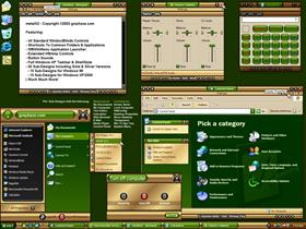
metalX2
Average Rating: 10
Yours: -1
File Size: .84MB
Downloads Today: 1 Downloads Total: 65994

metalX2

Updated Jul 10, 2003 by grayhaze


First Previous Page 6 of 8 Next Last
DarkMist
Comment #101 Sunday, July 13, 2003 7:39 PM
Excellent work
Frogboy
Comment #102 Sunday, July 13, 2003 7:42 PM
Looking forward to the silver version. This skin definitely rocks.
grayhaze
Comment #103 Sunday, July 13, 2003 8:02 PM
The silver version's already done Frogboy. Perhaps you mean the steel version?
EventHorizon
Comment #104 Sunday, July 13, 2003 10:16 PM
D*mn nice job grayhaze
Justin_9733
Comment #105 Monday, July 14, 2003 4:02 AM
Nice work, this is now my favorite WB skin, I would like a blue version of it though.
Justin_9733
Comment #106 Monday, July 14, 2003 4:03 AM
Nice work, this is now my favorite WB skin, I would like a blue version of it though.
Kerry Rosbrook
Comment #107 Monday, July 14, 2003 8:23 AM
I just love this skin!! Since I am not as computer savvy as many here, I thouhgt I would pose this question. I have read the user manual and have been able to figure just about everything out. Am I missing some step as to having the logoff panel match as well? Mine is still the blue one that is basic to XP. Any suggestions would be greatly apprecitated.

grayhaze
Comment #108 Monday, July 14, 2003 9:25 AM
No special steps are required to get the new logoff panel. Just make sure that you're using at least version 4 of WindowBlinds, as this feature wasn't supported in previous versions.
RichW
Comment #109 Monday, July 14, 2003 1:13 PM
Stunning....
RaZ0r68
Comment #110 Monday, July 14, 2003 2:27 PM
I've been one of the first five to give comments - I switched to silver as it's no so "heavy" on the eyes ;o) I guess this is just personal taste. However, the few glitches have been pointed out, are you going to correct them ? I'm not sure if it was mentioned already, but I would like to see beveled mouseover-effects, too. Furthermore a blueish sort of skin would be terrific.

rgds, Husker
Keila
Comment #111 Monday, July 14, 2003 2:39 PM
Very, very nicely done.
SlothMan
Comment #112 Tuesday, July 15, 2003 10:43 PM
Grat skin!! Love tha colors!!
Great Job!!
grayhaze
Comment #113 Thursday, July 17, 2003 6:45 AM
Thank you to those who have made a donation.

Development continues, and some new additions should be released in the next week or so.

http://grayhaze.com/docs/metalX2.htm#donate
carolelee
Comment #114 Thursday, July 17, 2003 9:57 PM
This is totally my fav!! Gold and green go so good together!!I look forward to the silver, too sharp!!Will this be in winstyles, hope so!!
Floymin
Comment #115 Saturday, July 19, 2003 12:28 PM
Fantastic! I have been waiting for someone to use Gold skins. Although Green is less than my fave, I'm glad that at least it's not silver, grey or blue.
sthrncin
Comment #116 Monday, July 21, 2003 9:38 PM
LOL My high school colors! I love this one. So nicely done.
mzfhredi
Comment #117 Monday, July 28, 2003 6:52 PM
I should just make a "grayhaze" folder in my puter, ya know! Been using WB for YEARS and I must admit that this is the first skin I can't seem to change from. The 'clock' I LOVE as I don't need extra stuff in my taskbar or on my desktop AND my most used proggys are a click away from where my cursor seems to spend much of its time...the titlebar! If you haven't given this a 'looksee', DO IT! I can't believe this is free! The 'Machine' wall goes quite well with the silver. "The Green" wall also works quite well with the Gold!
Nutshell7004
Comment #118 Tuesday, July 29, 2003 10:49 AM


Great job as always grayhaze.

kcrlshell
Comment #119 Thursday, July 31, 2003 4:25 PM
These are just the colors (gold/green) that I've been looking for! However, I do have a problem that crops up on many skins, including this one..anyone's help would be appreciated. It's backgrounds. I have carefully confirmed that I have the "use backgroun bitmaps" UNchecked..and also confirmed that I have the backgrounds override "unchecked" and still I get that gray with ovals background on many windows both mdi and os related. For instance, on this skin the "display" properties window outermost layer (where the apply, cancel and okay buttons are) has that blasted .bmp. I'm sure that's not intended as it looks awful. I even tried removing those files (wb.bmp, wbmdi.bmp) from the windowblinds directory and they still showed up! How is that even possible?
TheGuest
Comment #120 Monday, August 18, 2003 12:59 AM
LOVE the remake! Thanks!!

Please login to comment and/or vote for this skin.

Welcome Guest! Please take the time to register with us.
There are many great features available to you once you register, including:

  • Richer content, access to many features that are disabled for guests like commenting on the forums and downloading files.
  • Access to a great community, with a massive database of many, many areas of interest.
  • Access to contests & subscription offers like exclusive emails.
  • It's simple, and FREE!
Downloads remaining: 5
User Level: Visitor

Featured WindowBlinds

Popular WindowBlinds

Top WindowBlinds Skinners

Yesterday  |   Last 30 Days  |   All Time
1. LightStar 7247
2. don5318 4399
3. SimplexDesigns 3188
4. Vampothika 3181
5. adni18 2918
6. 2of3 1265
7. retiredmaster 1203
8. AeroPurple 754
9. SemoB 612
10. gmc2 567
11. IceBabee 565
12. BoXXi 531
13. DaveBax 502
14. jazzymjr 424
15. Dcrew57 417


web-wc01