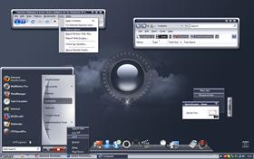
sotArt II
Average Rating: 9
Yours: -1
File Size: .38MB
Downloads Today: 1 Downloads Total: 74597
Vista Ready

sotArt II

Updated Jun 22, 2009 by adni18


First Previous Page 5 of 6 Next Last
Valhalla
Comment #81 Wednesday, September 10, 2003 3:56 AM
Oops - sorry. Make that "Featured"
adni18
Comment #82 Wednesday, September 10, 2003 4:41 AM
Oh! I didn't noticed it.
Thanks Kevin

Thank you also WinCustomize for the Featured Skin
fire_xox
Comment #83 Wednesday, September 10, 2003 8:49 PM
is good but you can do better then that
adni18
Comment #84 Thursday, September 11, 2003 2:12 AM
I am sure I can
Thanks for the comment fire_xox
danioc
Comment #85 Thursday, September 11, 2003 1:29 PM
perfect
adni18
Comment #86 Thursday, September 11, 2003 1:53 PM
Thanks danilloOC
RadialFX
Comment #87 Thursday, September 11, 2003 6:36 PM
Nikos, This is such wonderful work my friend. Thank you very much. I always look forward to your work. But then, you know that! Take care.
adni18
Comment #88 Thursday, September 11, 2003 7:09 PM
Thanks Randy
Take care too!
DocX
Comment #89 Saturday, September 13, 2003 10:28 AM
Great job Nikos!! It looks great!
adni18
Comment #90 Saturday, September 13, 2003 11:05 AM
Thanks Mark
aX3L
Comment #91 Tuesday, September 16, 2003 5:18 AM
This is a cool skin but, there's something that bothers me, some buttons have the name in black, and it's so dificult to read theme
adni18
Comment #92 Tuesday, September 16, 2003 12:30 PM
Thanks aX3L
It bothers me too, it happens only in Internet Explorer and I don't know what is going on.
The text on these buttons should be white...but they are not
TSR7
Comment #93 Wednesday, September 24, 2003 5:22 AM
Adni love this skin... tru gem as always.. one question tho.. my icons next to the start text ( bottom left) have an odd pink background.. any ideas how i sort this..

Thanks again for another great theme
adni18
Comment #94 Thursday, September 25, 2003 3:07 AM
Thank you TSR7
The pink you have mention, it is the color for transparency and it should not appear. I don't know for which reasons it is appearing to you
JohnWebb
Comment #95 Thursday, October 16, 2003 1:10 PM
I *LOVE* this skin, it has become the only one I use. Excellent use of color and shading, very nicely done. Now of course you knew there had to be an except coming, and there is. The only thing that really bugs me about this skin is the menu buttons. If they were the same color as the menu bars like they are in outlook (I believe this is because the menu is outlook is actually a tool bar) it would be a perfect skin. Just my two cents. Excellent job!
adni18
Comment #96 Thursday, October 16, 2003 7:08 PM
Thank you very much JohnWebb
palefire
Comment #97 Wednesday, October 22, 2003 4:30 AM
Fantastic skin. Beautifully done and, unlike many cool skins, easy to read. My only problem is in IE, my Google Bar messes up the spacing. But all in all a great job. Looking forward to more examples of your talent.
adni18
Comment #98 Wednesday, October 22, 2003 7:53 PM
Thank you very much palefire

What is exactly the problem with IE?
I know that it has black text in IE dark buttons, I will fix this problem, what else?
palefire
Comment #99 Thursday, October 23, 2003 2:27 PM
Thanks for the response. I should have been more precise. There is a space under, and surrounding, the Google Bar and some text appears to be out of allignment. When I move up the browser window the space shifts to the side. I'll send you a couple of partial screenshots which will show it. Thanks.
adni18
Comment #100 Thursday, October 23, 2003 5:10 PM
Thanks for your info and the screenshots palefire

I guess, that this is caused by the "Google Menu" script, it has nothing to do with my skin.
If it was a skin problem all the other menus would have the same problem too.

Regards

Please login to comment and/or vote for this skin.

Welcome Guest! Please take the time to register with us.
There are many great features available to you once you register, including:

  • Richer content, access to many features that are disabled for guests like commenting on the forums and downloading files.
  • Access to a great community, with a massive database of many, many areas of interest.
  • Access to contests & subscription offers like exclusive emails.
  • It's simple, and FREE!
Downloads remaining: 5
User Level: Visitor

Featured WindowBlinds

Popular WindowBlinds

Top WindowBlinds Skinners

Yesterday  |   Last 30 Days  |   All Time
1. LightStar 6903
2. don5318 4358
3. Vampothika 3649
4. SimplexDesigns 3184
5. adni18 2611
6. 2of3 1372
7. retiredmaster 1205
8. AeroPurple 899
9. SemoB 656
10. DaveBax 609
11. IceBabee 584
12. gmc2 574
13. BoXXi 541
14. Dcrew57 444
15. jazzymjr 345


web-wc01