


Phoon
Comment #3 Saturday, January 10, 2004 6:45 PM
Comment #3 Saturday, January 10, 2004 6:45 PM
Looks nice, but it would be better with a different start button
kongit
Comment #4 Saturday, January 10, 2004 6:58 PM
Comment #4 Saturday, January 10, 2004 6:58 PM
thats what I think to. the sides of the windows don't match up right with the top either. but it is nice overall.
I.R. Brainiac
Comment #5 Sunday, January 11, 2004 12:09 AM
Comment #5 Sunday, January 11, 2004 12:09 AM
Frogboy,I'm confused somewhat...hehe I thought the purpose of WB was to get AWAY from microsoft. 

Cdanr
Comment #6 Sunday, January 11, 2004 8:53 AM
Comment #6 Sunday, January 11, 2004 8:53 AM
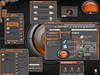
I love it but I changed the width of the user pane in the start panel from 250 to 240. That got rid of the one or two letters of the place descriptionthat were showing in the place panel. I think the skin is awesome.


I am Korean
Comment #7 Sunday, January 11, 2004 9:54 AM
Comment #7 Sunday, January 11, 2004 9:54 AM
Suffered making. LOL
Color of next time version should like to be broken more.
Color of next time version should like to be broken more.

rkd
Comment #8 Sunday, January 11, 2004 10:19 AM
Comment #8 Sunday, January 11, 2004 10:19 AM
Finally, a nice replacement of the default windows style. Microsoft needs some new graphics designers, because i think the ones now are color blind. The colors look great frogboy, but i hate windows lol.
rating: 8
rating: 8
ka darko
Comment #9 Sunday, January 11, 2004 11:51 AM
Comment #9 Sunday, January 11, 2004 11:51 AM
Nice one good contrast grey and green thanks for sharing
zaphman
Comment #10 Friday, January 23, 2004 6:21 AM
Comment #10 Friday, January 23, 2004 6:21 AM
Looks good, but why not add the the "put on top"/"nail" and roll up functionality as title bar buttons? I really find these functions soo handy, and makes the system more usable
anoldgoat
Comment #11 Thursday, March 18, 2004 11:00 AM
Comment #11 Thursday, March 18, 2004 11:00 AM
better colour! (why does everyone think blue is cool?)
Would like it more if but for
1) the places section is too narrow to see stuff -
2) start button. nice colour, but still the naff style.
Would like it more if but for
1) the places section is too narrow to see stuff -
2) start button. nice colour, but still the naff style.
srdiamond
Comment #13 Friday, July 22, 2005 1:16 PM
I thought, "Which of us is blind for distinguishing green from blue?" But the color picker says we're both wrong (or right). The main color is exactly evenly balanced for the two colors. (Of the three Luna replacements I've seen--Elegant Luna, Luna Alt, and SouLuna--Elegant is the greenest.) Anyway, I think the color is great, all around. My only reservation concerns what is absent. Why do none of the Luna substitutes provide the three-dimensional toolbar for Office 2003 applications? It not only looks cool (some may disagree), but it helps maintain the visual separateness of the rows of toolbar icons (which I don't think is a subjective aspect).
Stephen Diamond
Comment #13 Friday, July 22, 2005 1:16 PM
| better colour! (why does everyone think blue is cool?) |
I thought, "Which of us is blind for distinguishing green from blue?" But the color picker says we're both wrong (or right). The main color is exactly evenly balanced for the two colors. (Of the three Luna replacements I've seen--Elegant Luna, Luna Alt, and SouLuna--Elegant is the greenest.) Anyway, I think the color is great, all around. My only reservation concerns what is absent. Why do none of the Luna substitutes provide the three-dimensional toolbar for Office 2003 applications? It not only looks cool (some may disagree), but it helps maintain the visual separateness of the rows of toolbar icons (which I don't think is a subjective aspect).
Stephen Diamond
Please login to comment and/or vote for this skin.
Welcome Guest! Please take the time to register with us.
There are many great features available to you once you register, including:
- Richer content, access to many features that are disabled for guests like commenting on the forums and downloading files.
- Access to a great community, with a massive database of many, many areas of interest.
- Access to contests & subscription offers like exclusive emails.
- It's simple, and FREE!


Comment #1 Saturday, January 10, 2004 5:48 PM