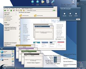
Velvet Waves
Average Rating: 8
Yours: -1
File Size: .4MB
Downloads Today: 1 Downloads Total: 55768

Velvet Waves

Updated Sep 15, 2004 by Woodbridge


First Previous Page 4 of 7 Next Last
Woodbridge
Comment #61 Sunday, February 1, 2004 8:14 AM
I don't really want to add any extra buttons to the title bar, I think it will ruin the look. The only way I would do it would be to use the small waves to the left of the min/max/close as indicators. I would probably have them highlight yellow when active. But I've no idea how to do that.

Mr XX, what version of Windows and what version of Windowblinds are you using? I'm seeing the classic startbutton ok here.
zaphman
Comment #62 Sunday, February 1, 2004 8:51 AM
Isn't there a "Shom image if...". Where if can be "ontop" "colapsed" etc. I'm not a theme editor, so I'm not really sure how it works. If so, an change in color on the waves should be nice. I don't want to argue around your artistic freedom Again, I really like the view of my desktop using this skin. Good work.
Woodbridge
Comment #63 Sunday, February 1, 2004 9:43 AM
ooo I think thats getting into scripting I'll take a look over the next week to see what I can do (no promises), will check with ThemeNorth about adding elements to the skin, as the style is his design.
XX
Comment #64 Sunday, February 1, 2004 1:14 PM
WB latest non-beta

Windows xp SP1
Vageli
Comment #65 Sunday, February 1, 2004 2:04 PM
Excellent theme indeed.

One thing though: progress bars, like the download bar from ie, show no progress (no color bar) within, because the progress line is very thin. Could that be addressed in a future release?

Thank you.
Woodbridge
Comment #66 Sunday, February 1, 2004 2:06 PM
No idea how to get the classic taskbar and have windows skinned on XP, so I can't check that (I use Window 2000 as well as XP). I can get the classic Startmenu up, but the taskbar remains skinned a-la XP.
Malakai2u
Comment #67 Sunday, February 1, 2004 4:56 PM
real nice skin had some minor probs such as the wave in the start panel not lining up, and the word all programs is way to the left and I can only see rograms.and the please wait window has a pink box in it top right. I am running XP and have WB4 bought so I dont know why I am having these probs. I was wondering if anyone can tell me how (in the start panel) to get the right side to be just icons with out the words as in this skins start panel...Please let me know......
Woodbridge
Comment #68 Sunday, February 1, 2004 5:45 PM
You need the latest version of Windowblinds otherwise the Startmenu will look wrong. Try entering the email you registered with on the https://www.stardock.com/support page and get the latest version, but you might have to wait untill the next non-beta release for it to work. The 'Please Wait' dialog - I can make it look not as bad... but it will always be moved slightly to the side on the 'Please Wait' dialog. Best I can do untill that dialog accepts 'magic pink'
Surutsjs
Comment #69 Monday, February 2, 2004 10:29 PM
hey the skin is really very nice ... hope u could come up with some different colour skins it would be very great keep up the great work..
qc832
Comment #70 Tuesday, February 3, 2004 6:15 PM
EXCELLENT skin, I agee on colors, would love more of them
Woodbridge
Comment #71 Tuesday, February 3, 2004 6:22 PM


It has custom colour support...you can pick what colours you want
garsgolfer
Comment #72 Wednesday, February 4, 2004 7:52 PM
Great skin, However, when I select the start key, there's a missing image for undock computer. All I see is a small square black box.
Woodbridge
Comment #73 Thursday, February 5, 2004 3:58 AM
Will add one in the next update
hitop
Comment #74 Thursday, February 5, 2004 12:05 PM
I like this skin a lot. The Start menu threw me off at first. Should I see "All Programs" somewhere? I didn't notice the wave highlight until after having used it for a bit.

Aside from that though, it's great. It's the first things I've used since downloading Squareness a while back. Like that one, this is nice, clean, simple. Thanks!
freezejeans
Comment #75 Monday, February 9, 2004 10:54 AM
This just keeps getting better! Thank you for the updates, I'm still using this skin and love it
SLing
Comment #76 Tuesday, February 10, 2004 6:27 AM
Friggin AWESOME skin, dude. One of the best I've seen.
danioc
Comment #77 Wednesday, February 11, 2004 6:22 AM
Awesome work
harrison1701
Comment #78 Thursday, February 12, 2004 4:58 AM
It's a beauty!
Woodbridge
Comment #79 Thursday, February 12, 2004 10:42 AM
updated the preview image...whoops
Mark Jaquith
Comment #80 Friday, February 13, 2004 7:01 AM
The only way I think this could be better is if the "Start" button looked better when the taskbar is doublesized. It sort of ends abruptly... maybe the image could just be repeated down? I don't know if this is possible.

Please login to comment and/or vote for this skin.

Welcome Guest! Please take the time to register with us.
There are many great features available to you once you register, including:

  • Richer content, access to many features that are disabled for guests like commenting on the forums and downloading files.
  • Access to a great community, with a massive database of many, many areas of interest.
  • Access to contests & subscription offers like exclusive emails.
  • It's simple, and FREE!
Downloads remaining: 5
User Level: Visitor

Featured WindowBlinds

Popular WindowBlinds

Top WindowBlinds Skinners

Yesterday  |   Last 30 Days  |   All Time
1. LightStar 7247
2. don5318 4399
3. SimplexDesigns 3188
4. Vampothika 3181
5. adni18 2918
6. 2of3 1265
7. retiredmaster 1203
8. AeroPurple 754
9. SemoB 612
10. gmc2 567
11. IceBabee 565
12. BoXXi 531
13. DaveBax 502
14. jazzymjr 424
15. Dcrew57 417


web-wc01