Comment #2 Wednesday, January 28, 2004 7:17 AM
Comment #3 Wednesday, January 28, 2004 7:46 AM
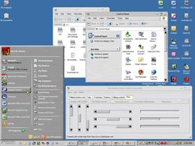
- The buttons (minimize, maximize, close) are not very good. Try to use some kind of blending (TGA or PNG).
- The taskbar buttons could be also more blend, use more smooth.
- The windows should have a thin border, like a black line.
- The scrollbar are too old fashion, maybe they could be more modern style.
That's everything for now.
Keep the the good work.
Comment #4 Wednesday, January 28, 2004 8:31 AM
Comment #5 Wednesday, January 28, 2004 1:54 PM
Babyface:
1:I agree, but I'm not much of an artist. I actually have a set of traffic light style buttons, but I wanted to keep the skin consistant. I'll have to look into it.
2:I take it that you prefer the softer style (Start Panel) to the harder edge?
3:I kept debating that too, but I figured that I'd release it and see what everyone said.
4:Do you mean just the arrows or the entire bar? The arrows remind me of my old Mac Plus (which was kind of intentional). I have a set with the softer style ready to go.
Please login to comment and/or vote for this skin.
Welcome Guest! Please take the time to register with us.
There are many great features available to you once you register, including:
- Richer content, access to many features that are disabled for guests like commenting on the forums and downloading files.
- Access to a great community, with a massive database of many, many areas of interest.
- Access to contests & subscription offers like exclusive emails.
- It's simple, and FREE!


Comment #1 Tuesday, January 27, 2004 7:49 PM