


 |
|
Page 1 of 2 |
|---|
bluesman219
Comment #2 Saturday, March 27, 2004 12:05 PM
Comment #2 Saturday, March 27, 2004 12:05 PM
Looks good P. I'm going to d/l and try it out. Thanks..
Luthorcrow
Comment #3 Saturday, March 27, 2004 12:47 PM
Comment #3 Saturday, March 27, 2004 12:47 PM
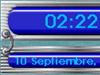
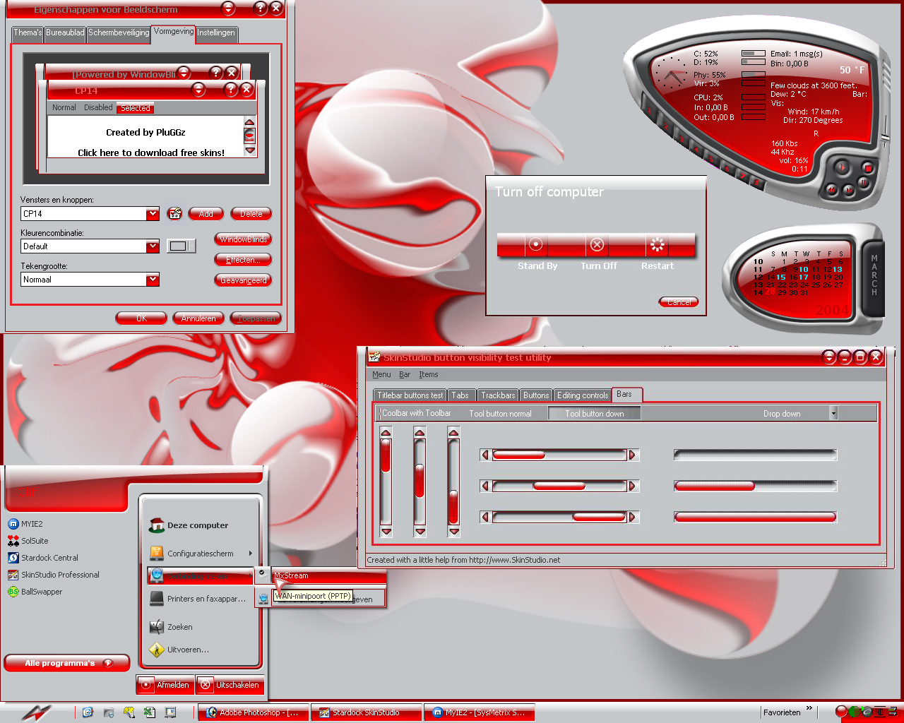
Looks great! We definitely need more good red skins. That said there two things I think that could be fixed.
1) The placement of user picture seems odd. Feels like it should be centered and a little larger.
2) The placement of user name seems a bit off as well. Would suggest putting in the gray space above documents or centering more on the red portion of the start bar.
3) Lastly the time and date seemed to far apart veritically. They are hard to read. Bringing them closer to getter would look better.
The peanut gallery has spoken. Thanks, good stuff!

Lord Doskias
Comment #4 Saturday, March 27, 2004 1:55 PM
Comment #4 Saturday, March 27, 2004 1:55 PM
another great skin with an odd name, hehe, the colors are perfect for this skin tho
but the date and time are a problem
but the date and time are a problem

kingtut19651952
Comment #5 Saturday, March 27, 2004 2:18 PM
Comment #5 Saturday, March 27, 2004 2:18 PM
Very nice work I like the colors keep up the great work 

pinchecl
Comment #6 Saturday, March 27, 2004 2:19 PM
Comment #6 Saturday, March 27, 2004 2:19 PM
Thanks people. Luthorcrow, I've taken notie of your peanuts.Got two problems though. Whatever I do I can't get the user name right where I want it. And I disabled the userpicture in my xp but I somehow can't enable it again to check that out. Any suggestion??? 

pinchecl
Comment #7 Saturday, March 27, 2004 2:22 PM
Comment #7 Saturday, March 27, 2004 2:22 PM
tnx jmcjmk, doskias. About the date and time. I can see date and time together only when I pull the taskbar a bit up. How can I change that?? As soon as I found out how to solve those "tiny" problems I'll do an update....
Essencay
Comment #8 Saturday, March 27, 2004 3:43 PM
Comment #8 Saturday, March 27, 2004 3:43 PM
Nice colors overall nice appearance but there are a few missing bits....
- Vertical Taskbar
- Taskbar Grippers (that's why you can't resize the taskbar)
- Control Panel Image and the Control Panel Header colors aren't set.
- Vertical Taskbar
- Taskbar Grippers (that's why you can't resize the taskbar)
- Control Panel Image and the Control Panel Header colors aren't set.
Chickie
Comment #10 Saturday, March 27, 2004 4:56 PM
Comment #10 Saturday, March 27, 2004 4:56 PM
I love this red. Looks like strawberry flavor skin. Thanx, Pinchecl. 

Thanx, Pinchecl. 

NightTrainthedark
Comment #11 Saturday, March 27, 2004 5:34 PM
Comment #11 Saturday, March 27, 2004 5:34 PM
I like the red glassy transparent scheme. There are a few minor text issues and the start panel is a little rough. Good work otherwise!
devdotnull
Comment #13 Saturday, March 27, 2004 10:43 PM
Comment #13 Saturday, March 27, 2004 10:43 PM
Having trouble reading text (pale white on gray?)
Make it easy to read, please.

Make it easy to read, please.

pinchecl
Comment #14 Sunday, March 28, 2004 12:47 AM
Comment #14 Sunday, March 28, 2004 12:47 AM
thanks for those comments people. I will look into all issues...and hope I can solve them
Pabloo
Comment #16 Sunday, March 28, 2004 5:52 AM
Comment #16 Sunday, March 28, 2004 5:52 AM
Wow, nice looking. Very creative, but not obnoxious. I hope that Weather/Player universal cool gadget thingy is in the desktopX gallery. I'm going there next.
pinchecl
Comment #17 Sunday, March 28, 2004 9:41 AM
Comment #17 Sunday, March 28, 2004 9:41 AM
tnx sadaam insane. Pabloo, that gadget isn't desktopx, it's sysmetrix and I used my P139 4smx for it.....
ranpat
Comment #18 Sunday, March 28, 2004 4:40 PM
Comment #18 Sunday, March 28, 2004 4:40 PM
what about the wall where can i find it,nice job keep up the goog work.
pinchecl
Comment #19 Monday, March 29, 2004 12:30 AM
Comment #19 Monday, March 29, 2004 12:30 AM
the wall wasn't included ranpat so I just uploaded it. It should be available by now....
Old_Crab
Comment #20 Monday, March 29, 2004 3:48 AM
Comment #20 Monday, March 29, 2004 3:48 AM
Excellent skin. WC need more red and green skins. Not purple though. One small problen is the grips on the task bar. I tend to need alot of extra room up yonder.
Crab rated: 8.33

Crab rated: 8.33

Please login to comment and/or vote for this skin.
Welcome Guest! Please take the time to register with us.
There are many great features available to you once you register, including:
- Richer content, access to many features that are disabled for guests like commenting on the forums and downloading files.
- Access to a great community, with a massive database of many, many areas of interest.
- Access to contests & subscription offers like exclusive emails.
- It's simple, and FREE!
|
|
Page 1 of 2 |
|---|


Comment #1 Saturday, March 27, 2004 12:02 PM