Comment #2 Sunday, May 23, 2004 9:26 AM
Comment #3 Sunday, August 29, 2004 3:07 PM
Comment #4 Tuesday, September 7, 2004 9:54 AM
Comment #9 Tuesday, January 25, 2005 12:39 AM

Comment #10 Tuesday, January 25, 2005 1:20 AM

Comment #11 Tuesday, January 25, 2005 6:18 PM
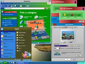
1) Blend your buttons with the backgrounds better.
2) Jazz up the titlebar with some easter-egg graphics all the way across.
3) Add some color to that close/minimize/maximize button.
Comment #12 Wednesday, February 2, 2005 2:59 PM


2. I could use clipart for titlebar, but that would be distracting. The preview doesnt show the active state. It is actualyy colorful.
3. Maybe. Maybe. Maybe I could, but again that would affect visibility. Maybe animate it when mouseover?
Comment #13 Sunday, February 27, 2005 3:51 PM
You can try www.ozones.com or www.phong.com for some really good tutorials.
Keep it up.
Comment #18 Thursday, March 10, 2005 5:31 AM

*Try Again and make it better*
Comment #19 Monday, March 14, 2005 4:49 PM
Please login to comment and/or vote for this skin.
Welcome Guest! Please take the time to register with us.
There are many great features available to you once you register, including:
- Richer content, access to many features that are disabled for guests like commenting on the forums and downloading files.
- Access to a great community, with a massive database of many, many areas of interest.
- Access to contests & subscription offers like exclusive emails.
- It's simple, and FREE!


Comment #1 Friday, May 7, 2004 3:44 AM
You might want to try making each part of the scheme fit into a previously thought out design though. This looks very "thrown together".
Keep at it.