Comment #522 Tuesday, November 1, 2005 7:34 PM

If the skin had a shadows option, this would be my primary. Awesome work!

Comment #523 Tuesday, November 1, 2005 7:36 PM
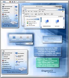
I was devastated with the start menu not displaying properly and appearing disjointed. I tried adjusting user overides to modify font style and size, to no effect. After reading this forum I used skinstudio to change the top and bottom of the start menu to stretch instead of tile. This did the trick for the full menu, which is what i like, and it looks seamless now.
The compact menus however still appear weird in that they are not completely compact but are showing part of the options they are meant to hide, and the new icons don't appear as they should in the picture of this skin. No idea how to fix that. If somebody knows the fix to that could they fix the compact menus, the standard menus, rezip it and post it on this site? I think this problem is very common for this skin.
Again, brewman thanks a million for this awesome skin, it's sweet.

Comment #524 Tuesday, November 1, 2005 7:59 PM
Check and see if this is not your problem.
You shouldn't be messing with those start panel settings, or
suggest someone fix it, zip it, and re-post!

Comment #525 Wednesday, November 2, 2005 6:38 AM
| For those people having trouble with this skin and others, please post your problems to the support forums. I'm as sure as I can be, that your problems are not related to the Dogmax Skin. |
Hmmm...
And yet I don't have problems with other skins. One possibility: does DogmaX properly handle 64x64 px icons? That's what I'm using (via IconPackager).
Comment #526 Wednesday, November 2, 2005 8:17 AM
if that's too big of a burden for you, use a different skin .... problem solved.

Comment #527 Wednesday, November 2, 2005 8:39 AM
 By the way, sometimes, when i open my start menu and i move my cursor oveer the items they aren't highlighted and at other times they are. Why is this?? Im using wb 4.5
Comment #528 Wednesday, November 2, 2005 10:14 AM
if that doesn't work, post at tech support forum.

Thanks for the comment!

Comment #529 Wednesday, November 2, 2005 10:32 AM
 But it's a small matter to re-program myself to launch the TV and then go to the Guide to see what's on.
Comment #530 Wednesday, November 2, 2005 5:24 PM
| @TommyC .......... I would suggest you either use 48x48 size or if that's too big of a burden for you, use a different skin .... problem solved. |
I guess I thought you'd be interested in making your skin as flexible as it can be, but whatever. I'm canning DogmaX.
Comment #531 Wednesday, November 2, 2005 5:36 PM

Comment #532 Thursday, November 3, 2005 7:31 PM
Comment #533 Sunday, November 6, 2005 10:32 AM

I've had so many requests for the previous
versions, that I may put together a package.
If anyone is interested in hosting, e-mail me.

Comment #534 Sunday, November 6, 2005 1:54 PM
I think that in the standard4 the "start panel" some of backgrounds (e.g. "User Pane Image") were incorrectly marked as "Tile the image" instead of "Strech the image". So it make for strange effects for people like me that sets their notebooks at 125dpi.
Comment #535 Sunday, November 6, 2005 2:20 PM
| I think that in the standard4 the "start panel" some of backgrounds (e.g. "User Pane Image") were incorrectly marked as "Tile the image" instead of "Strech the image". So it make for strange effects for people like me that sets their notebooks at 125dpi. |
Setting the "Grid" panels to "Stretch the image" will distort/stretch the grid pattern,
depending on the height of the Start Panel. Tiling keeps the grid pattern constant.
Comment #536 Sunday, November 6, 2005 2:50 PM
| Setting the "Grid" panels to "Stretch the image" will distort/stretch the grid pattern, depending on the height of the Start Panel. Tiling keeps the grid pattern constant. |
But how it is supposed work with tiling when the image includes one of the round corner ?
Comment #537 Sunday, November 6, 2005 3:15 PM
| But how it is supposed work with tiling when the image includes one of the round corner ? |
Standard4 "places panel" image is incorrect.

It should not contain part of the user panel.
Sorry about that! I'll will correct it shortly .... still needs to be tiled though.

Thanks for alerting me to the image problem.
Comment #539 Sunday, November 6, 2005 9:22 PM

Comment #540 Sunday, November 6, 2005 10:57 PM

anyways DOGMA or DOGMAX they are the best for me 10+
 Nice work!
Please login to comment and/or vote for this skin.
Welcome Guest! Please take the time to register with us.
There are many great features available to you once you register, including:
- Richer content, access to many features that are disabled for guests like commenting on the forums and downloading files.
- Access to a great community, with a massive database of many, many areas of interest.
- Access to contests & subscription offers like exclusive emails.
- It's simple, and FREE!


Comment #521 Tuesday, November 1, 2005 6:16 PM
DogmaX4 = WB5
DogmaX3 = WB4.6 or WB5
For those people having trouble with this skin and others, please
post your problems to the support forums.
I'm as sure as I can be, that your problems are not related to the Dogmax Skin.
Thanks to those who posted compliments.