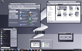
Thunder Storm WB
Average Rating: 9
Yours: -1
File Size: 1.06MB
Downloads Today: 1 Downloads Total: 202401

Thunder Storm WB

Updated May 27, 2010 by treetog


First Previous Page 6 of 14 Next Last
RoP1234
Comment #101 Sunday, March 14, 2004 6:09 PM
I only have 2 words: Thank you.
Apocalypse_67
Comment #102 Sunday, March 14, 2004 6:13 PM
Excellent work Renato. Nothing short from expectation. Thankx for the updates. Very smooth, I'll be using this skin for a while.
Keep up the great work.
sig101
Comment #103 Sunday, March 14, 2004 9:41 PM
Simply excellent! (And of course the mouseover on the start button is great too!)
Bones2112
Comment #104 Monday, March 15, 2004 2:32 AM
Excellent work, I really like the animations Simply awesome!!
retiredmaster
Comment #105 Tuesday, March 16, 2004 4:49 AM
This is still awsome, after a couple of weeks!

Give 'em a broadside master mates!
le_yanne
Comment #106 Tuesday, March 16, 2004 6:17 AM
When you have two icons in the system tray it looks a bit crap its not a major problem but I just wanted to report it... wanna report too this skin replaced pixxy on my comp who was soo far my fav' thank you treetog!! I new allready you are the best skinner

one question left,
I would like to change the all programs backgroundcolor from the startmenu to the same color as the idle color ( blue )
can you please tell me where I have to go? which section in skinstudio.. thx

here a screen of my desk to have a closer look on my problem, http://www.existence.clan.st/desk.jpg

thx,
treetog
Comment #107 Tuesday, March 16, 2004 9:01 AM
once more, thank you guys.

le_yanne: I saw your screenshot and went to make some tests. After trying in all ways I could, using even just one icons left in the systray, I couldn't fix it, since this problem doesn't happen here, from just one icon, till 6 icons in the systray, this problem never hapenned here. Maybe is the Windowblinds version you are using.
Thanks for the report, though.
SkinStudio
Comment #108 Wednesday, March 17, 2004 7:22 PM
That's an amazing skin. I encourage everyone to try it with vertical taskbar with a fet tasks running, IMPRESSIVE. I think it's actually a first skin out there that may be classified as a "dark skin" which still I am able to use. Best of both worlds.

Thank you Renato!
PurrBall
Comment #109 Thursday, March 18, 2004 2:23 PM
I've never known Renato's secret. Every one of his skins has pure genius in it. Way to go. Hope this one wins the bunch! Good luck!
amazinasian
Comment #110 Saturday, March 20, 2004 12:57 AM
Wow this is sexy

Only complaint I can muster up is that my user pics are all too big!!!! Can anyone help me there?
treetog
Comment #111 Saturday, March 20, 2004 9:12 PM
amazinasian, the matching user pick is inside the skin folder. it is a JPG file called userpick.jpg
amazinasian
Comment #112 Sunday, March 21, 2004 12:50 AM
When I download it, all I get is the wbload Document. I don't get it as a zipped folder.
treetog
Comment #113 Sunday, March 21, 2004 9:53 AM
amazinasia: after you install the skin go to the windowblinds directory and look for the ThunderStorm folder. I will be there.
amazinasian
Comment #114 Sunday, March 21, 2004 2:19 PM
There we go, thank you. My life is now complete
Jonathan Adkins
Comment #115 Wednesday, March 31, 2004 6:31 PM
Noticed a small bug regarding the quicktray area of the taskbar (when horizontal). When icons are hidden with the arrow, the oval surrounding the time looks perfect. When the arrow is ed and extended to show the icons, the oval is split in two irregularly.
Jonathan Adkins
Comment #116 Wednesday, March 31, 2004 6:31 PM
Meant to say when arrow is ed and quicktray area extended to reveal the icons.
Jonathan Adkins
Comment #117 Wednesday, March 31, 2004 6:32 PM
Bah, wish there was an edit button, the comments keep slicing a word I type out sel_ect_ed (there) and replacing it with ed.
insekta
Comment #118 Wednesday, March 31, 2004 7:17 PM
Well done, as usual. Your status as elite skinner remains intact. My only suggestion is the highlight box around the All Programs on the start menu looks a bit bland, as does the menu highlight box. If there were a way to make the arrow glow, and the ed items highlight more interesting, this would be a skin of perfection. Your skins always make my computer happy
aX3L
Comment #119 Thursday, April 1, 2004 11:03 AM
Good job! but, I like to keep my links toolbar in my taskbar, but it doesn't appears, only when i rool over whit the mouse pointer, so fix that out and it's gonna be the best skin ever!!!
Jincuteguy
Comment #120 Friday, April 2, 2004 11:20 PM
Hi Treetob, i really like this skin alot. But can you fix this one small thing? whenever i click on a window down at the taskbar, there's no other color to highlight the taskbar "window" so I know which "window" im on . Can you do that? thx a lot.

Please login to comment and/or vote for this skin.

Welcome Guest! Please take the time to register with us.
There are many great features available to you once you register, including:

  • Richer content, access to many features that are disabled for guests like commenting on the forums and downloading files.
  • Access to a great community, with a massive database of many, many areas of interest.
  • Access to contests & subscription offers like exclusive emails.
  • It's simple, and FREE!
Downloads remaining: 5
User Level: Visitor

Featured WindowBlinds

Popular WindowBlinds

Top WindowBlinds Skinners

Yesterday  |   Last 30 Days  |   All Time
1. LightStar 6903
2. don5318 4358
3. Vampothika 3649
4. SimplexDesigns 3184
5. adni18 2611
6. 2of3 1372
7. retiredmaster 1205
8. AeroPurple 899
9. SemoB 656
10. DaveBax 609
11. IceBabee 584
12. gmc2 574
13. BoXXi 541
14. Dcrew57 444
15. jazzymjr 345


web-wc01