|
2k5 m.netUpdated Oct 24, 2004 by stormsys2005 |
||||||||
Comment #2 Sunday, October 24, 2004 11:00 PM
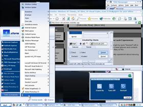
1. For you preview, make sure it's high resolution (ie png format or minimum compression jpg)
2. Make text readable - the highlights make text disappear
3. Start button - keep it simple, make sure it sticks with the rest of the theme
4. too many bevels mean not great skinning (bevels make skin bulky). Try using some minimal gradient overlays.
5. keep caption bar thin. Thick caption bars clog up screen area.
6. make tabs (and rest of skin ) flow... tabs seem out of place - there's a definite jut where tabs and rest of window meet.
Not a horrbible first skin. Remember, keep practicing... make simple graphics and minimalistic caption bars and task bars - these things make skins very usable.
Also, did you make all graphics yourself? The scrollbars seem to be taken directly from msn messenger.
Nice try though and keep at it!
Comment #3 Sunday, October 24, 2004 11:44 PM
In the "finish": the bottom of a window frame looks jaggged, inactive window rightside borders have a problem, button borders look like they're missing a pixel in each corner, as well as the titlebar buttons.
In the "consistency": Start button font does not fit with the taskbar font.
There are other issues, but if you're willing to spend the time, there are plenty of people willing here to help you (with ideas and with issues). Just ask here, in the message boards, or even in Stardock chat (irc.stardock.com).
Keep working, more time spent in the details on this would have resulted in a higher rating.
Please login to comment and/or vote for this skin.
Welcome Guest! Please take the time to register with us.
There are many great features available to you once you register, including:
- Richer content, access to many features that are disabled for guests like commenting on the forums and downloading files.
- Access to a great community, with a massive database of many, many areas of interest.
- Access to contests & subscription offers like exclusive emails.
- It's simple, and FREE!


Comment #1 Sunday, October 24, 2004 8:49 PM
But it is never a good idea to say in a skin description that you ran out of ideas. That seems to be suicide around here. *s*
I'll be looking forward to your next skin (when you find a few more ideas