Comment #2 Tuesday, October 26, 2004 8:52 PM
The close button "feature"
Wicked.
Comment #3 Tuesday, October 26, 2004 10:21 PM
Wicked.
Comment #4 Tuesday, October 26, 2004 10:54 PM
Comment #5 Wednesday, October 27, 2004 12:12 AM
Wicked.
Comment #6 Wednesday, October 27, 2004 12:49 PM
Heck of a job for your first skin, WickedP. Keep it up!
Comment #7 Thursday, October 28, 2004 12:32 PM
tonyd
Comment #8 Thursday, October 28, 2004 7:00 PM
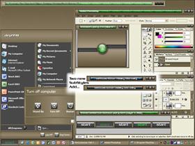
I created a couple of diffent sub-styles that change what I call the green "goo" area of the title bars to different colors and patterns. I'll upload a new preview and .wba file today.
Wicked.
Comment #9 Thursday, October 28, 2004 7:56 PM
Wicked.
Comment #10 Monday, November 8, 2004 9:03 AM
Comment #11 Monday, November 8, 2004 11:22 AM
Glad you like the skin...can you grab a screenshot of the raspberry status bar and e-mail it to me. wickedp@gmail.com
Wicked.
Comment #13 Tuesday, November 23, 2004 12:32 AM
There's an awful lot to like about it...
The design is graphically rich, but even at hi-res, it's majorly easy on the eyes... it also seems to be lightweight, making it ideal for everyday use. To me, this is exactly what a good WB skin needs to have going for it. Solid, stable design, splashes of color and texture without going overboard, and most importantly a sort of universal feel to its' graphics...
What I mean by that, is that it looks waaay different than, say, the Windows XP skin... but has clean enough lines, and thorough enough design, where it COULD've come as part of the OS, and appealed to a broad enough userbase to be a great alternative to the traditional look. I like it when a skin has that kind of elegance to it. It means its' creator isn't over eager to stamp their personality all over it. When that happens, I can't get away from always being reminded that I'm using someone elses' skin, and that kind of feels like I'm wearing someone elses' clothes... eerie.
You've managed to overcome those obstacles, and with the roll up feature, well... it's a winner.
So what's on my wish list? Hmmm... customized toolbars would be cool... but I'm sure I'll find this plenty useful, just as it is!
Excellent!
Comment #14 Tuesday, November 23, 2004 1:02 AM
Thanks for the kind words...I think you summed exactly what I was trying to create with the skin. Ahhh, toolbars and animations...I'm finding I have a long ways to go with my graphics skills before I can create a set of icons and animations.
In the mean time I suggest you give Tiggz's Killer Animations a look, and the XP Charcoal Toolbar Icons from Koasati also work well.
Wicked.
Please login to comment and/or vote for this skin.
Welcome Guest! Please take the time to register with us.
There are many great features available to you once you register, including:
- Richer content, access to many features that are disabled for guests like commenting on the forums and downloading files.
- Access to a great community, with a massive database of many, many areas of interest.
- Access to contests & subscription offers like exclusive emails.
- It's simple, and FREE!


Comment #1 Tuesday, October 26, 2004 8:41 PM
That said, there are a few issues that need some work. The inactive titlebar *loses* the close button. Scrolled up state looks a little funny, as if it were unfinished rolling up. Also, the All Programs flyout on the StartMenu has borders on both the left and the right - making the top and bottom borders stand out as missing.
Overall, a good skin with a lot of potential.