


|
MsgPlus! for Windows!Updated Dec 07, 2004 by gigablade777 |
||||||||
 |
|
Page 1 of 2 |
|---|
Advait Shinde
Comment #2 Thursday, December 9, 2004 7:04 PM
Comment #2 Thursday, December 9, 2004 7:04 PM
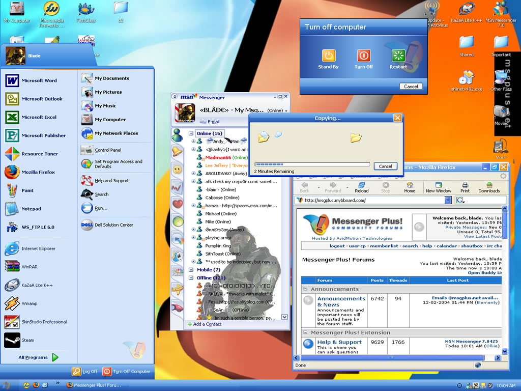
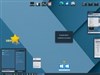
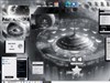
Too much dithering in preview to judge skin. Try to use higher resolution (at least 1280x1024), and use an external program to make screens instead of the print screen button. Great skin, but the preview gives a bad first impression. 

imake.my.ilife
Comment #3 Thursday, December 9, 2004 7:52 PM
Comment #3 Thursday, December 9, 2004 7:52 PM
I like the skin...hehehe ... partially because I love MsgPlus! but anyway..very nice
looks much like Xp or Royale...needs some work on buttons thou
looks much like Xp or Royale...needs some work on buttons thou

crzy chikn
Comment #4 Thursday, December 9, 2004 8:21 PM
Comment #4 Thursday, December 9, 2004 8:21 PM
You know what would help? You should make the text size smaller for the task bar. I don't like the huge letterings... Otherwise, pretty good.
gigablade77
Comment #5 Thursday, December 9, 2004 8:27 PM
Comment #5 Thursday, December 9, 2004 8:27 PM
Firstly, this theme is nothing like the default XP theme
Seccondly, I tried posting a 1280x1024 screenshot but Apparently WinCustomize's new system has an issue with them and totally warps/distorts them
And about the lettering, yes, a lot of things will be shrunk and/or modified when I finish and release RC3
Thanks for the comments and support
Don't forget to vote
Seccondly, I tried posting a 1280x1024 screenshot but Apparently WinCustomize's new system has an issue with them and totally warps/distorts them

And about the lettering, yes, a lot of things will be shrunk and/or modified when I finish and release RC3
Thanks for the comments and support

Don't forget to vote

gigablade777
Comment #6 Thursday, December 9, 2004 8:29 PM
Comment #6 Thursday, December 9, 2004 8:29 PM
LOL, sorry guys, posted with my old account 

Jjmvideogamer
Comment #7 Friday, December 10, 2004 9:07 AM
Comment #7 Friday, December 10, 2004 9:07 AM
Looks very nice.. but preview is blurry...
Good Job
Good Job
skinschiz
Comment #9 Friday, December 10, 2004 8:06 PM
Comment #9 Friday, December 10, 2004 8:06 PM
Well I like it and I dont think either it looks like XP out of the box (still got me scratching my head), nor do I think the text on the task bar is too big. I am perplexed about one thing...and I have to be honest I hate MSN anything..inlcuding their messenger....but it looks just like Yahoo's new version of messenger...I just loaded it up and did a side by side comparison (the new version of yahoo messenger refuses to be skinned by WB).
Anyway I like it and I think u did a great job...I would give a 7
Anyway I like it and I think u did a great job...I would give a 7
Steve Grenier
Comment #11 Saturday, December 11, 2004 11:21 AM
Comment #11 Saturday, December 11, 2004 11:21 AM
I think this skin was poorly done. You could have done much better. It looks like Royale with some changes that don't even make it better. I like the idea of the cut titlebars/start menu but at least make the images nicer and blend more with the theme. Make sure everything is in porportion and not a few pixels lower then it should be. Make sure everything is centered. Use good colours, don't settle for allright. It could be good, but you need to try harder when making it.
frub
Comment #12 Saturday, December 11, 2004 12:21 PM
Comment #12 Saturday, December 11, 2004 12:21 PM
I downloaded the skin, and while it was solid work, I don't see much difference over my default XP theme.
gigablade777
Comment #13 Sunday, December 12, 2004 12:19 PM
I don't know exactly what you mean? I tried to line everything up perfectly and I haven't noticed anything that wasn't - mind pointing it out> (I do know that there is a minor problem with min/max/close buttons which I am working on fixing).
Comment #13 Sunday, December 12, 2004 12:19 PM
| I think this skin was poorly done. You could have done much better. It looks like Royale with some changes that don't even make it better. I like the idea of the cut titlebars/start menu but at least make the images nicer and blend more with the theme. Make sure everything is in porportion and not a few pixels lower then it should be. Make sure everything is centered. Use good colours, don't settle for allright. It could be good, but you need to try harder when making it. |
I don't know exactly what you mean? I tried to line everything up perfectly and I haven't noticed anything that wasn't - mind pointing it out> (I do know that there is a minor problem with min/max/close buttons which I am working on fixing).
gigablade777
Comment #14 Sunday, December 12, 2004 12:22 PM
I don't know exactly what you mean? I tried to line everything up perfectly and I haven't noticed anything that wasn't - mind pointing it out> (I do know that there is a minor problem with min/max/close buttons which I am working on fixing).
Comment #14 Sunday, December 12, 2004 12:22 PM
| I think this skin was poorly done. You could have done much better. It looks like Royale with some changes that don't even make it better. I like the idea of the cut titlebars/start menu but at least make the images nicer and blend more with the theme. Make sure everything is in porportion and not a few pixels lower then it should be. Make sure everything is centered. Use good colours, don't settle for allright. It could be good, but you need to try harder when making it. |
I don't know exactly what you mean? I tried to line everything up perfectly and I haven't noticed anything that wasn't - mind pointing it out> (I do know that there is a minor problem with min/max/close buttons which I am working on fixing).
immortalCorrupter
Comment #15 Monday, December 13, 2004 9:42 PM
Comment #15 Monday, December 13, 2004 9:42 PM
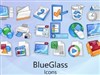
what is he name of his icon setup, i wnat the blue folders please help me??
gigablade777
Comment #16 Tuesday, December 14, 2004 8:29 PM
Comment #16 Tuesday, December 14, 2004 8:29 PM
It's a MAC OS icon set.
Why is my skin down to 2 stars? :-/
Why is my skin down to 2 stars? :-/
chrisellam
Comment #17 Saturday, December 25, 2004 2:30 AM
Comment #17 Saturday, December 25, 2004 2:30 AM
I love this skin. I,ve been using the same skin for about 3 months but now i,ll be using this. 

AK FM
Comment #18 Friday, December 31, 2004 4:52 PM
Comment #18 Friday, December 31, 2004 4:52 PM
I paticularly like this skin because I have the free version of WindowBlinds and Win 2000 aswell. So cool coz now it's making my Win 2000 plain-ness XP-like! But I wish WindowBlinds would adapt to to Win 2000 like it does to XP  But overall, nice skin
 But overall, nice skin
TN Brat!
Comment #19 Saturday, January 1, 2005 6:54 PM
Comment #19 Saturday, January 1, 2005 6:54 PM
Well, first I want to say that I think you're being WAY to defensive here. You asked for comments and suggestions, but can't take it when they are made and that's just sad. Don't ask if you don't want to hear what people have to say!
Now, I hate to say it but I tend to agree with Steve on this one. And to be honest there's nothing any more special about this one compared to any of the Royale skins out there, except for a few images like the shutdown dialogue back. It's a nice effort overall, but I already have this one...several time over...
Link
Link
Link
TN Brat!
Comment #20 Saturday, January 1, 2005 7:02 PM
Comment #20 Saturday, January 1, 2005 7:02 PM
Next time perhaps you could put a little more effort into making something original...don't get me wrong, it's nice, but so are the others. I mean you went through all the trouble of making a WB, and I'm sure you put a lot of effort into it...it would be nice to see you put that effort into something "more"
Oh and about the preview issue...making excuses and being defensive...I've not ever had any problem getting my 1280 by 1024 previews showing up without "warps/distorts". Link
Oh and about the preview issue...making excuses and being defensive...I've not ever had any problem getting my 1280 by 1024 previews showing up without "warps/distorts". Link
Please login to comment and/or vote for this skin.
Welcome Guest! Please take the time to register with us.
There are many great features available to you once you register, including:
- Richer content, access to many features that are disabled for guests like commenting on the forums and downloading files.
- Access to a great community, with a massive database of many, many areas of interest.
- Access to contests & subscription offers like exclusive emails.
- It's simple, and FREE!
|
|
Page 1 of 2 |
|---|


Comment #1 Thursday, December 9, 2004 4:36 PM